The MSI HQ Tour: Design 101
by Ian Cutress on July 7, 2015 8:00 AM EST- Posted in
- Motherboards
- MSI
- Trade Shows
- Notebooks
- HQ
- Tour
- Computex 2015
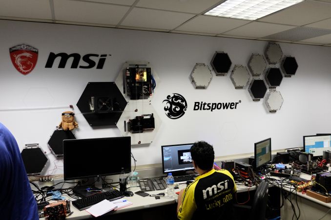
This year marked my fifth year at Computex, starting from 2011. Out of the trade shows I attend each year, it ranks as number one for a variety of reasons – the location (Taiwan) is a great country to visit and experience, most of the PC component companies I deal with on a day-to-day basis are there, and every year there tends to be a number of big launches either just before, during, or immediately after. Each year of my Computex visits, we have synchronized with a company in order to obtain both a tour of the headquarters as well as a high profile interview. This year we had a chance to visit MSI, based in the Zhonghe district of New Taipei City.
While the discussion direction of the interviews (I’m transcribing one this week for future publication) are question driven by us, the HQ tour of the headquarters is somewhat of an unknown. The company being visited obviously directs what we see and what we do not see. In almost every case there is also a restriction on photographs too, as to not potentially reveal company secrets, but again that is the norm. This is not unusual, and occurred when we visited ECS, ASRock, GIGABYTE and ASUS in the previous years. As a result, MSI dictated our tour, and we saw a clear focus on the design aspects of what is more than just a motherboard manufacturer.
Design 101
To be brutally honest, MSI’s HQ from the outside lacks a significant aesthetic. To put it into perspective, ASUS, ECS and GIGABYTE have dedicated buildings either tall (20+ stories) or identifiable on main roads. ASRock’s HQ is a few floors in a non-descript business district. MSI fits between the two – they had a couple of large buildings that were slightly off the beaten path. But as is usual in a city like Taipei, the persistent heat, humidity and weather systems (typhoons) has taken its toll over time and there was no commanding presence nor was there an obvious entrance, which felt a little odd. Because it was part of a business district, security was performed at door (like GB and ASRock) rather than a walled area (ASUS). As a result, none of the photographs I took of the outside fit the typical tech company motif that we are perhaps used to in the west.
The HQ Tour was split in half, as is normally the case – 50% of the day on meetings with various departments relaying my thoughts on their product stack and some NDA discussions, with the other 50% on viewing the departments/business units with interviews with VPs to follow.
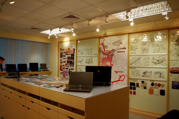
The primary stop on the second half is best described as a design room, showcasing MSI’s design philosophies and how ideas are developed.
It was clear that this was a showcase room, perhaps specifically set up for media or MSI’s partners to see how development progresses. Western designers sometimes call this a mood-room, where you are surrounded by inspiring pictures, colors, music and textures in order to get the creative juices flowing. MSI placed in this room a number of success stories but also design ideas that failed to make it to market in order to show what directions they have attempted in the past.
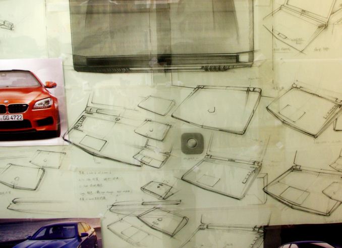
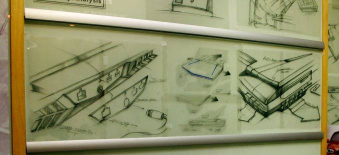
In recent quarters MSI has been growing its notebook business, particularly in gaming, so it was understandable that most of the room was directed to this cause. Naturally one of the more prominent metaphors with PCs is with fast cars, so there were plenty of images of cars surrounding the various design drawings on the wall.
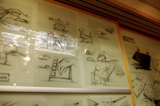
MSI certainly isn’t Logitech, so there isn’t a wealth of history in terms of keyboard and mouse design from a functional standpoint that involves physics simulations of how best to place keys, backlighting or for mice grips. However from the purposes of laptop design at least, these images show that the designers have to think about something similar.
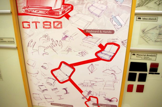
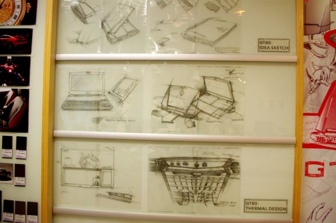
Here’s some more of the gaming laptop design, but I find this more interesting:
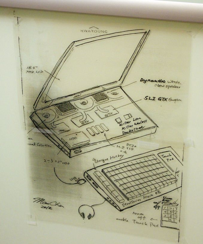
This is apparently one of the first concept designs for the GT80 Titan – a detachable mechanical keyboard instead of one in the chassis with an external touch pad. If this was taken forward, then arguably the main body of the GT80 Titan might have been able to take in more hardware or the airflow may have been designed differently. The obvious downside is the requirement to carry around a keyboard everywhere, and being unable to use the device without a keyboard. Other elements did make it through nonetheless, such as the dual GTX graphics cards, the four storage drives, the 18.4-inch FHD display and the mechanical keyboard concept.
When designs are near final, specific details are sketched out such as the graphics for the top plate (on the bottom left) or the airflow perception.
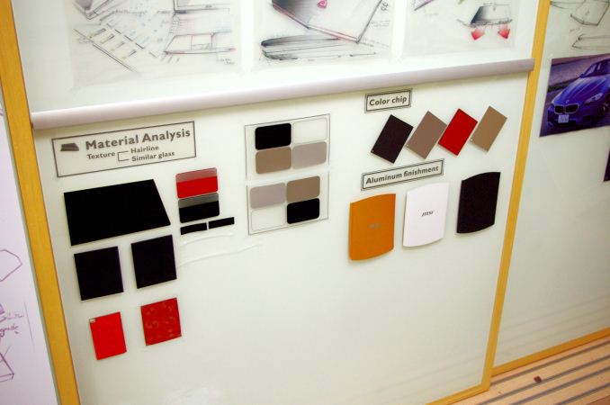
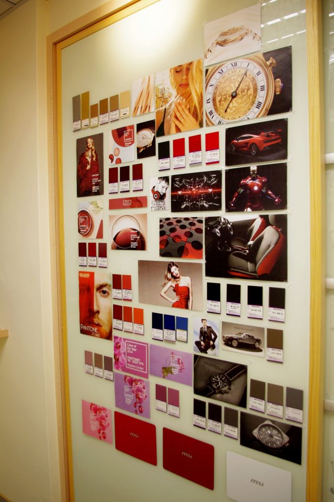
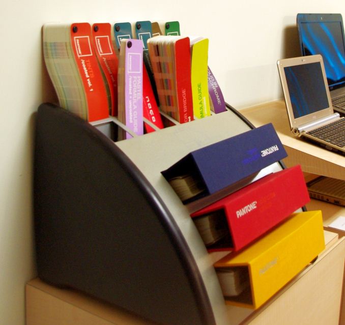
Almost every design studio will keep an array of colors and materials on hand to mix and match with what feels right for the design of the product. Matching the exact shade of red from the millions available while drawing cues from other uses of that color or texture is an important task.
Some Old Models, Some Never Launched Models
As with other manufacturers, there’s always going to be some models that get through various design stages but due to other pressures, never see the light of day. Others that are launched are quickly confined to the annals of history, either fondly remembered or quickly forgotten. MSI had a bunch on display.
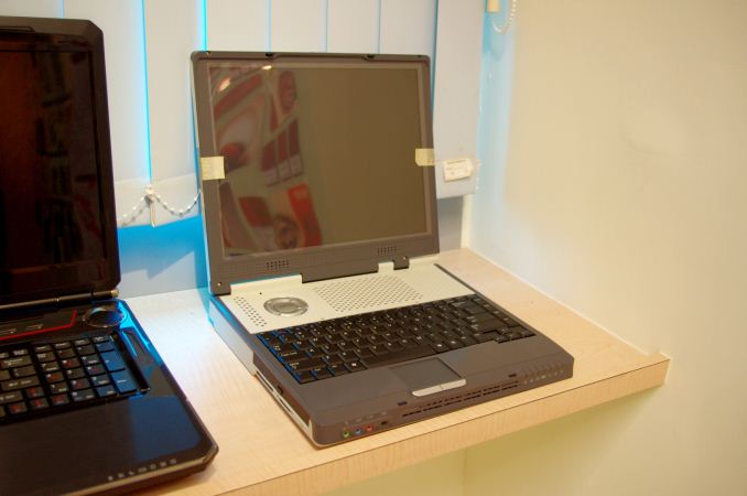
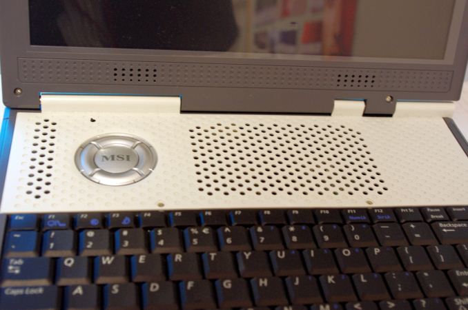
This was MSI’s first laptop design, built around 1999 if I remember correctly, and it’s clear from the size and design of just how old it is.
Interestingly enough, MSI shared a tidbit of information here – the concept of having user replaceable components through the middle of the chassis used here (the white section of the keyboard opens up to show DRAM and others) was part of the inspiration for the latest GT80 Titan flagship.
Open up a few screws and put in a new drive, memory, or dig deeper for other replacements. That being said, the large air vents here suggest that the heat generated is being dispelled above the keyboard, not making it the best of user experiences.
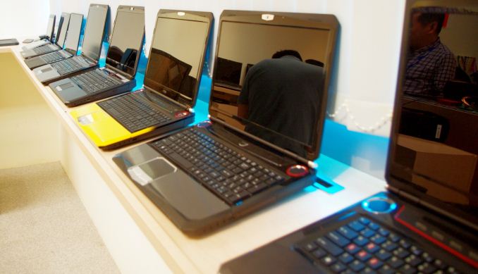
The dial design for the MSI logo was on a few other models in the room, including a mildly esoterical dual yellow/red design here near the middle.
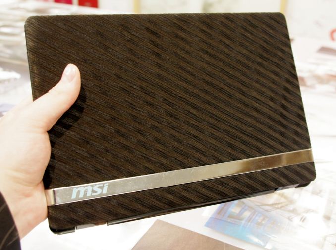
Here’s something that took my interest that never made it into production. This is a fabric covered netbook that was soft to touch and moves away from the shiny plastic, glass or matte designs that currently consume the market.
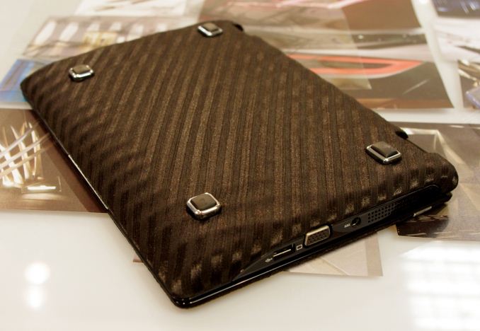
Even the rear is covered, and the VGA port on the side is also an indication of the age of this device (and idea). Having a fabric covered device opens up a range of color and texture designs not currently available on the market, or pushing it further to superhydrophobic surfaces for an element of water proofing is also a potential avenue to explore, which makes it sadder that this idea was canned.
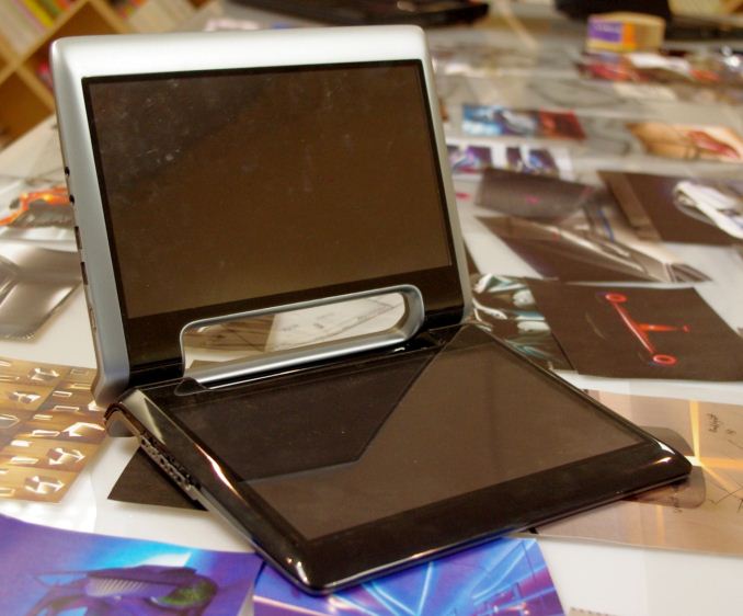
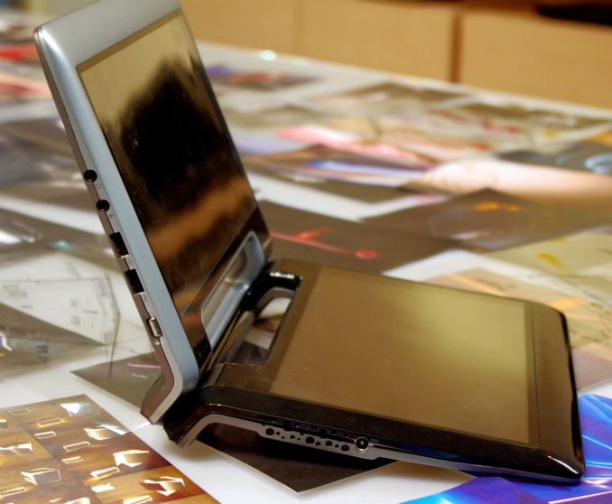
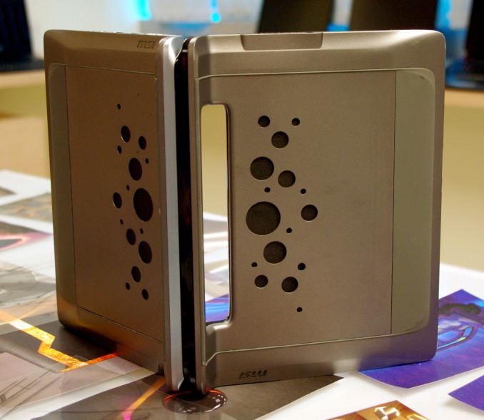
How about a dual screen tablet? This isn’t a wholly new concept, as I’ve seen several attempts at something similar in the past with laptops but here we have separate SoCs and hardware in each segment that when attached can act together.
It allows two people to use them as tablets or one individual as a laptop (as long as you don’t mind typing on a screen). There are a few obvious caveats, such as being unable to fold it flat because of the handles or ending up taking the wrong one if your data is on the other.
The dual device design is the foundation of the current market of two-in-ones, but the keyboard in a 2-in-1 acts as another battery and IO hub rather than a separate device. Nevertheless, off-the-wall ideas sometimes get big rewards, so it can pay to have designers come up with concepts such as this.





23 Comments
View All Comments
Murloc - Tuesday, July 7, 2015 - link
first!jtd871 - Tuesday, July 7, 2015 - link
Typos 1st page"queues" should be "cues"
"matt" should be "matte"
Ian Cutress - Tuesday, July 7, 2015 - link
Corrected - thanks :)chizow - Tuesday, July 7, 2015 - link
For those wondering, this is where you get most of your pre-launch leaks. NDA parts from all PC hardware vendors undergoing testing/validation by labrats/enthusiasts/gamers on some of the same racks and benches. :)der - Tuesday, July 7, 2015 - link
4th comment!Stuka87 - Tuesday, July 7, 2015 - link
Thanks for the tour, brings back old memories of my previous job.rjashton - Tuesday, July 7, 2015 - link
Pretty interesting to see this - bit different from the normal coverage!WorldWithoutMadness - Tuesday, July 7, 2015 - link
No wonder the designs are pretty bleak, they referenced the wrong products.They should get reference from BAC mono or Jag E-type for examples.
Yes, they can design but no, they don't have the taste
Freaky_Angelus - Wednesday, July 8, 2015 - link
Considering a certain person has spare time and has experience setting up a 'mood room' when working on Jeff...Why not?
But seriously, I do agree. I don't really like MSI for their designs that much (given the GT80 dropped my jaw) and seeing what they use for references... You'll always have a lag on designs so you'll have to look forward rather a bit to know what forward a small bit will be like. That means supercars, extraordinary designs and sci-fi for sources. How common is using a tablet now, it was sci-fi in series like TNG.
That said, given their rather interesting set of test facilities, the products then coming out deserve also more fame ;) Thank you for enlighting me on MSI!
chrnochime - Wednesday, July 8, 2015 - link
E-type is a classic car. Gamers like cutting edge design, which that is most certainly not.