Windows 8 Task Manager Features Improved UI for Multiple CPUs
by Andrew Cunningham on October 27, 2011 5:30 PM ESTMicrosoft's Ryan Haveson takes to the Building Windows 8 blog today to give us one of our first looks at a Windows 8 feature not included in the Developer Preview: new Task Manager features drastically increase its usefulness on multicore systems, especially on servers with large numbers of logical processor cores.
Rather than the old, graph-based approach, the Windows 8 Task Manager now displays CPU usage in numbers and colors - more heavily loaded processors are darker colored, while lightly used processors are lightly colors. Hovering your mouse over a particular processor will give you its logical processor ID. All of this makes it easier to tell at a glance what each of your logical CPUs are doing, especially in systems with as many cores as the one shown above.
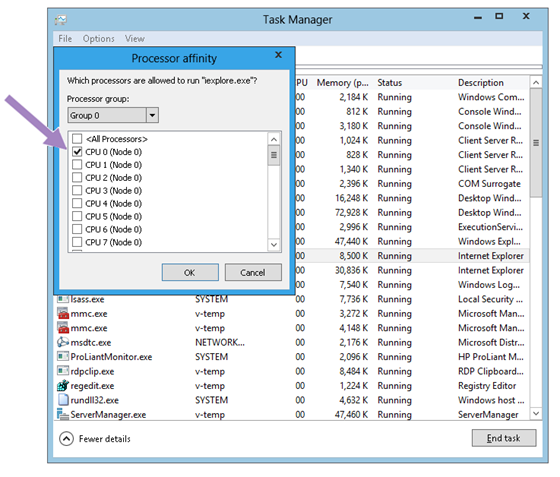
The new Task Manager also allows users to specify which logical processor or processors should run a particular process - one could, for example, restrict a browser or video encoding program to use only one or two of a system's cores, leaving the rest free for other tasks. This feature was also available in previous Windows versions, but the dialog boxes are more informative here.
For more, as always, check out the deeper and more informative post at the Building Windows 8 blog.
Source: Building Windows 8 Blog


36 Comments
View All Comments
name99 - Thursday, October 27, 2011 - link
Is there a civil war going on within MS?On the one hand they are releasing stuff like this --- on the other hand there is the SUPPOSED vision for Windows 8 (like an iPhone, only easier to use).
Seriously, WTF???
In THEORY these two poles can be balanced. Apple does this by having the Mac GUI, plus the UNIX world you can access from the command line. But what we're seeing here is of a piece with what we saw earlier with the ribbonned Explorer, in the mainline GUI, and makes one wonder just what Win8 is going to be.
It certainly looks on track to both horrify power users (with the simple start screen and basic apps) AND terrify novice users (as soon as they need to do anything that goes beyond the start screen).
yelped - Thursday, October 27, 2011 - link
Um... If you would check the source, then you would see that this is the advanced view.piroroadkill - Thursday, October 27, 2011 - link
I couldn't agree more. New task manager is awesome, yet metro is awful for desktop use.Windows 8 has so much love/hate stuff going on.
B3an - Friday, October 28, 2011 - link
MS have already made improvements to the new Start Screen (Metro) since the dev preview...http://blogs.msdn.com/b/b8/archive/2011/10/11/refl...
I think with them improvements it will be better than the current windows Start menu.
Atleast scientifically as MS point out above it IS better, you just have to get used to it and know it's features (for instance many people dont know you can just start typing to search, you dont have to bring up a search box anymore). But there we have the biggest problem of all for most users... change.
Nihility - Friday, October 28, 2011 - link
I really only use the start menu to search for programs and system features and to shut down the system.The search in metro is better but shutting down is worse. I generally like what they're doing with metro. My one concern is the lack of heavy multitasking.
robinthakur - Friday, October 28, 2011 - link
Seems like an odd fit i'd agree. Whilst i quite like this improved task manager, since I so rarely need to power up my self-built rig these days, preferring to just do everything home based on iPad, I think I'll stick with Windows 7 for a few more years.B3an - Friday, October 28, 2011 - link
Being as Win 8 will run on tablets it can completely replace your iToy or anything else. You'll have a full blown OS on a tablet that can do anything a desktop PC can. I'd expect Win 8 tablets to all have HDMI too, so just plug it in to a monitor to use it like a desktop computer for work, then unplug it when taking it around.ananduser - Friday, October 28, 2011 - link
The difference is that the transition between the 2 win8 interfaces is as seamless as ALT TAB, and Lion is a mess of a GUI that has angered even the most loyal Gizmodo editor, that wrote an entire article on the uselessness of Lion's GUI changes.Windows is the one moving forward, and Lion is stagnant. After all it's only 30$, you get what you pay for.
jabber - Friday, October 28, 2011 - link
I must admit I finally got round to borrowing a new Mac mini a few weeks ago to really try out Lian and see what all the fuss was about.I must say the most used phrase was "WTF???"
I was expecting something amazing compared to the dreadful Win7 I'd been using for the past 2 years.
Well that's what all the Apple fanboys led me to believe. Quite frankly the user experience was a real disappointment. It didn't feel advanced or slick at all. It really did feel quite old fashioned.
Not very intuitive either. Really other than web browsing, looking at photos and using iTunes it didn't seem all that great for anything else. Maybe that's why folks like them?
I didn't regret handing it back or feel like I had to buy one.
B3an - Saturday, October 29, 2011 - link
It certainly is inferior to Win 7. I'd say even Vista.Things like the "File / Edit" menu at the top of the OS is something Windows got rid of from Win 95 onwards. But even without that in so many ways OSX feels like Windows 3.1 to me. No amount of shiny icons can change this.
If you even make an app fullscreen, using the new Lion fullscreen option (Windows has fullscreen option for how many years???) then you cant even use any other connected monitors, they display grey and cannot be used at all. Apple has even copied Windows with the new OS buttons, they used to have round corners (looked like they were from 1999).
I'd literally be here all day if i were to list everything so i'll just stop now.