Motorola Droid Bionic Review - Dual Core with 4G LTE
by Brian Klug on October 11, 2011 1:55 AM EST- Posted in
- Smartphones
- LTE
- Motorola
- OMAP 4
- Mobile
- motorola droid bionic
It is something of an understatement to start out by mentioning that the Motorola Droid Bionic was easily this summer’s most anticipated smartphone. The story of the Bionic started at CES, where it immediately attracted attention thanks to its combination of 4G LTE connectivity and a Tegra 2 SoC. I remember seeing the Bionic on a table on the last bleary-eyed day of CES, among its other 4G LTE brethren as shown below.
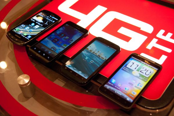
Left to Right: Droid Charge, LG Revolution, Motorola Droid Bionic (old), HTC Thunderbolt
I don’t remember much about that Bionic, other than that it was the only one among the four that I didn’t get a chance to grab photos of loading the AnandTech homepage or Dailytech, and that reps were guarded about letting me touch it. Rumor had it that the Thunderbolt would come first, and then down the row of devices. Eerily, other than the Bionic, the devices launched in that order.
That Bionic doesn’t exist anymore, instead the phone that launched in its stead is codename Targa, which was further down the roadmap and no doubt accelerated to take the original Bionic’s place. Until now, 4G LTE and dual core SoCs have been mutually exclusive, and the result is performance now gated by the SoC instead of the last mile of air between you and a base station.
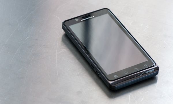
The new Motorola Droid Bionic (codename Targa)
Finally with the Bionic things change, and we have a smartphone that combines a dual core SoC with the fastest air interface around, 4G LTE. It’s been a long and arduous wait for the Bionic, but it’s finally here. The only lingering question is whether the wait has been worth it.
It’s always easiest to start with aesthetics, and here the Bionic shows an interesting combination of design language borrowed from the Droid X/X2 and the latest QWERTY keyboard packing Droid 3. I think that actually does a good job summing up what the Bionic really is - it’s a combination of the X/X2 form factor and display, and the SoC plus nu-Motorola design language of the Droid 3. If you take a step back and squint at it, I think these are totally reasonable conclusions to make.
The Bionic’s front side is a single piece of gorilla glass with tapered edges, ringed in relatively typical Motorola chrome. The lip where display meets the edge chrome is something that has drawn a lot of attention for being a dust magnet, but thus far I haven’t seen inordinate dust or lint collection in that crack. It’s nothing that a microfiber cloth can’t take care of, and honestly isn’t as big of an issue as dust collection in virtually every smartphone earpiece.
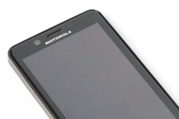
Up at the very top is the VGA front facing camera, earpiece, proximity and ambient light sensor, and finally notification LED. I know the notification LED is a must have for some smartphone shoppers, so rest assured it’s here and does work. It appears to have two colors - green and red, which blink for alerts and charging status, respectively.
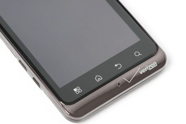
At the bottom are the same style capacitive buttons as we’ve seen on other Motorola phones. I guess it’s worth mentioning that this isn’t something that changes much anymore - each OEM seems to have settled on at least some common pattern and is keeping it that way. The buttons are nicely backlit, but the white point seems a tad warmer than most. Right in the center of the bottom chrome is the primary microphone.
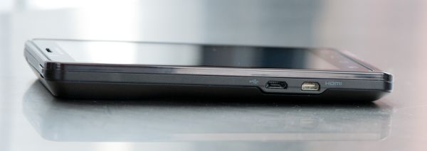
Left side is home to the microUSB and microHDMI ports, which are in the bottom quarter just like so many other Motorola devices. They jut out normal to the side and don’t follow the curve of the phone along its side, no doubt so it can mate up with the laptop dock, which unfortunately we don’t have.
If you squint and look at the phone from this angle, it’s readily apparent just how much inspiration the Bionic draws from the Droid X/X2 line of devices. They both have a thicker top region that tapers to a thin point at the bottom, and this iconic port placement.
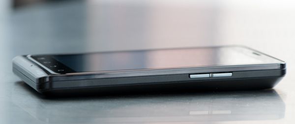
On the other side is the volume rocker, which is one piece of plastic and adequately clicky.
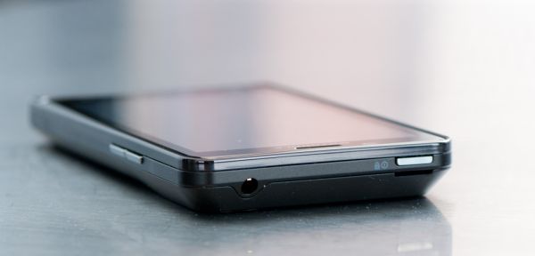
Topside is the headset jack, and opposite to it, the Bionic’s lock/off button. It took me a while to get used to this button placement, and the button itself isn’t very good either - it rocks back and forth, and feels loose, but gets the job done.
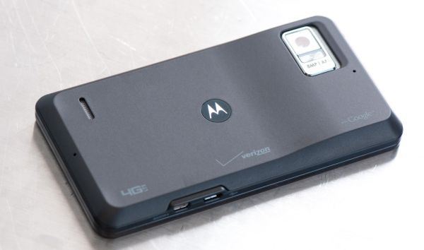
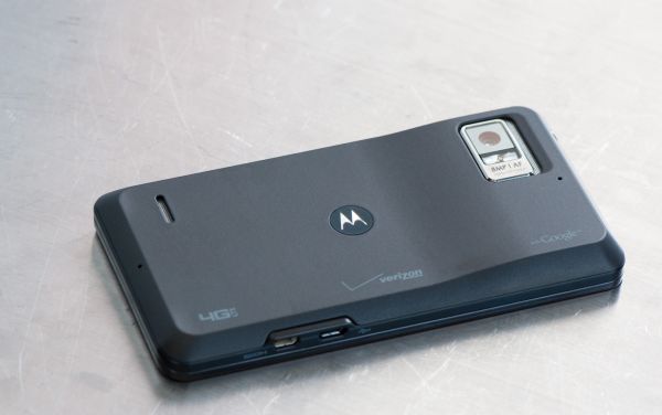
Directing our attention to the back side, we can see the Bionic’s 8 MP rear facing camera and LED flash, which is ringed in a large chrome package. There’s a grille to the side of this which serves no real purpose that I can tell other than decoration. Just below this is a microphone for ambient noise cancelation, and on the extreme other side of the Bionic is another microphone for stereo audio recording. That’s a grand total of three microphones on the Bionic, which is pretty par for Motorola.
The edge of the phone is given a bevel which proceeds around the entire lip. This gives it a uniquely positive in-hand feel. The battery cover is topped with a brown-grey soft touch material.
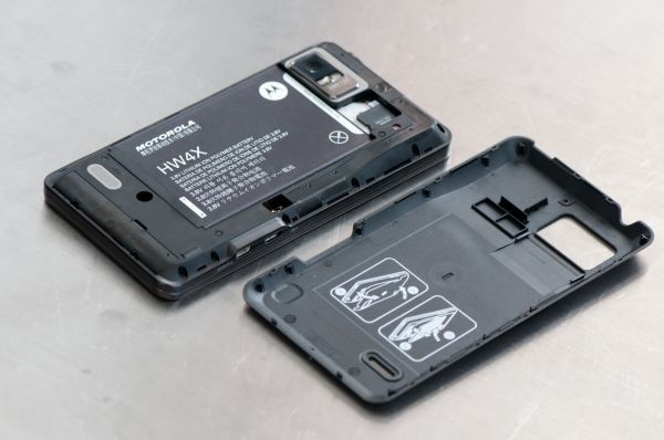
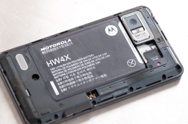
Peel that battery cover up, and you can see Bionic’s standard thin and wide battery. At the top is the unique microSD card slot, which just pushes in and is held in place by friction and the battery cover. The Bionic’s SIM slides out sideways underneath it.
You can also see some characteristic antenna traces on the backside. There’s one at the bottom for CDMA and LTE, WLAN on the right side, and another at the very top likely for diversity. More on that later though.
I find the Bionic’s industrial design to be a relatively safe design for Motorola, especially given some of the more radical things we’ve seen come out lately. It keeps the chrome chin at the bottom and absolutely does match the Droid 3, but at the same time I feel like things could be much more overstated than they are here for such a high profile device.
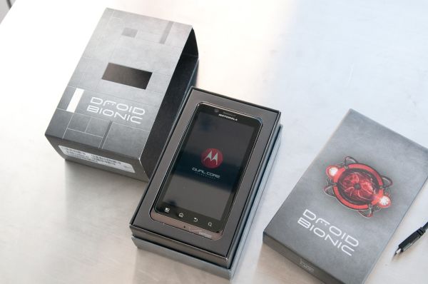
Packaging for the Bionic matches what I’ve seen for the other high end LTE devices, with a die-cut card stock wrapper giving a glimpse of the droid eye underneath. There’s nothing out of the ordinary here, but it bears mentioning. Inside that box is the phone, standard battery, microUSB cable, charger, and some documentation. The 16 GB class 4 microSD card is, like always, preinstalled in the phone.
| Physical Comparison | ||||||
| HTC Thunderbolt | Motorola Droid X2 | Motorola Droid 3 | Motorola Droid Bionic | |||
| Height | 122 mm (4.8") | 126.5 mm (4.98") | 123.3 mm (4.85") | 127.5 mm (5.02") | ||
| Width | 67 mm (2.63") | 65.5 mm (2.58") | 64.1 mm (2.52") | 66.9 mm (2.63") | ||
| Depth | 13.2 mm (0.52") | 9.9 - 14.4 mm (0.39"-0.57") | 12.9 mm (0.51") | 10.99 mm (0.43") | ||
| Weight | 183.3 g (6.46 oz) | 148.8 g (5.25 oz) | 184 g (6.49 oz) | 158 g (5.57 oz) | ||
| CPU | 1 GHz MSM8655 45nm Snapdragon | 1 GHz Dual Core Cortex-A9 Tegra 2 AP20H | 1 GHz Dual Core Cortex-A9 OMAP 4430 | 1 GHz Dual Core Cortex-A9 OMAP 4430 | ||
| GPU | Adreno 205 | ULP GeForce | PowerVR SGX 540 | PowerVR SGX 540 | ||
| RAM | 768 MB LPDDR2 | 512 MB LPDDR2 | 512 MB LPDDR2 | 1 GB LPDDR2 | ||
| NAND | 4 GB NAND with 32 GB microSD Class 4 preinstalled | 8 GB NAND, 8 GB microSD class 4 preinstalled | 16 GB NAND, up to 32 GB microSD | 16 GB NAND, 16 GB microSD class 4 preinstalled | ||
| Camera | 8 MP with autofocus and dual LED flash, 720p30 video recording, 1.3 MP front facing | 8 MP with AF/LED Flash, 720p30 video recording | 8 MP with AF/LED Flash, 1080p30 video recording, VGA (0.3MP) front facing | 8 MP with AF/LED Flash, 1080p30 video recording, VGA front facing | ||
| Screen | 4.3” 800 x 480 LCD-TFT | 4.3" 960 x 540 RGBW LCD | 4.0" 960 x 540 RGBW LCD | 4.3" 960 x 540 RGBW LCD | ||
| Battery | Removable 5.18 Whr | Removable 5.65 Whr | Removable 5.65 Whr | Removable 6.6 Whr | ||
I'm not quite at the point where I can do videos like Anand, complete with studio, but I've done the usual thing and put together a video review and tour of the Motorola Droid Bionic.




64 Comments
View All Comments
Jamezrp - Tuesday, October 11, 2011 - link
Still going through the full review now...obviously quite a bit to get to. But I did want to say that Anand's first video review with the Apple Cinema Display was intriguing, and I enjoyed watching it. But this one, Brian...it just lacks the humanity. Seeing someone on the screen actually made me interested in watching, even with a complete lack of movement. Not sure if anyone else agrees, but if you guys are going to do video, I'd like to see faces talking intelligently, like you most certainly can.Brian Klug - Tuesday, October 11, 2011 - link
I've been doing videos in this format for a while now to show off the phone and keep it cropped nicely, but going forwards we're trying to find a way to merge the two styles.Doing something like what Anand usually does will require telepresence of some kind, however, but it's indeed a format we are working on.
-Brian
jackka - Tuesday, October 11, 2011 - link
Being able to see a talking face shouldn't matter much for phone reviews. People want to see the actual phone up close and in detail.It's not like we're watching the news or a talk show. The current format is simple and effective at its job. While I wouldn't mind more personality in the video, I definitely wouldn't trade it for any bit of the view or the detail of the actual phone that is being reviewed.
Much thanks for the video and the review, by the way.
Johnnn3433 - Saturday, November 5, 2011 - link
Is 4G LTE Speed Faster Than 4G or Even Faster Than 3G?www.fourgltephones.com
Jamezrp - Tuesday, October 11, 2011 - link
No worries, I totally get what you mean. I've stayed away from the camera for years...and every time I think of picking it up and putting myself on the screen, I stop myself for way too many reasons. I just think that you guys are clearly articulate enough to express exactly what need be said in a video, perhaps without even showing much of the product itself.Then again, it may depend on the product in question. I guess that still needs to be tested.
vol7ron - Wednesday, October 12, 2011 - link
Bad idea. Sure it's nice to see a face, maybe you want to use PIP by lockergnome does, but the review is about the device. You want to see how the device looks, how it interacts, it's something visual. You can get away with doing that for something like an SSD, CPU, or RAM, but if you're doing a video about a device that takes visual input or gives visual output, you better include it in the video.Jamezrp - Tuesday, October 11, 2011 - link
I've had the Bionic myself for a bit now, testing it...the biggest problem I've had (besides battery life) are the occasional software hiccups, which I didn't see you didn't seem to have Brian, or at least didn't mention. The worst is when I lose my cell data connection, the Bionic won't start up that connection again, period. I need to put it in sleep mode and wake it up, or reboot it entirely. Not even airplane mode switching fixes that.Other quirks include the awful shortcut-adding method, no settings in the drop-down menu, and a few more which escape me because it's late. On my model it even reads only 8GB of onboard memory, plus the 16GB card. The more I investigate, the more I think my model may be slightly defective...
Have you experienced any of these software problems?
I'll also add that I've had nearly identical benchmark scores. But I don't have the laptop dock...any plans on adding a section for that?
Brian Klug - Tuesday, October 11, 2011 - link
I honestly haven't experienced any of those issues at all - I've lost cellular data and had it come back no problems many times. Handover remains a problem for many of the LTE handsets however, where you'll either get stuck on EVDO until you reboot.Does airplane mode fix it at all? Sometimes these things really only can be remedied by a hardware swap, unfortunately.
No plans to add a section related to the laptop dock since Motorola didn't sample us one. However I'm told this is exactly the same as the Atrix, you can check out Anand's experience with that in his review though: http://www.anandtech.com/show/4165/the-motorola-at...
-Brian
bplewis24 - Tuesday, October 11, 2011 - link
You may have a lemon, because I don't have any of those issues.Hubb1e - Tuesday, October 11, 2011 - link
Mine has been flawless as well. Sounds like a lemon. The extended battery turns this into a great phone for power users and doesn't add that much bulk. I'm very happy with mine.