The Apple Watch Review
by Joshua Ho & Brandon Chester on July 20, 2015 8:00 AM EST- Posted in
- Wearables
- Apple
- Mobile
- Apple Watch
WatchOS: Communication
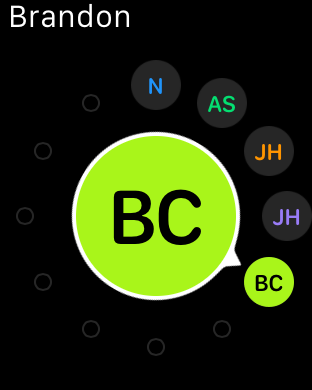
If you’ve been reading closely in the past few pages, you’ll probably notice that there’s a rather consistent theme when it comes to what I find myself doing with the Apple Watch. For the most part, those uses revolve around instant messaging, text messages/iMessage, email, and the extremely rare phone call. Ultimately, communication is what the Apple Watch is all about. I suspect that this is ultimately why Apple has placed a dedicated side button for the Friends screen, which contains a carousel of contacts that you would frequently contact. In practice, this is the only way to access some of the features that are specific to Apple Watch, namely Digital Touch and sending animated emoji.
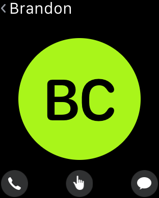
The Friends UI itself is definitely quite effective for what it is, and really shows again just how useful the digital crown can be when it comes to keeping the UI compact without compromising usability. Selecting a given person is done with the digital crown, with confirmation providing by tapping the display. Once confirmed, the user can elect to call or send a text message. If the friend has an Apple Watch as well, the previously mentioned Digital Touch and animated emoji features will also be accessible from the same screen.
Honestly, I saw next to zero value for sending heart rate or animated emoji, but the ability to send taps to someone is really quite helpful given how good the haptic feedback (Taptic Engine) is at getting someone’s attention. It’s definitely possible to accidentally spam taps to someone without malice though, which is something to be mindful of. Drawings are also a fun feature, but probably not a killer app. At the end of the day, it’s probably a fair bet that you’re going to spend most of your time using the Apple Watch to send text messages and make phone calls rather than drawings or emoji.
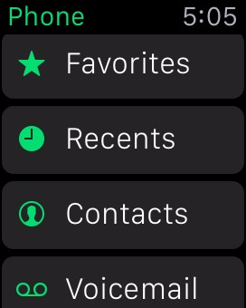
Although I’ve already discussed the text messaging aspect, the phone aspect is a pretty interesting experience. In practice, phone calls are definitely not going to work in public on the watch, but in private settings I found the experience to be without any major problems. The actual phone call part of the experience is usually pretty relaxed as you can basically leave the iPhone 6 somewhere else and talk over speakerphone with your hands on a computer as the microphone can still pick up voices reasonably well in that kind of situation as long as you haven’t covered the mic with your wrist or clothing. Trying to make a call is also one of the easier things to do, with a list of recent calls synced from the paired iPhone, favorites, a contact list, and voicemail access from the phone application. You can also make a call from the previously mentioned Friends screen.
One issue that I've observed when making calls on the Apple Watch is that there are times where it will hand the call off to the iPhone rather than completing it on the watch. In fact, every time you make a call you will momentarily see a message that says "Handed Off", which would imply that the call has been transferred to the iPhone. Usually this will be quickly followed by the standard ringtone and call connection being done using the speaker and microphone right on the watch, but I've encountered times where it actually does hand the call off to the iPhone and there's no way to pass it back. This seemed to happen in very specific circumstances, such as calling a certain contact using the friends menu rather than right from the phone app, and it's definitely something that will just require a small bug fix.
Something else to note about audio calling is that the Apple Watch doesn't support making FaceTime Audio calls. This is less of a problem now than it would be in the past, as Continuity and Handoff allow iPhone users with iPads and Macs to answer phone calls on those devices. That being said, it means that there's no way to communicate with a person on their iPad or Mac if they don't own an iPhone, which is somewhat disappointing with how FaceTime is positioned by Apple as a way to communicate across all Apple devices. I would imagine that support for FaceTime Audio calling will be added down the road in either a software update or a new version of the Apple Watch, quite possibly with a front-facing camera to enable both video and audio calling.
Fitness
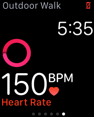
Fitness has been a huge trend in the wearable industry as of recent, with no signs of slowing down. Heart rate monitoring is almost a standard in smartwatches by this point for better or worse, as is step counting. Fitbit, Jawbone, Microsoft, Garmin, HTC, and others have all made strongly fitness-targeted wearables. In the case of the Apple Watch, I was somewhat dubious that this feature would be all that important to my evaluation of the watch. After all, an enormous number of these wearables suffered from the abandonment problem that I previously discussed. Given that fitness tracking didn’t seem to be all that of an appealing feature, I was pretty well convinced that the selling points of a truly successful wearable would be elsewhere. I’m also decidedly low-tech when it comes to how I approach exercise, as to me there’s no real data needed other than a timer and whether I feel like I’m exercising at a sufficiently strenuous pace, when I exercise at all. As a result, I haven’t been evaluating applications like Endomondo and other fitness-related applications in deep detail, and I didn’t really expect to be writing this section either.
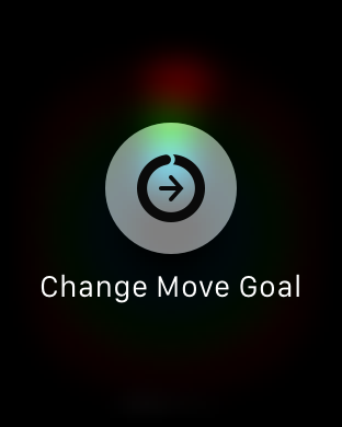
So now that we’ve established the background in which I approach fitness, we can start to talk about the actual fitness app on the watch. The fitness aspect is actually remarkably simple. Setting up the application at the start goes something like inputting your height, weight, sex, and age, then selecting a starting move goal. Once you’re done with all of this, just about the only thing you actually have to do with any kind of regularity to make the fitness tracking work is put the watch on and make sure it isn’t locked when you use it. One of the most important parts of getting people to actually use an application is to always ensure a low barrier to entry, and Apple has pulled this off remarkably well.
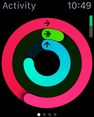
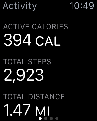
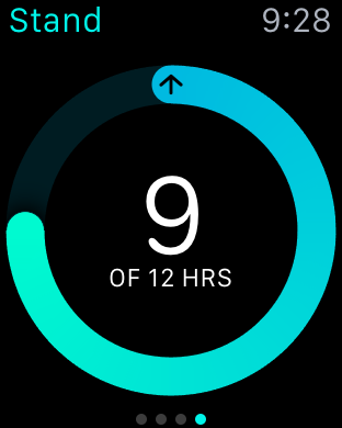
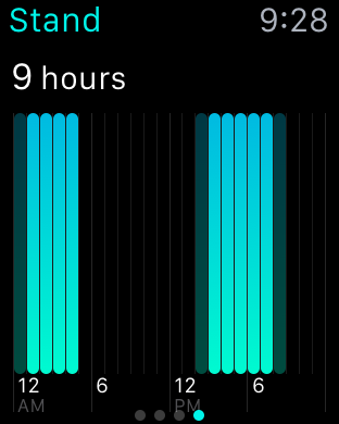
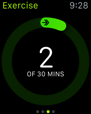
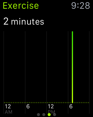
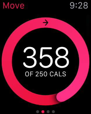
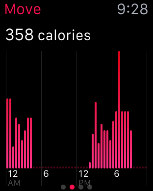
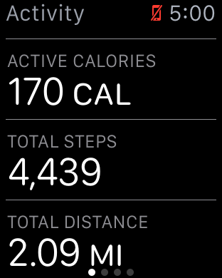
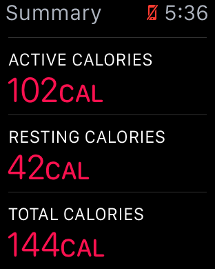
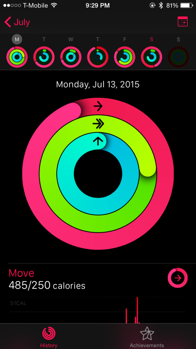
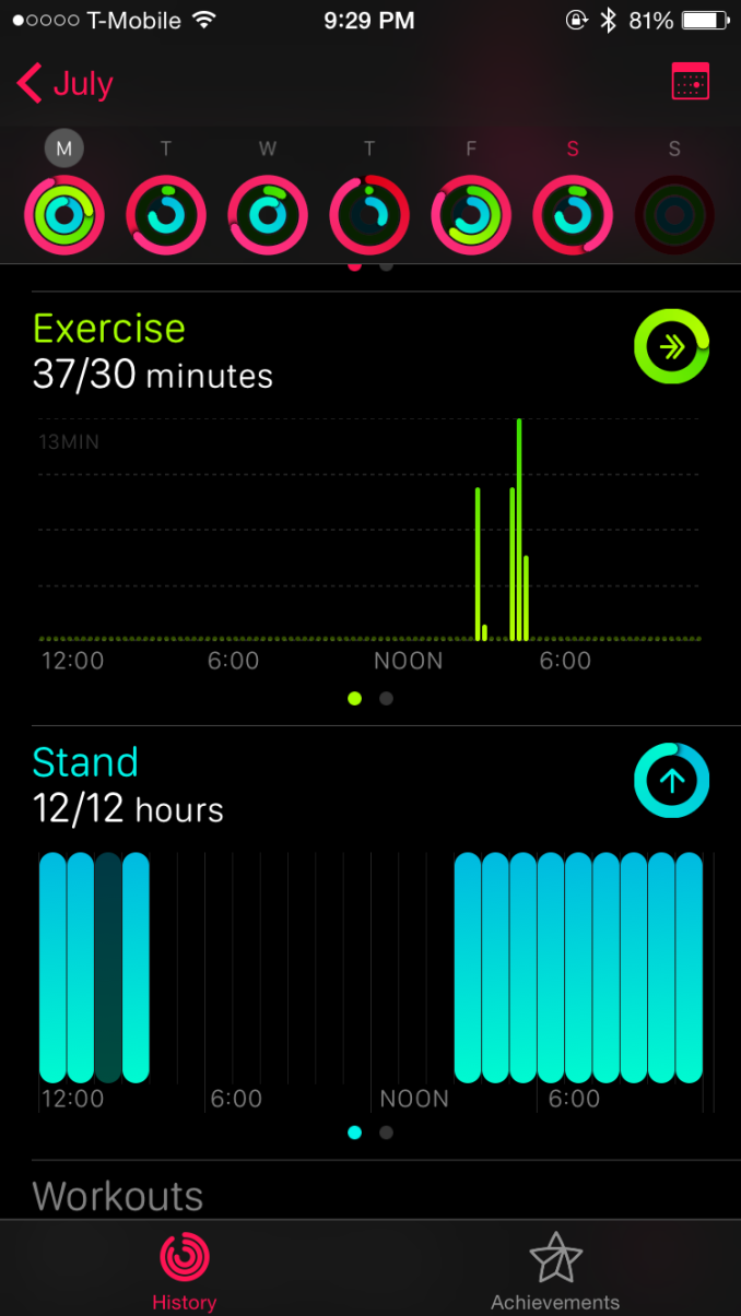
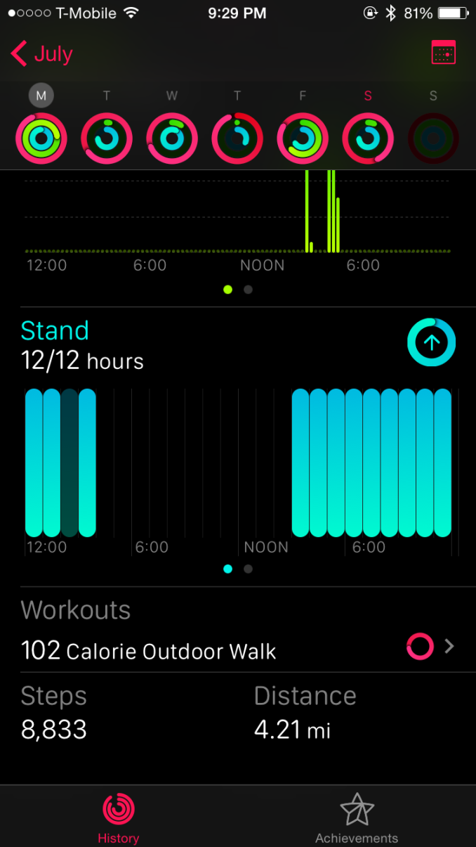
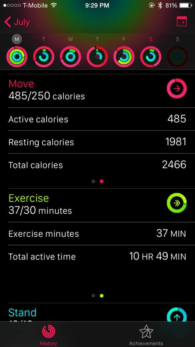
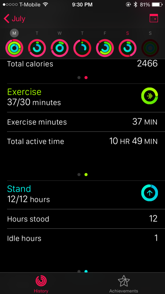
From there, the actual fitness tracking is completely invisible. The user never actually has to actively interact with the watch to get fitness tracking to work. There are only three metrics tracked at this time, but they’re probably the most important predictors of health. The first is movement, which appears to be at least partially based upon heart rate because I seem to have “movement” calories during times when I’m doing nothing but sitting in front of a computer and typing. The second is exercise, which is definitely influenced by heart rate although I haven’t been able to really experiment to see if heart rate is the sole determinant of this metric. The final metric is standing, which effectively attempts to get people to stand for at least a minute every hour for twelve hours a day.
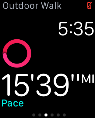
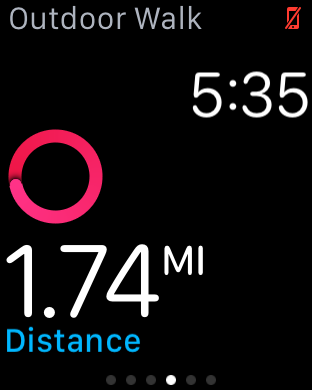
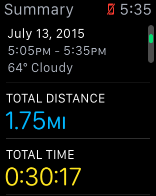
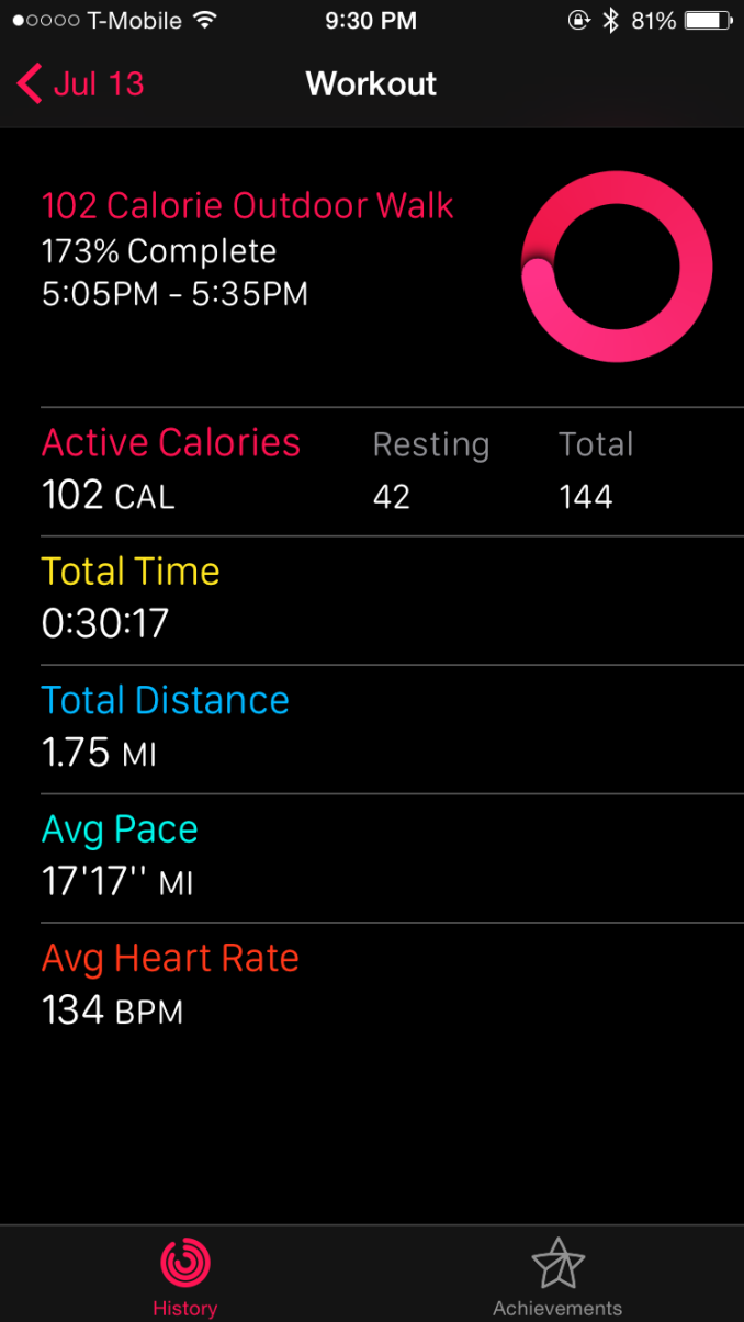
As far as I can tell, after a few weeks of continuously using the watch with the phone paired it didn’t make a real difference in distance estimates when I would forget the phone and rely on the watch for distance estimates. When using purely passive distance tracking, I found that the watch estimated a 1.8 mile walk at 2 miles, or roughly 10% error. However, when selecting the "outdoor walk" fitness option a 1.8 mile walk was estimated at 1.75 miles, which is pretty much no error at all.
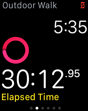
There is a workout component, but I suspect that this is something more targeted towards someone who is actually setting aside time every day to do nothing but exercise. I tried the interface and found it to be a useful addition, but I really haven’t had a reason to use it as the automatic tracking is pretty much good enough for my needs.
Of course, outside of tracking the watch will also give you reminders (or guilt trips?) throughout the day of your progress on these three metrics. If you haven’t stood within the last hour, the watch will also remind you of this so you can stand for at least a minute and take a break from whatever you were doing. None of these are really all that intrusive though as the reminders are widely spaced throughout the day so it didn’t feel like I was getting bombarded by notifications from the fitness application. The stand notifications can get pretty excessive if you’re sitting down for an excessive amount of time, but it’s possible to disable this which is a nice touch.
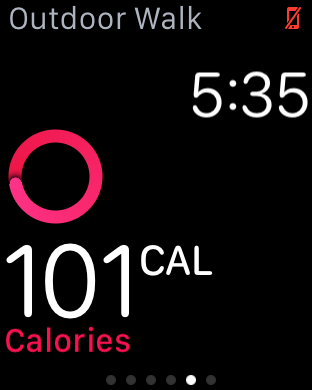
Surprisingly, I found myself looking at these features pretty often because it’s data that I haven’t actually had any real insight into. I’ve never really used a fitness tracker that keeps track of something as simple as standing time, which seems like an obvious metric to track as soon as you start using the fitness functions of the watch because sitting for extended periods of time can have significant effects on health regardless of how much exercise you do. Other fitness trackers have also tracked calories burned and distance covered before, but an actual exercise metric is surprisingly helpful because it’s often difficult to tell what exercise really constitutes as. For example, I wouldn’t consider walking at a decent pace to and from a store half an hour away to be exercise, but with heart rate tracking it turns out that at least half an hour of the one hour walk was actually exercise. I’m sure some people would consider this to be cheating, but in practice I’ve found that the end result was that I had a tendency to try and be more active more often because almost any kind of reasonably strenuous activity would be counted as exercise.
Overall, I found that the fitness component of this watch to be a real surprise. I often hear that Apple is good at making things we didn’t know we wanted, but this is probably the first time I’ve really believed that statement. Going into the review, I didn’t really realize that I wanted a solid fitness tracker on a smartwatch, but now I’m really convinced that there is value to such features.
The only difference was implementation, and it’s apparent to me that the difference here is strongly influenced by a level of thought that I otherwise haven’t seen in most smartwatches. I don’t particularly care for step counts, but I do care about how many calories I’ve used through activity and how many minutes of exercise I’ve done in a day. Even if you don’t care about fitness tracking, the watch’s fitness tracking capabilities are worth keeping in mind when comparing against other wearables. Of course, buying Apple Watch isn't going to magically make you healthier, but it will provide information that allows such actions to be taken.






270 Comments
View All Comments
Murloc - Monday, July 20, 2015 - link
First!Murloc - Monday, July 20, 2015 - link
the reviewer has no hair??ianmills - Monday, July 20, 2015 - link
HAHAHAHA exactly. The apple watch is reviewed by someone who is self-concious enough to shave their arm hair. This explains why the review is so positive. Some people find self-esteem in odd places...supermoon - Monday, July 20, 2015 - link
That's just what some people's wrists look like bruh, including mine. what are you grasping at??dsumanik - Monday, July 20, 2015 - link
This entire article (photos and content) has been 'photoshopped' by apple PR. Hair and skin smoothed, bokeh added....look at how the watch is posed in the shots, it is amateur photography heavily post processed....in a lame viral marketing attempt.ANANDTECH STOP TRYING TO SELL US SH*T.
APPLE SAMSUNG CORSAIR WHATEVER
IF I WANT A COMMERCIAL, ILL GO TO THE MFG WEBSITE.
PS.
EVERYTONE IN INTERNET LAND THE REVIEWERS FORGOT TO TELL YOU THAT THIS WATCH DOES
NOTHING.
ZIP.
ZILCH.
NADA.
WITHOUT AN IPHONE.
IT COSTS $400 + AN IPHONE EASILY PUSHING THE PRICE OVER 1K.
PS
GO SEE IT IN THE STORE, ITS CHUNKY AND PRETTY CHEAP LOOKING, NOT LIKE APPLE'S WEBSITE PHOTOS AT ALL.
GO SEE FOR YOURSELF.
12K FOR THE 'EDITION' ?????????????
LOOKS LIKE IT BELONGS RIGHT AT HOME IN THE WALMART ELECTRONICS SECTION!
LOL!
navysandsquid - Monday, July 20, 2015 - link
Hate on brother lol butt hurt much its ok enjoy your droid turbo lolRyan Smith - Monday, July 20, 2015 - link
"This entire article (photos and content) has been 'photoshopped' by apple PR. Hair and skin smoothed, bokeh added....look at how the watch is posed in the shots, it is amateur photography heavily post processed....in a lame viral marketing attempt."While we do use Photoshop for editing (once you get past basic cropping, you probably want Photoshop), to be clear here these photos haven't received any significant processing. The only work we do on our photos is lens/sensor correction and auto toning.
The fact of the matter is that Josh is an excellent photographer (the best one among us, in fact), which is how he's able to pull off these amazing shots. So the fact that you think it has been heavily edited is flattering in a sense; we didn't have to edit them, we were able to take those photos naturally in the first place.
And no, no one from Apple PR has touched the photos. Or the article.
BittenRottenApple - Monday, July 20, 2015 - link
Worship the holy apple.The apple way, selling over expensive crap to stupid consumers that like to
get robbed.
This has been a disastrous launch in every respect. The iwatch is such an
ugly piece of crap, it is truly unbelievable how a company, formerly known for
its remarkable design, dares to put out such a crap ton of shit. Some
characteristics are glaringly obvious and inherent to it: over expensive,
hardly innovative, limited functionality and usability (need of an iPhone to
make it work), looks exactly like a toy watch and so on.
There are of course way better smart watches out there, especially from the
likes of Samsung, Sony, Motorola, Asus, LG, simply put, there is no need for
another piece of over expensive junk.
Regardless of what the casing and strap are, it's still maybe $8 worth of electronics at best, a painfully tiny screen, awful battery life, absolute dependence on an iPhone for proper function, and in reality adding extra time to decide if the message your phone just pinged your wrist with is worth pulling the phone out for to reply with.
The smart watch is a dumb idea in its current form. The Apple icrapWatch (tm) with its "Wealthy - Rich - Look how obscenely rich I am" case material tiers (seriously, the upgrade from plastic to red leather band is $7k? Not even a gold band available to justify that $17k price?) is the ultimate expression of that.
Maybe in 5 years or so a transparent OLED screen over a traditional watch with these sensors to pop-up notifications long enough to be noticed but not need to be charged every two hours is when it'll make sense, but for now it's a useless gimmick that nobody really needs.
Let's face it, the Apple Watch is a total and utter failure. The one called Sport edition doesn’t even has a dust, shock and water resistant exterior and thus fails in nearly every "sports" related usage scenario, albeit still costing nearly as much as an iPad, or, you know, a real watch, which works for years to come.
And the luxury one? Oh god, 17k+ for this utter crapicious experience. If you’re a millionaire, donate that 17k+ to the EFF, the communist party, an union or consider that such an amount of money could save lives in many third world countries or help to preserve nature. Besides that, it doesn’t even look that luxurious compared face to face to Rolex standards, more like some sort of ugly, chubby toy enclosed in a thin, and tiny gold case. The functionality provided, if one even dares to call it that way, are utter crap too, nothing new, nothing exciting here, nothing Samsung, LG, Pebbles haven't been offering for years on a far superior basis. For example the Pebbles watch which costs
less than 79$ and has 8 days of battery life, shows many of the notifications and info someone might need, all the while being water and dust proof, with changeable wristbands. Seriously, fuck this overpriced, environmentally obscene, eco terroristic icrapWatch (TM).
Yet another fine addition to the long list of "Terrible Products Apple Makes to Gouge Money out of People".
The new icrapWatch (tm) is a testament to Apple's collapsing technical acumen. They eliminate all ports providing no cable based connectivity at all? This craven stupidity should send the last adherents running. But running to what? Windows isn't even a viable option anymore, since it now is the most widespread commercial NSA gathering tool available, closely followed by Android, iOS and OS X.
It's a sad day for people who need real smartwatches. Jony Ive is a pompous, clueless hack who should be fired and shot on the spot (or torn apart by a horde of rabid dogs) for introducing crippling regressions like this one.
Look at this POS: No USB port, which won’t require an adapter to do anything. So if you aren’t going to require an adapter anyway, why not make that nonexistent port a modern port one: Thunderbolt. Thunderbolt can carry USB, video, Ethernet, external storage... ALL AT ONCE. And it can be daisy-chained, which would be hugely important when the icrapWatch (tm) would have ONLY ONE PORT. So WTF is Apple doing in not making its nonexistant port into a thunderbolt port?
And again, are you kidding me? No thunderbolt connector? Now every sorry user of this pos doesn’t have to find a thunderbolt to USB C, a USB C to USB to HDMI, a USB to USB 3.0 period, a USB C to USB connector for apple’s time machine and also does not manage to don't short circuit all that with the AC/DC to USB C connectors, seriously ? Not worth 200$ new pile of hairy connectors for the brand new icrapWatch (tm), and that is called a revolution nowadays? No ********** way, the Pebbles is way superior, period.
By the way, they're perpetrating no connectors at all. Thunderbolt is a much-needed step to a modern I/O standard. No connector is an outdated, abused standard that was designed primarily for Rolex watches. It's not suitable for external storage, video, or anything else requiring bulk data transfer with minimal CPU overhead. A nonexistant connector at all is a regression, a major step BACKWARD.
Starting at $349.00----Less than $8.00 worth of hardware = ~$341.00 premium to use icrapWatch OS instead of windows. (Honestly the most expensive component of this icrapWatch (tm) is probably the screen.)
Anyone with real work to do will not even be able to buy this thing. My friend’s last Air was neat in that it was small and lasted all day, but it was so under-powered, it was frustrating. I can only imagine how limited this machine will be.
Who cares about price, weight and size, when this product is crippled by a hopelessly defective design? You can't hook up a power adapter and external storage at the same time. You can't hook up an external display and external storage. Hell, you can't even plug in a thumb drive!
This product is the most asinine piece of shit Apple has produced, and that includes the (thankfully) short-lived Shuffle that could only be controlled by a gimped Morse code.
$270 less gets you the new Pebbles which will eat the crapWatch's lunch.
If you need to do a lot of processor intensive work, than you would not even go near this thing. It would be useless to you. If you need to crunch spreadsheets or are heavy in corporate analysis, this icrapWatch (tm) would also be useless to you.
This is the kind of icrapWatch (tm) that Apple sells a lot of. This icrapWatch (tm) is largely useless for anything other than email and facebook. It cannot store many files, it cannot process much information, and it has no external port. There is nothing wrong with using this icrapWatch (tm) for casual tasks, but it is CERTAINLY not a productivity machine.
It is what it is. A status symbol/statement. Or some other statement. A statement that you just bought a $349 or icrapWatch(tm) with a $341 or more case so you can show off in front of your hipster isheep friends.
I hate to stick to Apple only facts here, but Apple said that the current Samsung Smatwatch is 24% thicker than this new icrapWatch (tm). That does NOT mean that the new icrapWatch (tm) is 24% thinner than the current Samsung Smatwatch , it means that it is ~20% thinner than the current Samsung Smatwatch. They clearly phrased it that way to make it sound more impressive and hence dupe the consumer, aka stupid isheep.
So, it's a toy watch plus with a display and no over expensive dongle so you can’t do everything a Pebbles can do, at more than four times the price while looking posh.
And here I thought technology was about function over form. I get it, functional art; art I can do things my phone does, but in a space that anyone can see me doing it, stylishly. Crippled and non standard in-house branded "business" software does great, can't do anything really artistic on it except maybe GarageBand or stock filter photo edits to my innumerable selfies, but it's got that partially eaten fruit on the back that screams "money I'm too stupid to keep or invest wisely."
Take my money!
I wouldn't hold my breath.
This is apple's marketing strategy: mind-numbing markup on dirt-cheap, mediocre icrapWare (tm). They throw together a cheap little toy like icrapWatch (tm), pretty it up with silver or gold paint, and ride the wave of ignorance, outrageous markup, and marketing that they've been using as a business model for many, many years now. The only thing Apple has ever made that's less worthless than all the other crap their conspirators like Hon Hai Precision Industry Co., Ltd excrete all day and night by taking advantage of child labour are iOS and OS X which, besides being notoriously crippled and constrained walled gardens, aren’t even worth the hassle unless you also dumped thousands of dollars into other apple products.
Many apple owners I’ve encountered never stop trying to belittle and demean others because they don’t have a Macbook or an iPhone (or an icrapWatch (tm) for that matter) and then try to act like their overpriced apple products are overall better when they are certainly not, by any standard.
Luxury cars, while still worthless crash grabs, usually offer some quality and features that are actually somewhat superior to cheaper competing vehicles and models.
icrapWatch (tm) such as this start already expensive as hell with little performance to warrant such outrageous costs. Apple isn’t the luxury car of anything. It’s the luxury car DESIGN with a 4-cylinder under the hood and a tape-deck in the sound system, all with the price tag of "luxury". They sell laptops made cheap in china, using child labour and the same hardware you can find in SO many other laptops, slap their OS on it, put it in a thin case, and then markup the price by 300% to 600%. These are the facts. This icrapWatch (tm) in question is nowhere NEAR worth that kind of money. I mean, smartwatches in general are overpriced, but apple has made their entire business model out of extreme markups backed by clever marketing with little actual technological superiority of any kind. Every single apple product on the market can be outperformed in every way by comparable products. Apple icrapWatches (tm) can be outperformed by smartwatches that are FAR FAR cheaper while relying on older tech. The only thing that apple has that nobody else does is OSX and iOS, their operating systems. These are mediocre operating systems, but they are literally designed to be limited on anything it determines to be "non-apple hardware". Other operating systems can be installed on just about any computer you can slap together, whereas OSX is specifically and deliberately designed to be non-functional on ANYTHING that isn’t made by apple. It’s nothing but a cash-grab.
Apple is indeed playing run-of-the-mill capitalism, they try to capitalize on the ignorance of the average consumer with marketing campaigns designed to make you assume you're getting your money's worth.
There are millions of consumers who are on the fence, who are actually interested in buying something that's worth the money they spend. Those people deserve factual information and do not deserve to be exploited for their ignorance on the topic. So excuse me if I have a problem with it. College students especially, who don’t have a lot to spend in the first place, are being taken advantage of in every area of their life. Buying a smartwatch should be one less area of exploitation. This is why I have a problem with apple and with many other companies and services that attempt to capitalize on ignorance.
Years down the road when the batteries in this model are dead and you have to keep it plugged in just to use then you'll have no way to plug in a flash drive or an external hard drive. I don't care how sexy it looks: sometimes and more often than not less means a serious lack of functionality.
We can only hope that consumers send this piece of diabolic garbage to oblivion, as they did the idiotic iPod Shuffle that could only be controlled with Morse code over a proprietary headphone wire.
The Apple Iphone 1 and Ipad 1 might have been innovative at their time,
but since then, the bitten apple has been continuously rotting from the inside
outwards, always swarmed by millions of Iworms which regale themselves with its
rotten flesh, not forgetting all other Americans who support apple by means of
their tax dollars to finance its bought US Treasury/Government bond interest rates.
Last but not least, every Apple product includes a direct hotlink to the NSA,
free of charge, something that might make it a good value, after all.
Ceterum censeo Applem esse delendam.
twanto - Monday, July 20, 2015 - link
"There is nothing wrong with using this icrapWatch (tm) for casual tasks, but it is CERTAINLY not a productivity machine." I was really hoping it could handle some spreadsheets and a bit of 3D rendering, but I guess not.This post was either satire or the greatest literary achievement by someone with a bonus chromosome 21.
Schickenipple - Tuesday, July 21, 2015 - link
Word. If you are trying to create spreadsheets on your watch, or any screen that small, you are an idiot.