The iPhone 6 Review
by Joshua Ho, Brandon Chester, Chris Heinonen & Ryan Smith on September 30, 2014 8:01 AM EST- Posted in
- Smartphones
- Apple
- Mobile
- iPhone 6
Display
As the primary mode of interaction with the phone, the display is one of the most important areas of evaluation. Of course, the methods of evaluation can be hotly debated. There is a great deal of subjectivity in this area in terms of what someone prefers. However, for the sake of color calibration our tests follow world-wide standards instead of personal preference one way or another. This means that we use the sRGB gamut and 2.2 gamma, which most content is adapted to. While AdobeRGB and other gamuts exist, these are for limited use cases and only applicable to operating systems that are aware of multiple gamuts and can dynamically switch between them depending upon the metadata of the content. In order to accurately test for how well a display conforms to these standards, we use SpectraCal’s CalMAN 5 along with a spectrophotometer for accurate color readings.
For those that are unfamiliar with the display of the iPhone 6 and Apple’s key marketing points on this new model, the improvements are mostly centered on higher resolution, contrast, and better viewing angles. In terms of higher resolution the iPhone 6 moves from the 1136x640 pixels of the iPhone 5/5s generation to 1334x750 pixels. However, this doesn’t improve the pixel density, which remains at 326 pixels per inch.
In practice, I definitely continue to notice the difference in resolution when using the iPhone 6 as opposed to the higher pixel density iPhone 6 Plus and the various Android smartphones with 450+ PPI displays. I definitely don’t find the resolution to be a problem though, as these issues only become significant to me below 300 PPI. I do think that around 450 to 500 PPI is the right place to be when balancing pixel density and power, but Apple’s choice should pay off in the form of better power consumption especially because LED backlights rapidly lose efficiency near the highest current region.
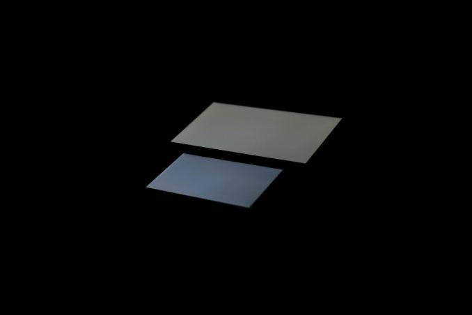
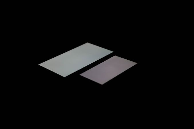
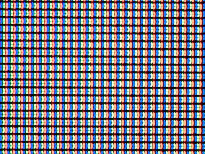
The other issue at hand is that of viewing angles. While Apple is one of the first to really talk about dual domain pixels, this technique is rather commonly used to improve viewing angles. The result is that a pair of pixels will appear to be a chevron, and overall the pixels appear to be squiggly in nature. While this doesn’t really change the readability of the display at extreme angles, colors like white no longer have noticeable red/yellow/blue shifts depending upon the angle that the display is shifted at.
This is definitely noticeable in everyday use, as the iPhone 5s could only avoid color shifting at certain angles instead of every angle. As I predicted in the launch article though, the one caveat seems to be that black has a noticeable shift towards purple in certain angles. There's also a noticeable hatching on close examination, but this doesn't affect image quality. This is definitely better than what I see on AMOLED though, as while AMOLED has much better brightness stability the color shifting is far more obvious and significant.
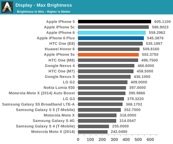
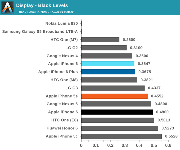
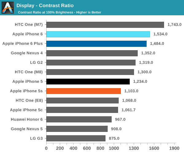
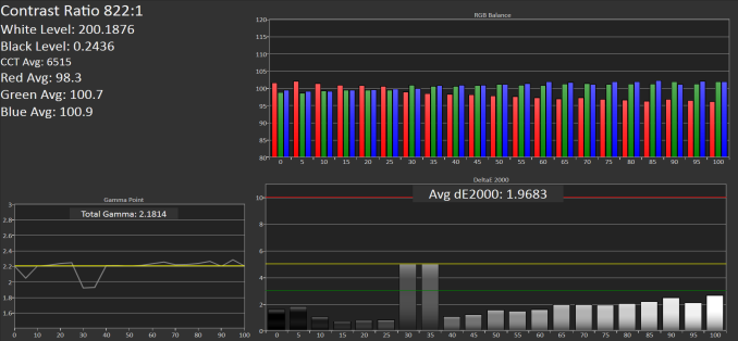
Now that we’ve covered the other two, we can talk about contrast. For this test, we measure brightness of 100% white and black at maximum display brightness, and look at the ratio. While we’re looking into getting patterns that can’t be defeated by dynamic contrast/backlight this should give an idea of best case contrast. In this case, peak brightness is on the high side at 560 nits, with relatively low black brightness at about a third of a nit. The result is one of the best contrast ratios I’ve ever seen. While the HTC One (M7) has a 1743:1 contrast ratio in our tests, some testing I’ve done indicates that the true contrast ratio is realistically around that of the One (M8). I’m not quite sure how this was done, but Apple stated that a new deposition process was used for the liquid crystals. This, along with changes to the liquid crystals themselves, could be responsible for the improved contrast.
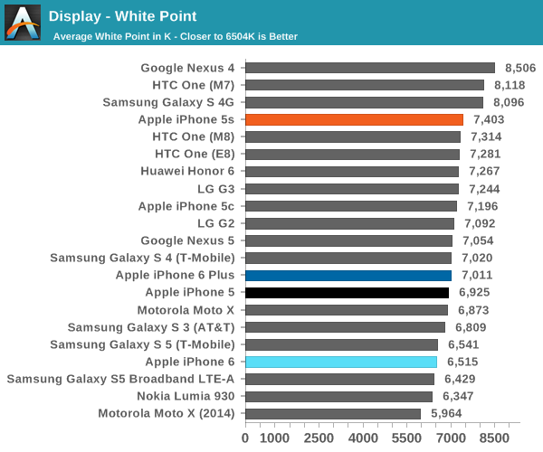
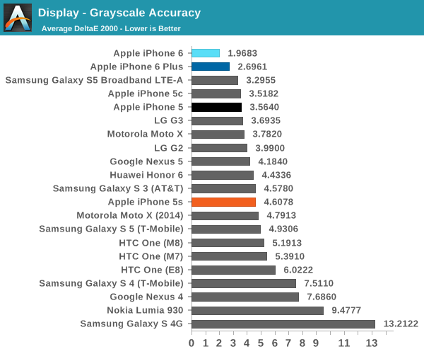
The next part to talk about is grayscale, which is an area where Apple seemed to prefer bluer color balances. I don’t really have much to pick at here, because the level of calibration here is incredible. While there is a noticeable trend of overshooting red at the low end and undershooting red at the high end, this is nitpicking at best. At any rate, this is essentially perfect.
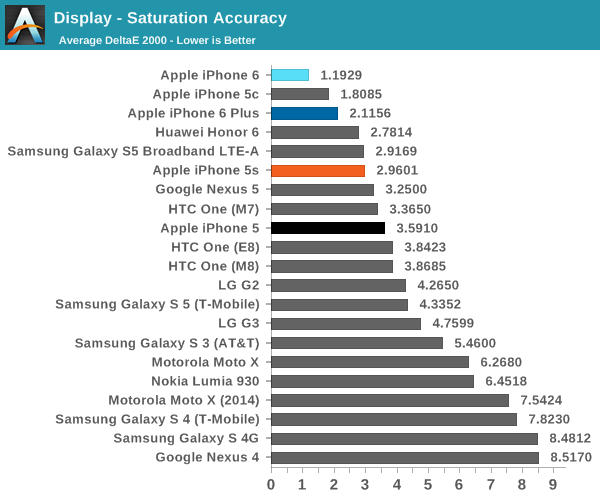
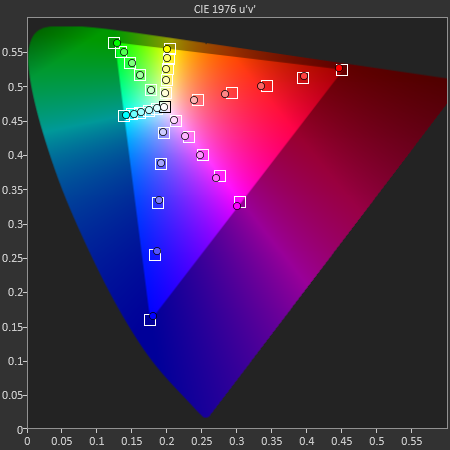
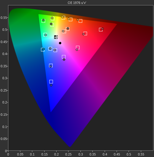
Our next test is the saturation sweep, which tests each primary and secondary color for accuracy in hue and luminance. While it’s true that humans can be relatively insensitive to differences in saturation, it is all too common to see OEMs artificially compress saturations to have vivid colors and be able to claim that they have an accurate display because it matches the sRGB gamut. In this test, the iPhone 6 sets a new record. I really don’t have any objections here because a dE2000 value of 1.19 is a deviation that is almost impossible to notice.
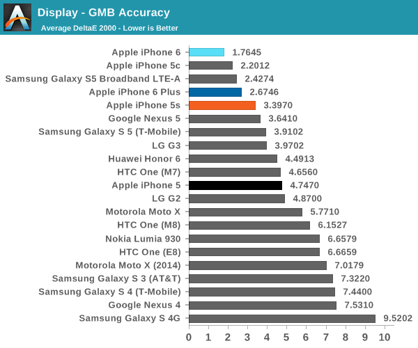
The final test is the Gretag MacBeth ColorChecker, which tests various hues and is usually one of the hardest tests to perform well in. In this regard, the iPhone 6 once again sets a new record for accuracy. This display is effectively calibrated to sRGB, and one would be hard pressed to find a significant deviation when compared to a reference monitor.
Overall, it’s hard to find any criticism for this display. I would normally be incredibly suspicious to see these numbers on a smartphone, but the fact that there’s a hot pixel in the center of the display suggests to me that this was not a cherry-picked unit. The fact that I find this level of calibration to be suspicious speaks volumes about how good this display is. While contrast isn't AMOLED levels of black, there are no purple smearing effects, noticeable uneven luminance near black, or any other idiosyncrasies.





531 Comments
View All Comments
bobobobo - Tuesday, September 30, 2014 - link
solid phone, solid improvement.AppleCrappleHater2 - Tuesday, September 30, 2014 - link
Worship the holy apple.The apple way, selling over expensive crap to stupid consumers that like to
get robbed.
This has been a disastrous launch in every respect. The iwatch is such an
ugly piece of crap, it is truly unbelievable how a company, formerly known for
its remarkable design, dares to put out such a crap ton of shit. Some
characteristics are glaringly obvious and inherent to it: over expensive,
hardly innovative, limited functionality and usability (need of an iPhone to
make it work), looks exactly like a toy watch and so on.
There are of course way better smart watches out there, especially from the
likes of Samsung, Sony, Motorola, Asus, LG, simply put, there is no need for
another piece of over expensive junk.
The iPhone 6 is technologically stuck in pre-2011 times, a base model with
a capacity of 16GB without the possibility to use SD cards isn't even funny
anymore. The screen resolution is horrendous, it isn't water proof, shock and
dust resistant, it offers nothing innovative, just some incremental
updates over its predecessor, both lacking severely behind their competitors at
their respective launch dates.
Now the Iphone 6 Plus offers a „Retina HD“ screen, full 1920x1080p, oh wow,
where have you been for the past 4 years apple, talk about trailing behind.
That’s pathetic. The interesting thing about that is the fact that apple
always manages to sell backwards oriented, outdated crap to its user base, all
while pretending to be an innovative technology leader. The similarities
regarding any form of sectarian cult are striking.
You gotta love how Apple always comes up with new marketing bullshit terms,
aka "Retina HD", with the intention to manipulate its users while preventing easy
comparisons with its competitors by withholding the actual specs. Apparently it’s
not enough to have a 1080p screen, you have to call it "Retina HD" to make those
suckers buy it, otherwise someone could look at the 4K Amoled and Oled screens
form LG and Samsung devices and get outright disappointed. Same goes for
everything else. Every outdated „feature“ needs to get its own marketing label
to persuade buyers with crappy „experience“ and „usability“ ads, while covering
the truth with marketing gibberish, knowing full well that only a fraction of
aforementioned buyers cares to look at the facts and dares to compare them.
Car engines come to mind. For comparisons shake let’s look at a 1.0 liter, turbo
charged petrol engine and a V8 compressor. What’s better should be obvious, but
by calling the former an „ecobooster“, thus giving it a special marketing label,
this joke becomes a „feature“, something positive that can be added tot the list
of features of a car.
By doing so a negative aspect is transformed into a positive one, the
reality is distorted, non tech savvy buyers are manipulated and comparisons are
made more difficult (another layer of marketing bullshit to overcome), well done
marketing department. You see , if something is seriously lacking (of course for
profit, what else), don’t bother explaining, just give it a nice marketing term, distort
reality, make it a feature and call it a day. Fuck that!!
FACT: Apple has been forced to copy Android in style and size for
years because people abandoned their tired, moribund and fossilized
devices for superior and innovative Android devices.
Steve Jobs said no one should want a 7" tablet until everyone went and bought
Android devices forcing Apple to copycat with the iPad Mini. Apple
didn't think anyone wanted a phone screen larger than a business card
until they all bought Androids thus forcing the arrival this week of the
iPhone Galaxy and iPhone Galaxy Note clone phones.
Swipe down notifications that don't interfere? Copied from Android and WebOS. Siri?
Bought and ruined from a private developer; Google Now crushes it.
3rd-party keyboards? Welcome to 2010, iChumps! Widgets? Welcome to 2009
except you can't place them on your home screen. Live wallpapers and
hidden icons? Maybe Apple will get around to copying those in iOS X in
2016. Who knows.
Apple lacks creativity and honest people acknowledge it. Steve Jobs gets credited as an
innovator when all he was, was a huckster who'd spot someone else's tech, polish it up nicely,
then slap a gnawed fruit logo on the back, charge a premium price and
wait for the rubes like Jim Smith to hand over their cash like the good
iSheep they are.
But after that initial iteration, Apple is incapable of actually innovating something new.
They literally cannot make a product until someone else shows them how and they copy it.
They are also unable refine things because they believe to improve is to
admit something was imperfect the first time. (This is why QuickTime 4
had a legendarily terrible UI that was never changed through QT7 a
decade later.) All they can do is make things incrementally thinner or
faster but it's just minor refinements since they can't invest their way
out of a wet paper bag.
For all their squealing about Retina displays, they never even had a HD display until now;
8th time is the charm, though you need the iPhone Galaxy Note to get the 1080p that many Android
users have had for at least a year and is now considered
bare-minimum spec. At the rate Apple drags along, QHD screens should
arrive in 2018. Maybe. A graphic went around after the reveal comparing
the iPhone Galaxy to the Nexus 4 from 2012. Exactly.
The Apple Iphone 1 and Ipad 1 might have been innovative at their time,
but since then, the bitten apple has been continuously rotting from the inside
outwards, always swarmed by millions of Iworms which regale themselves with its
rotten flesh, not forgetting all other Americans who support apple by means of
their tax dollars to finance its bought US Treasury/Government bond interest rates.
Last but not least, every Apple product includes a direct hotlink to the NSA,
free of charge, something that might make it a good value, after all.
Ceterum censeo Applem esse delendam.
esterhasz - Tuesday, September 30, 2014 - link
Since we're quoting Cato today, here's a good one: "grasp the subject, the words will follow".uhuznaa - Tuesday, September 30, 2014 - link
You seem to be a tiny bit obsessed.iphone6splus - Tuesday, September 30, 2014 - link
Yet, he didn't comment on Touch ID.kevin_newell - Thursday, October 9, 2014 - link
Apple is lagging far behind it's competitors both in user satisfaction (source: http://www.consumertop.com/best-phone-guide/) and innovation. I mean, who was first with large screens and phone cameras that work well in low light? It sure wasn't Apple.Caliko - Tuesday, October 6, 2015 - link
A large iPhone is NOT innovation.Sorry iPhoney fan.
lowtolerance - Tuesday, September 30, 2014 - link
I can recommend some good therapists. You need one.melgross - Tuesday, September 30, 2014 - link
You sir, are a complete idiot!Gondalf - Tuesday, September 30, 2014 - link
To be fair, a >$600 phone deserves a good LCD.....at least good as competitors, more ram and a little SD expansion slot. Plain and simple. This is not a matter of "idiocy"