The iPhone 6 Review
by Joshua Ho, Brandon Chester, Chris Heinonen & Ryan Smith on September 30, 2014 8:01 AM EST- Posted in
- Smartphones
- Apple
- Mobile
- iPhone 6
Design
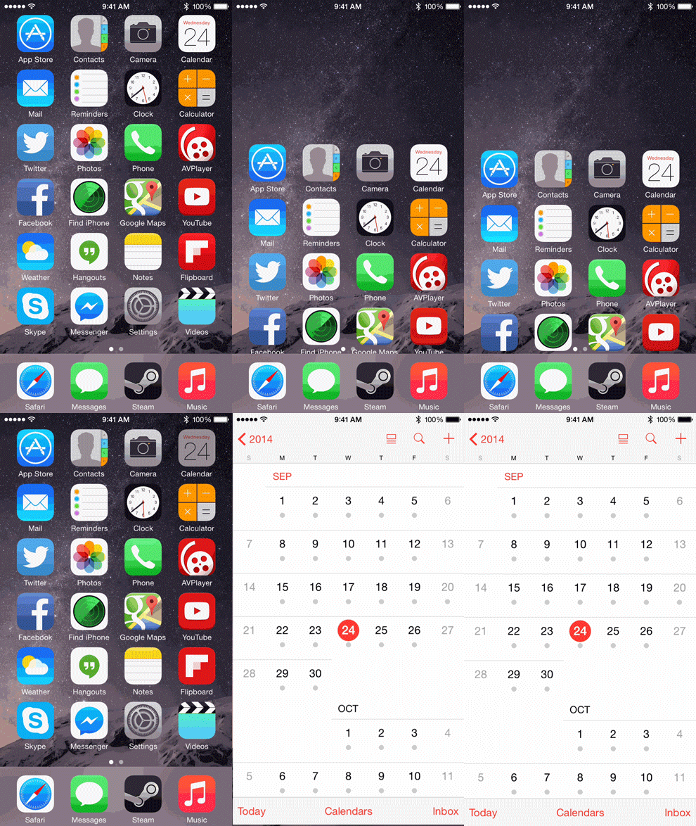
The iPhone 6 comes with Apple’s newly released iOS 8. For a full rundown of everything Apple is bringing to the table with iOS 8 you can read our review of the operating system itself. iOS 8 also includes changes that are specific to the iPhones 6 and 6 Plus. Much like when Apple moved from the 3.5” 3:2 display in previous iPhones to the 4” 16:9 display on the iPhone 5, these changes are to add support for the new display on the iPhone 6. The home screen now displays an additional row of icons, meaning that it fits even more than an iPad. In addition, all of Apple’s default applications have been updated to take advantage of the larger, higher resolution screen.
Weather. iPhone 6 on the left, iPhone 5s on the right.
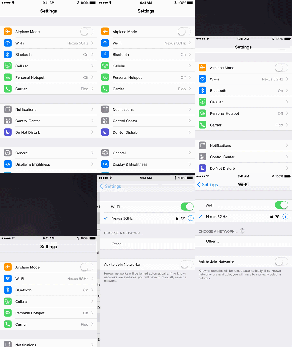
In the case of applications like Calculator, the interface simply has larger assets with the same layout as the 4” iPhones. Other applications like Settings and Notes display the elements of the interface at the same size as previous iPhones which allows more to be fit on the screen. Unlike the iPhone 5 which shared the same width as previous iPhones, the increase in space applies along both display axes on the iPhone 6 Plus. This is well demonstrated by the new Weather application which now fits more of the hourly forecast horizontally and more of the weekly forecast vertically.
The keyboard has also been updated to take advantage of the larger display when in landscape mode. The right side of the keyboard has been given dedicated keys for moving the cursor left and right in a text box, as well as a period button. The left side has an undo key and a comma. When the emoji keyboard is enabled it also receives a dedicated button next to the toggle between letters and numbers/special characters.
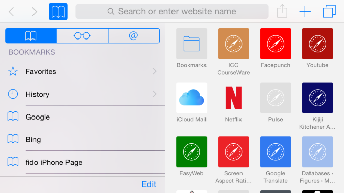
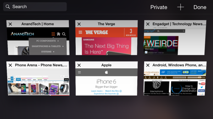
Another application with landscape specific improvements is Safari. While the iPhone 6 does not get the new split landscape views in applications that the 6 Plus has, it does get the horizontal tab view in Safari and the sliding bookmark menu on the new tab page. What's interesting is that this Safari interface is nearly identical to that of the iPad version, which is similar to Safari on OS X Yosemite. The one difference is that tabs in the tab view that are from the same website do not stack on top of each other. Apple really seems to want a unified interface and experience for Safari across all of their platforms, and the general design of the interface has translated well to the various different display sizes on iOS and OS X devices.
The iPhone 6 includes a feature called Reachability for users who find the increased display size difficult to use with one hand. Apple is late to the party with their larger displays, and we’ve seen attempts in the past by other manufacturers to make large devices easier to use. Shrinking the interface and displaying it in a bottom corner was a feature Samsung introduced with the Galaxy Note 3. It wasn’t a very elegant solution, but it worked. Apple’s Reachability feature uses a similar idea but implements it in a more elegant fashion. Double-tapping the capacitive ring around the home button shifts the display downward so the top of applications can be easily pressed. Once an action is performed the interface shifts back into position.
The last new feature specific to the new iPhones is Display Zoom. Display Zoom increases the size of what is displayed so that the interface displays the same amount of information that is shown on the iPhone 5, with an internal rendering resolution of 1136x640. This means that all icons, buttons, etc. are displayed in a much larger size than the default view setting. Because everything is being scaled up to the 1334x750 panel, the interface suffers from the slight blurring that you also see in third party apps that have not been updated to support the new iPhones. This feature is likely aimed at users with aging eyes who would like a bigger display to display bigger controls rather than to display more content, and who aren't concerned about having the sharpest text.
A notable feature that is missing is Apple's new Apple Pay service that works with the NFC hardware in the iPhone 6 and 6 Plus. Although Apple Pay is a feature of the new iPhones and of iOS 8, the service will not be rolling out until October. Other iOS 8 features like SMS Relay and iCloud Photo Library were also absent from the initial iOS 8 release and are scheduled to launch in October. It's likely that the fact that the iOS 8 release date is determined by the yearly release of new iPhones forced some features to be pushed back to a later update.
UX
While the design of iOS 8 itself is generally well-implemented, the user experience ends up a bit more mixed, and the result comes from the confluence of hardware and software. In the case of the iPhone 6, these issues effectively boil down to RAM and odd layouts that come from the upscaling needed for the 1334x750 display. In the case of upscaling artifacts, this is a temporary issue at best but it's glaringly obvious when an application is upscaled in certain cases.
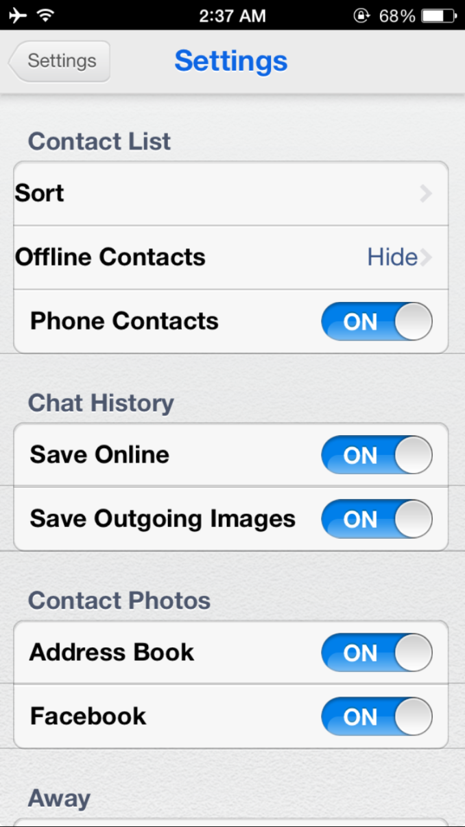
For example, Trillian is an IM application that hasn't been updated in over a year. While it was already lacking in functionality with iOS 7 as it lacked support for the background refresh API, on the iPhone 6 in iOS 8 there are significant issues with consistent spacing and there's also no support for third party keyboards. Once again, it's important to understand that this isn't the result of poor work on Apple's part, but it does show the limits of what can be done with the upscaling system and emphasizes the need for developers to keep their applications updated.
The other issue has the potential to be far more serious. While iOS' software architecture is more RAM efficient due to manual garbage collection and the use of precompiled binaries, it's quite easy for me to push the phone past the breaking point in Safari. For example, six tabs of common websites for mobile devices cannot consistently be held in memory. If I continuously go through all six tabs, at least one will need to reload. In my first attempt at running this test, Safari crashed as I tried to go through all tabs constantly to keep them in memory. I didn't notice this behavior in the new Moto X, which can do the same test without issue. Outside of memory intensive use cases though, the iPhone 6 does respectably and I usually don't notice the lack of RAM. I have to emphasize that this should be a generally unlikely problem, and that the same behavior can be replicated on the iPhone 5s given the same workload. If you did not have issues with out of memory crashes before, there won't be any issues now.
Outside of these two flaws, there's really a lot to like. iOS continues to deliver a relatively well-polished experience that few seem to be able to match. Most of my issues from the iPhone 5s experience have been resolved. For example, it's now possible for me to upload photos to Dropbox selectively instead of turning camera upload on and deleting photos that I don't want to upload. The odd segregation of current notifications and missed notifications has been removed. Swiftkey has been added, although it's not quite the same as the Android version due to the different prediction insertion behavior and keyboard layout.
In addition, although it isn't necessarily the result of software, the larger display really helps with improving touch accuracy when compared to the iPhone 5s. While I haven't been able to try out Apple Pay since it will be launching in October, it also seems to be quite intriguing as the NFC solution is quite novel, though I'd like to see further use of NFC outside of payment and similar applications. TouchID continues to be a key differentiator, and the use of TouchID for Apple Pay authentication would definitely show the strength of Apple's hardware and software integration.





531 Comments
View All Comments
bobobobo - Tuesday, September 30, 2014 - link
solid phone, solid improvement.AppleCrappleHater2 - Tuesday, September 30, 2014 - link
Worship the holy apple.The apple way, selling over expensive crap to stupid consumers that like to
get robbed.
This has been a disastrous launch in every respect. The iwatch is such an
ugly piece of crap, it is truly unbelievable how a company, formerly known for
its remarkable design, dares to put out such a crap ton of shit. Some
characteristics are glaringly obvious and inherent to it: over expensive,
hardly innovative, limited functionality and usability (need of an iPhone to
make it work), looks exactly like a toy watch and so on.
There are of course way better smart watches out there, especially from the
likes of Samsung, Sony, Motorola, Asus, LG, simply put, there is no need for
another piece of over expensive junk.
The iPhone 6 is technologically stuck in pre-2011 times, a base model with
a capacity of 16GB without the possibility to use SD cards isn't even funny
anymore. The screen resolution is horrendous, it isn't water proof, shock and
dust resistant, it offers nothing innovative, just some incremental
updates over its predecessor, both lacking severely behind their competitors at
their respective launch dates.
Now the Iphone 6 Plus offers a „Retina HD“ screen, full 1920x1080p, oh wow,
where have you been for the past 4 years apple, talk about trailing behind.
That’s pathetic. The interesting thing about that is the fact that apple
always manages to sell backwards oriented, outdated crap to its user base, all
while pretending to be an innovative technology leader. The similarities
regarding any form of sectarian cult are striking.
You gotta love how Apple always comes up with new marketing bullshit terms,
aka "Retina HD", with the intention to manipulate its users while preventing easy
comparisons with its competitors by withholding the actual specs. Apparently it’s
not enough to have a 1080p screen, you have to call it "Retina HD" to make those
suckers buy it, otherwise someone could look at the 4K Amoled and Oled screens
form LG and Samsung devices and get outright disappointed. Same goes for
everything else. Every outdated „feature“ needs to get its own marketing label
to persuade buyers with crappy „experience“ and „usability“ ads, while covering
the truth with marketing gibberish, knowing full well that only a fraction of
aforementioned buyers cares to look at the facts and dares to compare them.
Car engines come to mind. For comparisons shake let’s look at a 1.0 liter, turbo
charged petrol engine and a V8 compressor. What’s better should be obvious, but
by calling the former an „ecobooster“, thus giving it a special marketing label,
this joke becomes a „feature“, something positive that can be added tot the list
of features of a car.
By doing so a negative aspect is transformed into a positive one, the
reality is distorted, non tech savvy buyers are manipulated and comparisons are
made more difficult (another layer of marketing bullshit to overcome), well done
marketing department. You see , if something is seriously lacking (of course for
profit, what else), don’t bother explaining, just give it a nice marketing term, distort
reality, make it a feature and call it a day. Fuck that!!
FACT: Apple has been forced to copy Android in style and size for
years because people abandoned their tired, moribund and fossilized
devices for superior and innovative Android devices.
Steve Jobs said no one should want a 7" tablet until everyone went and bought
Android devices forcing Apple to copycat with the iPad Mini. Apple
didn't think anyone wanted a phone screen larger than a business card
until they all bought Androids thus forcing the arrival this week of the
iPhone Galaxy and iPhone Galaxy Note clone phones.
Swipe down notifications that don't interfere? Copied from Android and WebOS. Siri?
Bought and ruined from a private developer; Google Now crushes it.
3rd-party keyboards? Welcome to 2010, iChumps! Widgets? Welcome to 2009
except you can't place them on your home screen. Live wallpapers and
hidden icons? Maybe Apple will get around to copying those in iOS X in
2016. Who knows.
Apple lacks creativity and honest people acknowledge it. Steve Jobs gets credited as an
innovator when all he was, was a huckster who'd spot someone else's tech, polish it up nicely,
then slap a gnawed fruit logo on the back, charge a premium price and
wait for the rubes like Jim Smith to hand over their cash like the good
iSheep they are.
But after that initial iteration, Apple is incapable of actually innovating something new.
They literally cannot make a product until someone else shows them how and they copy it.
They are also unable refine things because they believe to improve is to
admit something was imperfect the first time. (This is why QuickTime 4
had a legendarily terrible UI that was never changed through QT7 a
decade later.) All they can do is make things incrementally thinner or
faster but it's just minor refinements since they can't invest their way
out of a wet paper bag.
For all their squealing about Retina displays, they never even had a HD display until now;
8th time is the charm, though you need the iPhone Galaxy Note to get the 1080p that many Android
users have had for at least a year and is now considered
bare-minimum spec. At the rate Apple drags along, QHD screens should
arrive in 2018. Maybe. A graphic went around after the reveal comparing
the iPhone Galaxy to the Nexus 4 from 2012. Exactly.
The Apple Iphone 1 and Ipad 1 might have been innovative at their time,
but since then, the bitten apple has been continuously rotting from the inside
outwards, always swarmed by millions of Iworms which regale themselves with its
rotten flesh, not forgetting all other Americans who support apple by means of
their tax dollars to finance its bought US Treasury/Government bond interest rates.
Last but not least, every Apple product includes a direct hotlink to the NSA,
free of charge, something that might make it a good value, after all.
Ceterum censeo Applem esse delendam.
esterhasz - Tuesday, September 30, 2014 - link
Since we're quoting Cato today, here's a good one: "grasp the subject, the words will follow".uhuznaa - Tuesday, September 30, 2014 - link
You seem to be a tiny bit obsessed.iphone6splus - Tuesday, September 30, 2014 - link
Yet, he didn't comment on Touch ID.kevin_newell - Thursday, October 9, 2014 - link
Apple is lagging far behind it's competitors both in user satisfaction (source: http://www.consumertop.com/best-phone-guide/) and innovation. I mean, who was first with large screens and phone cameras that work well in low light? It sure wasn't Apple.Caliko - Tuesday, October 6, 2015 - link
A large iPhone is NOT innovation.Sorry iPhoney fan.
lowtolerance - Tuesday, September 30, 2014 - link
I can recommend some good therapists. You need one.melgross - Tuesday, September 30, 2014 - link
You sir, are a complete idiot!Gondalf - Tuesday, September 30, 2014 - link
To be fair, a >$600 phone deserves a good LCD.....at least good as competitors, more ram and a little SD expansion slot. Plain and simple. This is not a matter of "idiocy"