HTC Droid Incredible 4G LTE Review: One Alternative
by Jason Inofuentes on July 13, 2012 9:24 PM EST- Posted in
- Smartphones
- HTC
- Droid
- Mobile
There will always be those of us, that don’t like anything outside the stock Android theme. That said, there’s a real sense of completeness and value to Sense 4 as applied to ICS on this device. The theming is pervasive, so you no longer have some menus or scenarios that revert to the stock theme. And flourishes that previously hijacked the interface are now fully contained within their respective widget. In the past the worst offender was the weather widget, which on coming out of stand by was liable to animate the current weather across the whole of your screen. Pretty? Yes. Useful? Not when I’m trying to check my e-mail.
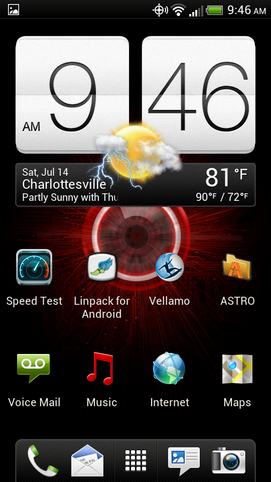
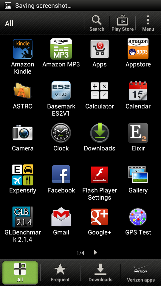
So with Sense now a useful addition, if one that I could still do without, what’s the rest of the software load-out like? In a word: Verizon. The Sense app drawer comes with three tabs for app organization, All, Frequent and Downloaded. Er, that is, it comes with three tabs on other phones. On the Incredible 4G we also have the Verizon tab. So, even if you could delete the offending apps, you’d still be left with a branded reminder that the phone was brought to you by the good graces of Verizon Wireless. As if the monthly fee and on-device branding wasn’t enough. I’m not trying to draw VZW’s ire, but it’d be a different matter entirely if these pack-ins were full-blown games and value adding apps. Instead, the superfluous VZ Navigator sits beside the My Verizon app and demos for Let’s Golf and Real Racing 2. Not that the games are labeled demos, no you discover that after you play a round and then wonder why you’re not moving on to the next race. And in a phone with 8GB of NAND on-board, microSD notwithstanding, every precious GB should be for the user to fill.
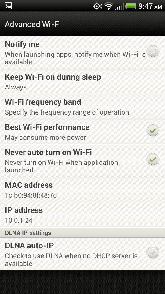
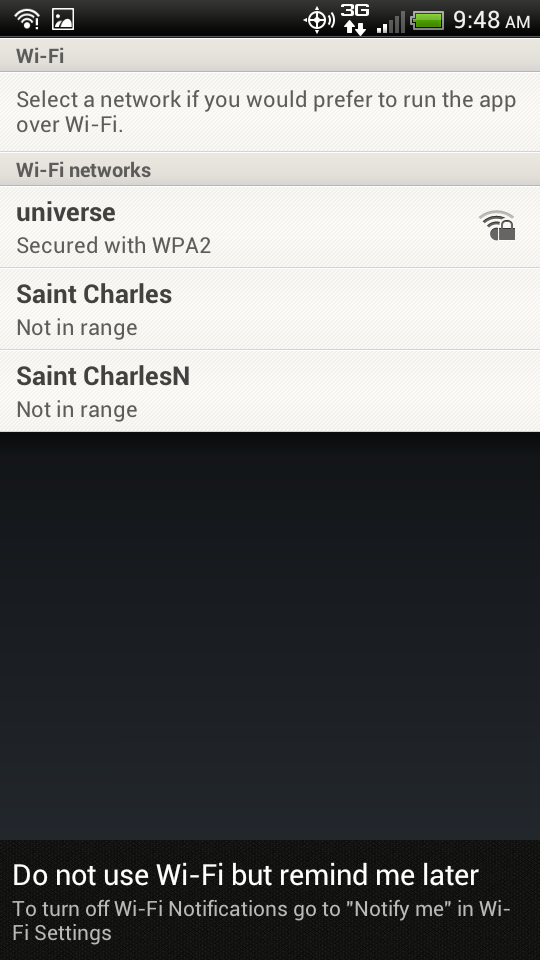
There’s two other things I wanted to cover with regards the software: the WiFi notifier and the browser. Power up your new phone and you’ll quickly be greeted by a message prompting you to connect to your WiFi network. Android users are used to this, it’s pretty standard stuff. Now imagine that prompt appearing every time you open an app while not connected to WiFi. Imagine there being a persistent notification in the notification shade letting you know whether you’re connected to a WiFi network, always. That, apparently, is something Verizon thinks we need, based on what we’ve seen of the VZW Galaxy S 3. The purpose, of course, is to ensure that you don’t unnecessarily use their network, 4G or otherwise. With nearly all of their users now tied to tiered data plans, this is no doubt an effort to squelch complaints by users that went over while streaming movies or doing video chat, where WiFi options were available. There's an option buried in the WiFi menus to turn off this notification, thankfully, but an opt-in prompt during set-up would be preferred.
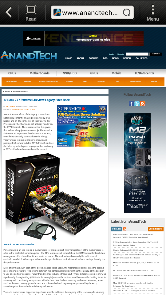
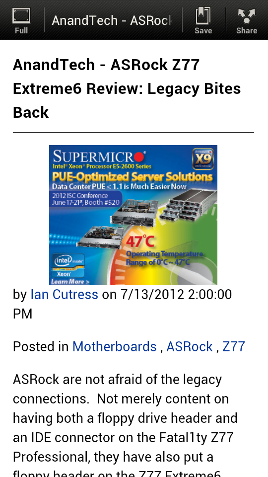
The browser is a much more personal nuisance. While using a web browser a user wants to have as much real estate devoted to the site as possible, though this shouldn’t be at the expense of absent or ambiguous controls. The stock Android browser includes a back/stop, button and the ubiquitous Menu button, along with a tabs button, which looks like a stack of folders. The Sense 4 browser, features a back button, a tiny Refresh/Stop button, an oversized menu button, and a huge Read button. At first glace I have no idea what a Read button is meant to do, but I know that it means to get to a list of tabs I have to hit Menu and then Tabs. HTC does have a solution for this, three-finger gestures are implemented for switching between open browser tabs, and this is fine for those that don’t ever have too many tabs open at once, but get over four or five and you could be swiping back and forth a lot to find the tab you’re looking for. The Read button is handy, I'll admit, but I would appreciate the option to place it under a menu, and restore the tabs button. Browser issues are a somewhat self-limiting problem, as Chrome will be the default browser when Jelly Bean reaches the One series, and its kin, but for now, it’s a point of disfavor for me.
Camera
The One series has one of the nicest cameras found in a phone, and in a stem to stearn fashion. Everything from the optics to the ISP performs as well as we could expect, and the result is a camera that's both versatile in features and excellent in image quality. With the Droid Incredible 4G LTE, some compromises were made, likely in pursuit of a lower price. First, the optics aren't the f/2.0 set-up of the One series, in its place is an f/2.2 28 mm set-up, likely inherited from the HTC Rezound. The result is low light performance that relies more on the ISP to yield useful images. And that ISP? It's not HTC's ImageSense ISP, and they weren't willing to say more about what ISP is used. Whatever silicon they're leveraging, it's a fair performer, if not quite a match for the One series. Pictures can be shot rapidly with just a minor lag, but where the One X camera could get mashed for nearly instantaneous images, the Droid Incredible 4G's camera is not quite so fast.
Quality, though, doesn't seem to have suffered so much for all this. The usual filters and parlour tricks are all here, including Panorama and HDR mode. Those are joined by a few unique ones, including a Whiteboard mode that seems targeted at my habit of shooting a picture of the whiteboard with my grocery list on it while on my way out the door. I'm not as well equipped as Brian to provide a gallery of comparison shots from every major handset released, but the gallery above should give you some idea of what you can expect. Low light performance does suffer, but frame a good shot in decent light and the image should impress.
Video performance seems to suffer a little more than single shots. The camera can record in 1080p30, and the files come in at 1920x1088 and 10 Mbit/s, and suffer from blockiness and compression artifact. Audio recording provides decent separation between left and right channels, but be careful of trying to refocus during a shot, an audible click is recorded as the lens shifts. A novelty slow motion setting is provided that records at 768x432 and seems to be recording at around 100 fps, with playback around 25 fps. Audio isn't recorded during this setting and quality is degraded versus the HD recording, but for a quick shot of a car passing by, it'll do.




24 Comments
View All Comments
aNYthing24 - Tuesday, July 24, 2012 - link
The One S has a Super AMOLED display, not a Super LCD.Omega215D - Tuesday, July 24, 2012 - link
Kind of strange how battery life differs from other reviews. So far only a couple have said subpar life while more have gotten good to very good usage time. Could it be a problem with the phone itself? Well, it's nice to know my Rezound isn't too bad but I do like the designs of both the Incredible and Rezound.pikahatonjon - Tuesday, July 24, 2012 - link
what is with the differences with the EVO 4G LTE & the Htc One X (att) in the contrast test.also, is the Tmobile Galaxy S 3 actually brighter than the At&t galaxy s 3. arent the 4 phones listed above pretty much identical to each other( one series & galaxy s series) what is with the huge diference in the brightness/contrast test
Rockmandash12 - Tuesday, July 24, 2012 - link
The One X has a Super LCD 2 display, not a TFT display.JimmiG - Tuesday, July 24, 2012 - link
How many more years until Android phones can match the iPhone 4S in terms of 3G web browsing battery life?The Nexus One got 3.77 hours back in 2010 vs 4.5 hours for the iPhone 3G. Fast forward to 2012, and the iPhone 4S has more than doubled the battery life to 9.85 hours, while most Android devices have just barely caught up with the iPhone 3G.
Clearly Apple uses the same batteries as everyone else, so it must come down to incredibly lazy programming and poor power use optimization on the Android side. Some OEMs have apparently taken it in their own hands to optimize battery usage (Samsung, HTC), but this should really be something provided by the core Android OS. Battery life should be the main focus on for the next version of Android!
zorxd - Tuesday, July 24, 2012 - link
The iPhone has a small display. It consume a lot less. AMOLED displays are also not very efficient for displaying white backgrounds found on many web sites.Android's battery life isn't bad. Just look at the cellular talk time.
lunarx3dfx - Tuesday, July 24, 2012 - link
What zorx said. You can't compare the iPhone and most Android phones Apples to Apples because of design differences. I'd be willing to bet money that if you had identical devices, the only difference being that one has an A5 and one has an S4, the S4 would wipe the floor with the A5 in every category except for maybe GPU performance.Not only is the S4 almost certainly more energy efficient due to be being a newer architecture, but it will also smoke it in terms of performance per watt.
A5= Dual Cortex A9's @ 800 MHz
S4= Dual Krait Snapdragons @ 1.5 GHz
On top of clock speed Krait is the ONLY ARM based CPU on the market with out of order execution which is why it is faster than Quad Core CPU's (Exynos 4 and Tegra 3).
Jimmi, I would recommend that you learn a bit about how all of this works before you comment again. The iPhone is a good device (although you couldn't pay me to use one), but in terms of theoretical performance it was out-dated before it was ever even announced.
Phasenoise - Tuesday, July 24, 2012 - link
He indicated, as the article states, that the iphone has superior 3g web browsing battery life.So, for him, perhaps picking display or CPU technologies which consume more power is a poor trade off. He doesn't appear to be interested in theoretical performance, just actual real world browsing usage which as we know is generally not Incredibly taxing (pun intended).
lunarx3dfx - Tuesday, July 24, 2012 - link
The reason I brought up performance, was to illustrate my point that Apple doesn't necessarily make a more efficient product as much as they use low power components. I'll admit that I did get a little lost in my own argument. Oops.JimmiG - Tuesday, July 24, 2012 - link
We will see when the next iPhone comes out with a much bigger display and higher clock speeds but still better battery life. The same thing can be seen with Windows vs OSX on laptops with similar specs - Apple simply spends more time optimizing the software side of their mobile devices.It's not limited to just AMOLED displays, and secondly, the CPU should not spend a lot of time at the highest clockspeed and voltage when you're browsing, especially with 3G which should be bandwidth limited. Unless of course the system is poorly optimized.
I'm an Android user myself, and battery life is the Achilles heel of the system. At the end of the day, my Optimus 2X is down to ~15% of battery while coworkers' iPhones last for two days without charging. It was the same with the Nexus One before that.
Just like the unresponsive and choppy user interface, it's important to realize when there's a problem that needs to be fixed.