Google's Android Event Analysis
by Mithun Chandrasekhar on February 2, 2011 4:26 PM ESTA lot is also happening behind the scenes in Android 3.0. I kept mentioning on the previous page that some of the features from Android 3.0 will eventually make it over to smartphone-versions of Android. This will be enabled because Google is heavily pushing code reusability (or 'fragments' as they called it) with Android 3.0. Not only will this enable features to be easily adapted for future versions of the OS, but features can also be reused between applications. On a related note, Google emphasized that existing Android apps will work on Android 3.0 devices without requiring any code modifications. They used the 'Fruit Ninja' app to demo this. While this is great news for developers who don't want to redevelop the same app for 3.0 devices, what I didn't get a clear answer for was about applications targeted specifically at Android 3.0. From the looks of it, I wouldn't be wrong if I said that in such a case, the developer will in fact have to make two, slightly different versions of the app.
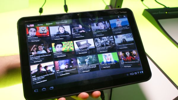
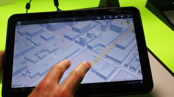
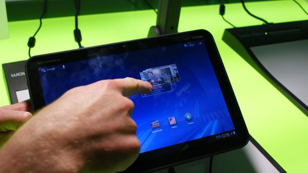
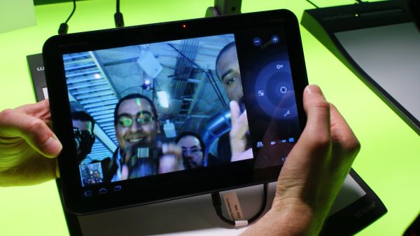
(Top left) YouTube app, (Top right) Google Maps, (Bottom left) stack transitions, (Bottom right) Video chat
Google has also put in place a new graphics engine. Dubbed 'Renderscript', both 2D and 3D graphics are fully hardware accelerated in Android 3.0. This was quite visible in the demos and hands-on where the Xoom easily transitioned between screens and applications without much trouble. The bookstore, YouTube and Google Maps applications seemed to make the best use of the new engine. Speaking of Maps, Android 3.0 does come with a new version of Google Maps. Apart from bringing in features such as check-in, another big feature is better map caching. Although the intial impression given to me was that it is a valid enough alternative to offline mapping (where map data is stored in local memory), upon testing I realized that it very much needs an active data connection of some sort to work. It's just that because of better vector data compression, the application can now better cache areas around the one you are browsing. In my experience, it was a couple of blocks in each direction at best.
Android 3.0 builds upon the 'Stagefright' media framework introduced in Android 2.2. With the more robust rendering engine running underneath, the framework is able to make good use of the underlying hardware and includes features such as HLS (HDTV Live Streaming), built right into the OS. A demo of the CNN app streaming a live video feed was shown, although in all honesty, the quality was worse than standard YouTube videos. Video chat functionality is also now included as a part of Android 3.0.
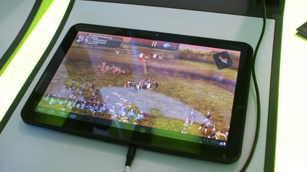
(Left) Live video stream in the CNN app (Right) Great Battles : Medieval
Google did also show a couple of game demos, including one of a direct XBOX 360/Playstation 3 port. Although Monster Madness (War Drum Studios) was impressive in that it was (supposedly) a direct port of a current-gen console game, it wasn't particularly impressive in itself. Another game, Great Battles : Medieval looked more impressive and was definitely playable, but I could still pick up not-so-smooth transitions while panning and zooming. Nevertheless, it seems like both the game and Android 3.0 were in their 'near-final' forms.
Final Impressions
Honestly, I came a bit disappointed from the event today. But that was more because of the fact that I had very high expectations off of it, than the event being a let down in itself. Another reason may have been that Google had already gone about trumpeting Android 3.0 and the Xoom earlier on at CES, not leaving a lot to the imagination for today's event.
That being said, Android 3.0 does mark a very important milestone for Google. Although always having been feature rich, usability was never one of Android's forte and you had to be a bit of a geek to try and figure your way around some it. But with version 3.0, Android has finally moved into the current-gen of mobile operating systems when it comes to usability and cloud integration. It seems like Google has done its homework and has set the stage up quite well for itself for a real entry into the tablet arena.





22 Comments
View All Comments
bplewis24 - Wednesday, February 2, 2011 - link
Is there any doubt that Duarte was the driving force behind Honeycomb now? The lead designer for WebOS gets nabbed up less than a year ago, and a version of one of the best features of WebOS (Deck-of-Cards multi-tasking) ends up making an appearance. Coincidence?Samus - Thursday, February 3, 2011 - link
Only time will tell if Hurd is as benificial to Oracal...InternetGeek - Wednesday, February 2, 2011 - link
I like the market. Looks clean, works fast and you can get stuff done.My only qualm is that it seems that for a while now Google has been filtering the apps available to you not based only on your phone model but also on your operator. My proof is that I bought my Nexus One directly from Google and searching for a Bing app in the market from the phone the results will include only Bing for China. If I use the web version of the market there's also an English version of Bing. The website says I cannot install the English version because it is not available from my Operator. I believe this is wrong because this is only a search function that does not require operator support beyond a data connection. It is not related to a revision of the phone specifically for my Operator (Vodafone Australia) because I bought my phone directly from Google.
chocks - Wednesday, February 2, 2011 - link
Filtering on the country and carrier is something that's set up by the application publisher when they submit the application to the market, so it's Microsoft's fault rather than anything Google has done. Possibly they only specified US carriers.alovell83 - Thursday, February 3, 2011 - link
If you are rooted you can use MarketEnabler to fake a carrier code that'll be a carrier that has access to Bing.sprockkets - Wednesday, February 2, 2011 - link
"You don't get interrupted with a jarring pop-up in the middle of the screen."Isn't this something iOS does and up until iOS 4 the option to turn it off wasn't even offered?
I thought Android did this right to begin with.
chocks - Thursday, February 3, 2011 - link
Yes notifications in earlier Android versions appear briefly in the status bar at the top, which can be pulled down to display the full notification. I wouldn't call this a "pop-up in the middle of the screen".alovell83 - Thursday, February 3, 2011 - link
Also, this doesn't require a dismissal, which is half of iOS's problem. Also, I haven't seen a notification when you are in an app, such as a game, or more importantly a movie, which is another big problem on iOS.ltcommanderdata - Wednesday, February 2, 2011 - link
The article mentions several times how certain features of Android 3.0 should be ported over to smartphones. So does this mean that Android 3.0 will not be coming to smartphones? So does Google intend to maintain separate OS versions for smartphones and tablets or will they be unified at some point?And it's interesting that despite the supposed animosity between Apple and Google, Google is using OS X to demo their new App Store, OS, and tablet which of course competes against Apple's ecosystem.
mythun.chandra - Wednesday, February 2, 2011 - link
Quote from the article:"I confirmed this with Google; Honeycomb, atleast in the current form, will not be coming to non-tablet devices. But that being said, I was told that features from Honeycomb will definitely trickle down to smartphone OS's and Google actually built Honeycomb with this in mind."
:)