The iPhone SE (2020) Review: A Reinvigorated Classic
by Andrei Frumusanu on April 24, 2020 6:30 AM EST- Posted in
- Mobile
- Apple
- Smartphones
- iPhone SE
- Apple A13
- iPhone SE 2020
Camera - Quick Evaluation (Outdated, Archived Samples)
Update April 29th:
Apple has replaced my initial iPhone SE sample with a new one, and taken back the old with for internal analysis. The optics issues described here are not present on the second sample, pointing out that the first unit (on this page) possibly had a manufacturing defect.
The initial analysis and camera samples are archived here for transparency.
As noted in the intro, the camera of the new iPhone SE isn’t all that new. It’s essentially the same generation sensor as found on the iPhone 8. The reason for this likely is due to the fact that Apple was limited by the physical form-factor of the phone, particularly the z-height of the camera module, unable to include any of the newer and bigger generation modules.
What’s also lacking from the iPhone SE are some of the machine-learning features such as night mode and Deep Fusion. I think that’s partly due to the fact that those modes rely on stacking multiple images captures together, and my hypothesis is that Apple was making use of the newer generation’s sensor dedicated DRAM chips to capture very quick consecutive exposures. As these older sensors lack dedicated DRAM, it wouldn’t be possible to capture quick consecutive exposures like that, and the phone wouldn’t be able to guarantee the same level of quality.
Whilst the hardware limits some of the capabilities of the camera, the new A13’s ISP does make up in other areas when it comes to image processing. Here we’re expecting to see some of the same advancements that were also been able to see in the last few generations of iPhones.
For the camera comparison today, due to the time rush and for simplicity’s sake (it’s a single-camera phone after all!), we’re limiting ourselves to the comparison of the iPhone SE vs the iPhone 8 vs the iPhone 11, with the Galaxy S20+ (Exynos) thrown in.
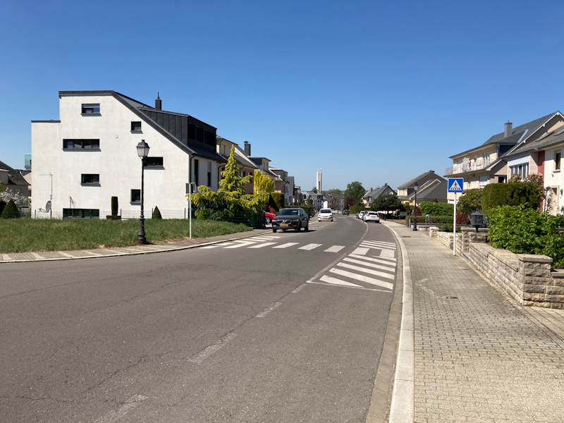
In the first scene, what’s immediately evident is that the exposure and composition of the scene is very different to that of the iPhone 8, more closely resembling that of the iPhone 11. Where this is most visible is on the façade of the white house, whose texture is able to retained a lot more on the newer SE. The SE retains the warm colour temperature that was predominant in past iPhones – I think the iPhone 11 here is a lot more realistic and accurate.
Looking at details of the street and vegetation, there’s quite the odd behaviour going on. The iPhone SE just looks outright blurrier than the iPhone 8 and isn’t able to retain the same level of sharpness in a lot of the scene.
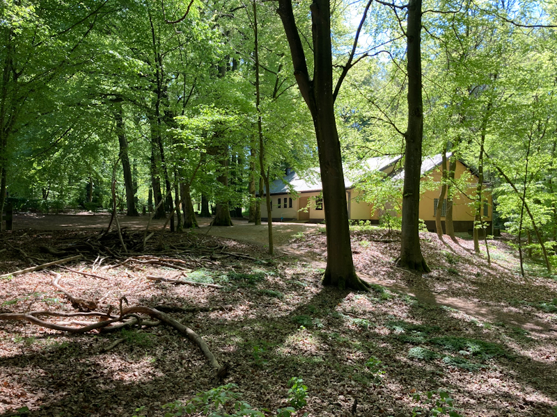
This forest scene is always extremely harsh on cameras due to the sheer amount of detail and high-contrast elements in it. Immediately visible again is that the iPhone SE has a bright exposure and more detail in the shadows than the iPhone 8, showcasing a stronger dynamic range or HDR implementation that’s more similar to the iPhone 11. The colour temperature here is also again a tad warmer on the SE compared to the newer phone.
When it comes to detail, the iPhone SE here isn’t faring well at all as it’s evidently much worse than the iPhone 8. There’s a high amount of blur in the foliage. If you look at the high contrast tree branches near the sky you also see quite a bit of chromatic aberrations. This is a quite worrying tell-tale sign of weak optics of a camera, something is either wrong with the lenses or the phone isn’t correctly focusing.
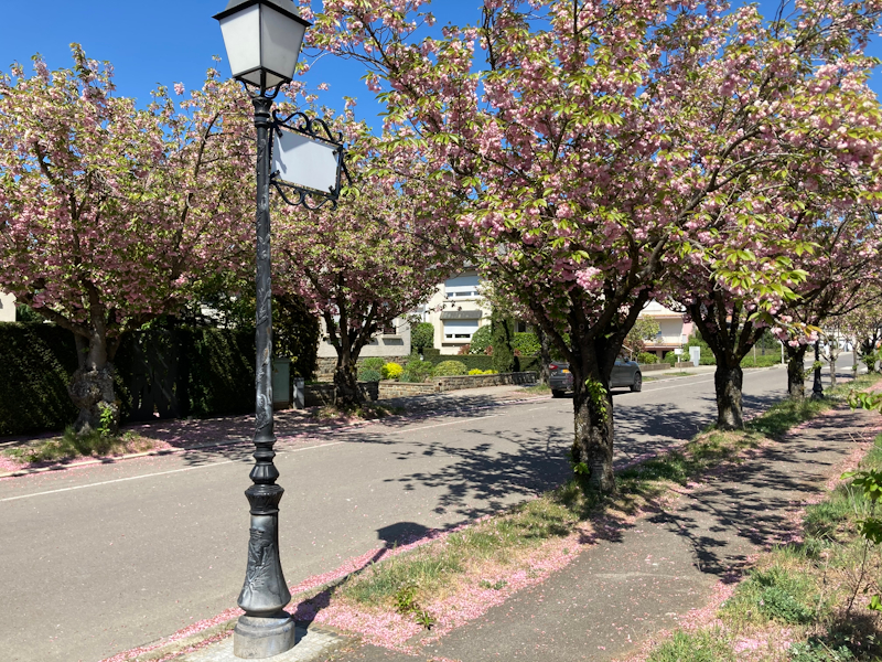
Here again the iPhone SE shows its much better HDR implementation as it has more levelled highlights as well as slightly more pronounced shadow detail.
The detail loss here is again present, most notably seen in the street and foreground grass. To me it seems the differences are a lot smaller in the centre of the image, which again might point out that this is an optics issue and not a software processing issue.
Here’s a showcase of again the much better HDR implementation of the iPhone SE, matching the composition of that of the iPhone 11 (with again, warmer colours).
Detail-wise it’s again as if the SE is focusing much closer than it should be, with off-centre detail being blurrier.
Also, what’s to be noted is that the iPhone SE camera has the same focal length as that of the iPhone 8 at an equivalent 28mm, versus the iPhone 11’s 26mm. This might not seem like much, but it makes up for quite the difference in the field-of-view of the cameras.
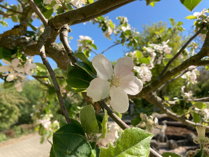
Here I think it’s more evident that the iPhone SE focused closer to the camera than the iPhone 8 when pointing and shooting. Maybe the focus calibration is off?
In the last scene again the first thing that pops out is the fact that the iPhone SE’s HDR is much superior to that of the iPhone 8, the overall composition is again almost identical to that of the iPhone 11.
Detail-wise, the iPhone SE again suffers badly in this shot. The whole bottom-left quarter of the image just looks blurry and notably worse than the iPhone 8, and a far cry from what the iPhone 11 is achieving.
Overall Initial Daylight Impressions
Overall, I was somewhat disappointed with the camera results of the iPhone SE. Whilst Apple here has indeed ported over the better HDR implementations of the newer generation iPhones, there’s still some leftover characteristics from the older phones. The iPhone SE’s color temperature is warmer and more typical of past iPhones, as Apple only more recently had changed this aspect of their cameras.
What’s worrying is the fact that the iPhone SE in the vast majority of scenarios actually fares quite worse in detail than the iPhone 8. To me, this either looks like a focus or optics issue, as the pictures have tell-tale signs of something being wrong in that regard.
We’ve reached out to Apple with our results and are awaiting a response on the matter. The shots were captured on iOS 13.4- I’ve also quickly tested it on today’s 13.4.1 update and the blurriness persists.
Update: Apple is sending a replacement unit, in case my unit has abnormal defects.
Update April 28th: Apple has replaced my initial iPhone SE sample with a new one, and taken back the old with for internal analysis. I've quickly gathered some new camera samples, and the optics issues described here are not present on the second sample, pointing out that the first unit possibly had a manufacturing defect. We'll be updating the camera samples in this article shortly.
Low-Light Impressions
I’ve didn’t have time for a more extensive outdoors low-light testing, but in my limited indoor testing I noted that the new iPhone SE’s low-light capabilities are massively superior to that of the iPhone 8. While the resulting pictures are quite noisy, they still retail a lot of detail of the scene whereas the iPhone 8 remains a blur. It’s a respectable result for the phone given its hardware and software limitations.





196 Comments
View All Comments
ingwe - Friday, April 24, 2020 - link
Very impressed overall. Glad Apple finally released something at this price range again. Time to upgrade from my SE.haukionkannel - Friday, April 24, 2020 - link
I agree, very impressive indeed! This makes most other middle range phones look really bad in comparison!linuxgeex - Friday, April 24, 2020 - link
Hopefully Sandcastle will get to a point where we can install Android 11 on this and end up with a phone we can actually customise and install the software of our choice on vs the limited Apple ecosystem. And I'd love to see whether the Geekbench numbers hold up when running on Android, so we can see whether/how much Apple has been cheating on that benchmark ;-)mrochester - Saturday, April 25, 2020 - link
Why would you want to ruin an iPhone by putting android on it? The whole reason the iPhone is so popular is because it’s NOT android!Oxford Guy - Saturday, April 25, 2020 - link
The last time I tried Android it was so bad I returned the phone.But, iOS is seriously annoying in some ways — like how it spams you with random pop-ups telling you that you can turn on location tracking.
Well, if you choose "Ok" to dismiss the pop-up it turns on location tracking. The only other option you're given is "Open Settings". How many conventions does the pop-up violate?
1) Totally modal? Check.
2) No way to close the window without choosing from bad options? Check.
3) Comes up without any prompting/relevance? Check.
4) Behaves in a way that's user-hostile? Check
5) Behaves in multiple ways that are user-hostile? Check.
6) Violates expected UI conventions ("Ok" to dismiss)? Check.
Of course, one should expect that location tracking is still enabled even if it's "off".
One of the things I always find amusing is how my car always knows I have an iPhone because it's broadcasting Bluetooth even when Bluetooth is "turned off".
Oxford Guy - Saturday, April 25, 2020 - link
7) Gives you two laborious options instead of a simple/efficient option? Check.8) Makes it seem like one option is laborious but the other is simple (deception)? Check.
yeeeeman - Saturday, April 25, 2020 - link
Last time you probably tried android was version 2.0. Now we're at version 10. Try it again.Oxford Guy - Sunday, April 26, 2020 - link
"Last time you probably tried android was version 2.0. Now we're at version 10. Try it again."I tried it before I purchased an iPhone 8.
(Given JCheng's comment, Apple may have changed the behavior of the pop-up between iOS 12 and the most recent, which I believe is 13. I am still using 12 for the moment, despite Apple's harassment over that which is another topic.)
RSAUser - Sunday, April 26, 2020 - link
Android 7? That's quite a while ago, missing a lot of newer things, I'm on 10 currently.Android 8 introduced:
- Project Treble (updates are way faster now due to modularization, I get an update every month)
- Adaptive icons (theming, circle, square, rounded, etc.)
- Notification improvements (channels (grouping), badges, snooze, multi-colors)
- System-wide autofill
- Can limit app background activity and location checks
- Color management for display
- 8.1 onward: Neural networks API, sahred memory API, Bluetooth battery level for connected devices, auto light and dark themes
Android 9:
- Screenshot option to lock menu
- Lockdown mode
- Notifications are "rich", can include images, smart replies, etc.
- Volume slider change (the two bars, that can also pop out to be all media controls without having to go to all the settings)
- Pill gesture system (I kind of still prefer this to the Android 10 gestures, a bit torn)
- "Shush", mute standard notifications if phone is face down
- Adaptive battery (way better hibernation, my phone lasts me two days easy with 7/8 hours screen on)
- Auto brightness based on habits (I think I adjust brightness maybe once a month or so, usually if watching a super dark video)
Android 10:
- New permissions system for once off only, only if shown, etc
- Background apps can't jump to foreground
- AV1 codec support (Netflix uses way less data and space.)
- System-wide dark theme
- New gesture navigation
- Project Mainline: Core OS components updated via google play store, no more restart for those updates or reliant on manufacturer and carrier to approve.
I'm still wondering what Android 11 will bring, since Android 10 is really well fleshed out now, the next couple of updates will be minor things, same for iOS. Only recently used iOS again since ~10, 13 is actually pretty nice, just a little annoyed by how difficult it is to easily connect to specific BT devices, Android still has better pop-up imho, though really happy iOS finally introduced it.
Best thing would have been if iOS left both old and new gestures in, with toggle options for which you want, ah well.
flyingpants265 - Friday, May 8, 2020 - link
I mean.. almost everything in that list is crap.-Keyboard still lags when popping up, when it should be the fastest feature on the entire phone. It's about 5x slower than it should be (I measured against other UI movements)
-App-switching is laggy on every phone.
-App-switcher (Recents) is still UNORDERED EVERY SINGLE TIME, no options to configure this. Each iteration of Recent apps is worse.
-Most of the software takes up way more memory/CPU than it should.
-Most of the apps have very bad UI, lots of clicking through menus and going "back" with the wonky back button, it's truly an adventure.
-Multi-window is useless. We've had widgets for 10+ years (also useless), but nobody thought to put widgets inside multi-window so you can do multiple things from the same screen.
-Can't do basic things like switch between different multi-window panes that are already set up (app1+app2 to app3+app4). Think "multi desktop".
-Can't do basic things like configure swiping left/right between different apps, i.e, I'm in Discord, I swipe left to go to WhatsApp. I swipe right to go to Skype. When I first heard about/saw Android, I saw the "swiping screens around" thing and I was blown away. Turns out, all you can do is swipe between your fucking multiple home screens.
-The battery usage window has EVEN FEWER details, it's actually gotten worse over time, so I can't even really see where 8AM is in the graph.
-Still no way to manually re-order/sticky your notifications in the list, therefore, you'll never develop muscle memory for the notification list.
Doing a simple task like finding an image online, downloading it, cropping it, uploading it to imgur, getting the link, and sharing it to a friend.. takes a full minute, when using Gyazo on a PC takes 6 seconds. I have timed it. On the Android phone, most of the time, you are waiting for lag.. apps to switch, features to load.. then clicking through awful UIs. Somehow, nobody ever thought to just make the software work properly? What happened? Everything worked fine on my Pentium 3. Even Atom can do multi-window, multi-tasking, with full windows apps (not crippled Android apps). Seriously, what happened? Did we all just forget how to write computer programs?
I am usually refuted by saying "Oh yeah, well MY device isn't bad.. MY device isn't slow..." That's because you are not using it properly. Try doing multiple things very quickly, and you will be slowed down by the bad UI/apps/OS, even on the latest flagship phones.
I know what the problem is. People are just content to use what they've got, instead of thinking carefully, and creating a vision of how an ideal phone OS "should" work. It's a form of collective brainwashing, and lack of initiative/creativity. It's really that simple. Fix all these problems first, and make the phones unbreakable/easily repairable, and finally THEN, maybe we can talk about paying $999 for a phone.
iOS is even worse.