The Meizu PRO 6 Review
by Matt Humrick on August 26, 2016 8:00 AM EST- Posted in
- Smartphones
- Mobile
- MediaTek
- Meizu
- PRO 6
Design
One thing Meizu admires is design consistency: All of its phones use the same materials, construction, and style. The PRO 6 continues this legacy, with an all-aluminum, sandblasted chassis whose rounded edges and corners make it comfortable, but a little slippery, to hold.
There are a few minor differences between it and Meizu’s previous generation of phones, which I’ll point out in a minute, but the biggest difference is size; Meizu has shrunk the screen of its flagship from 5.7-inches to only 5.2-inches. I would not call the PRO 6 a small phone, but it’s definitely not a phablet either, shaving 9mm and 7mm off the PRO 5’s height and width, respectively. The PRO 6 is essentially the same size as Huawei’s P9, another phone with a 5.2-inch display, and is about 5mm taller, a little more than 1mm wider, and 0.6mm thinner than Samsung’s Galaxy S7 (5.1-inch display) and Sony’s Xperia X (5.0-inch display). It seems the PRO 6’s purpose is less about replacing the PRO 5 and more about filling a size gap in Meizu’s lineup.
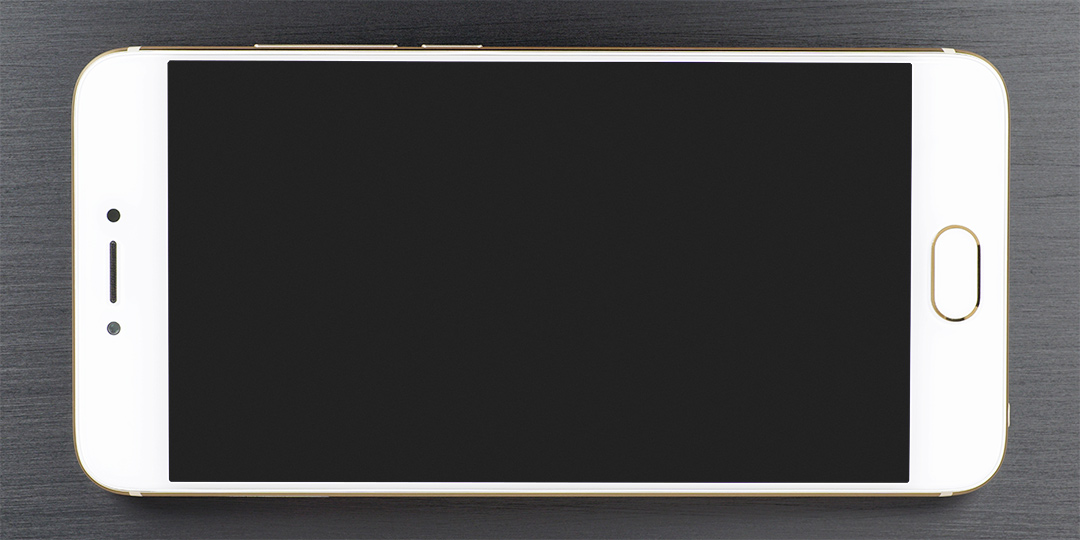
The front of the PRO 6 is still edge-to-edge Gorilla glass with a small radius that blends into a polished, chamfered edge on the aluminum chassis. There’s an almost nonexistent black border around the screen and the bezels, particularly on the sides, are reasonably small.
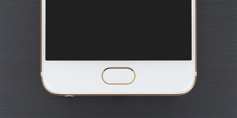
There’s a single, multi-purpose button below the screen. When pressed, it acts as a home button and makes a nice, solid click. Pressing and holding the button locks the screen. It also houses the touch-based fingerprint sensor and serves as a capacitive back button when not being used to unlock the phone or authorize purchases. The pill-shaped button is slightly recessed, which makes it easy to find without looking, and is surrounded by a polished gold or chrome accent depending on body color.
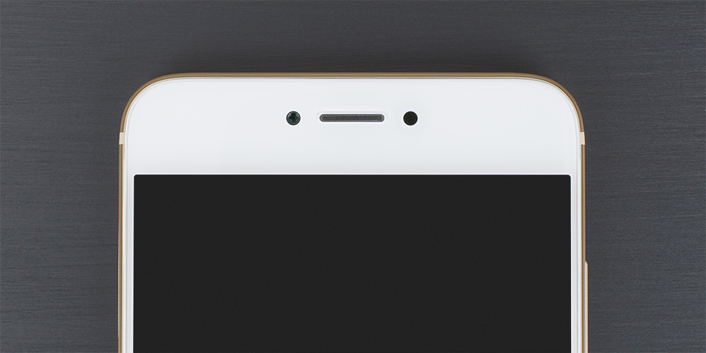
For the M3 note, Meizu focused on improving symmetry which applies to the PRO 6’s design as well. The rather small earpiece, centered above the display, is the same size as the PRO 5’s; however, the PRO 6’s narrower width makes it easier to align with the ear, making phone conversations easier to hear relative to the PRO 5. The ambient light/proximity sensor and front-facing camera are the same size and sit to the right and left of the earpiece, respectively. There’s also a white notification LED hidden below the bezel to the left of the camera. Whether an intentional design choice or an optical side-effect of the bezel, a glowing ring surrounds the LED when lit that looks neat and makes it easier to notice.
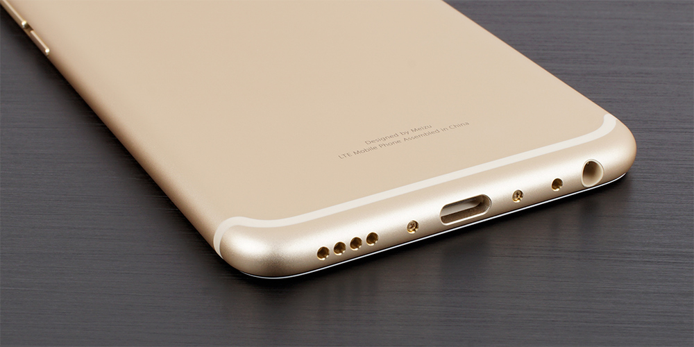
The only feature on the top edge is the PRO 6’s single noise-cancelling microphone. The USB Type-C port is centered on the bottom edge, with the primary microphone and 3.5mm headphone jack on one side and a mono speaker on the other. The circular openings for the speaker and microphone are the same size and finished with a polished chamfer that looks nice and eliminates sharp edges.
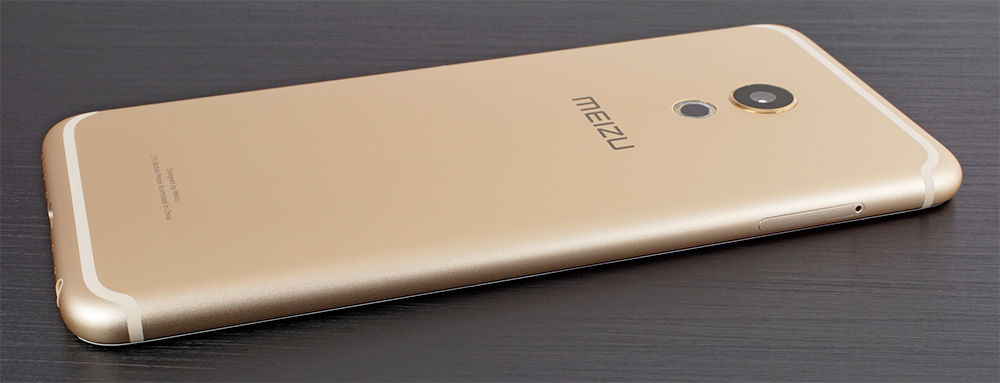
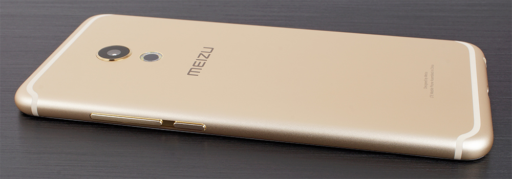
The left edge is home to a metal tray with slots for two NanoSIM cards. The single-piece volume rocker and power button sit within a nicely polished groove on the opposite side. Because the buttons share the same texture and there’s not much space between them, it’s easy to press volume down instead of power or vice versa. At least the buttons have a positive click when pressed and do not rattle when the phone shakes.
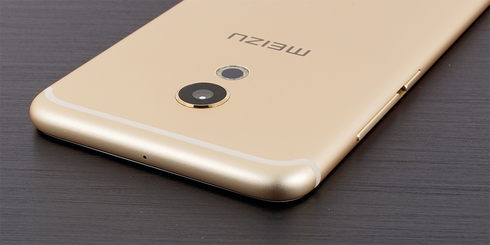
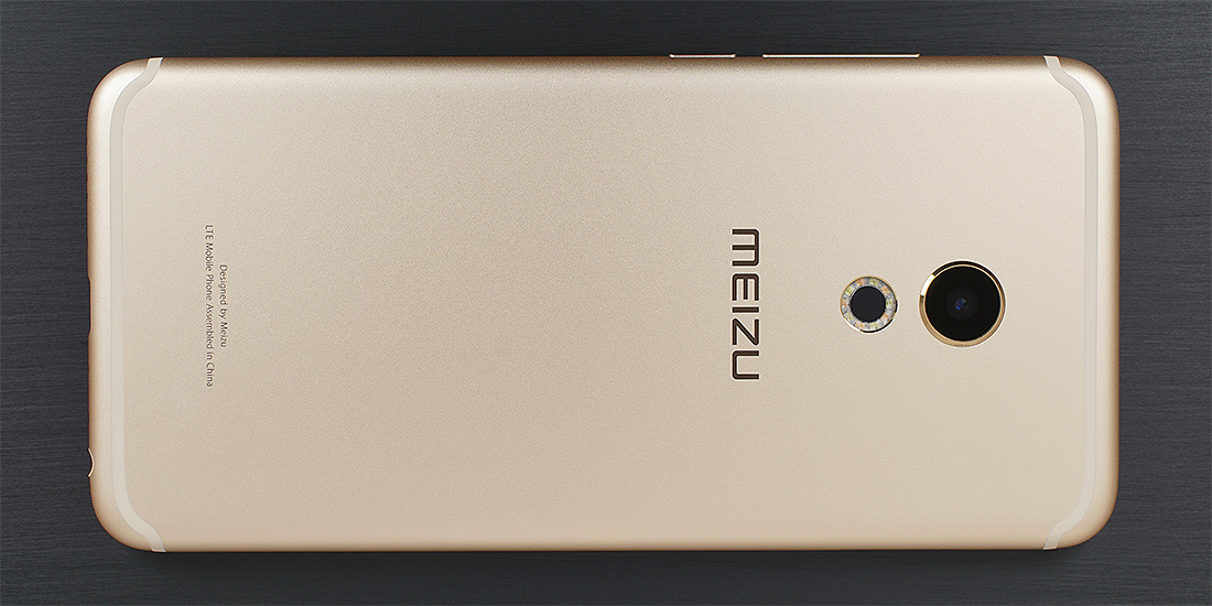
Around back we see a couple more subtle changes to Meizu’s established design. The rear camera’s protective lens is still circular and slightly raised, with a polished metal ring around its perimeter, but its diameter is smaller than the PRO 5’s. The flash module has also been redesigned: Instead of a vertical pill shape like its previous generation phones, Meizu’s PRO 6 uses a circular ring flash with five pairs of dual-color LEDs encircling a black center that matches the camera and contains the laser autofocus system. The ring flash is sunk just below the surface to protect the lens and the metal edge has a subtle, polished chamfer that ties in with the phone’s other highlights.
Integrating the antennas in the most functional, attractive way is a big challenge for designers. In previous phones, Meizu placed its antennas under plastic end caps on the top and bottom of its phones and cleverly hid the seam between plastic and metal with a machined and polished slot. Even though Meizu did a decent job matching the plastic’s color and texture to the aluminum chassis, viewing the phone from different angles revealed an obvious color mismatch that betrayed the appearance of a sleek, all-metal phone.
With the PRO 6, Meizu replaces the end caps with injection molded plastic antenna lines that hug the upper and lower edges of the back. The plastic is dyed to blend in with the phone’s color, and even though they do not match exactly, the antenna lines are not as distracting as those on some other phones.
The PRO 6 comes in three different colors: gold with white front like our review unit, silver with white front, and a dark gray with black front. These colors when combined with the aluminum chassis, machining highlights, and symmetric design make the PRO 6 a very elegant phone. Its exceptional build quality rivals even the most-expensive phones and is a point of distinction among its peers.




48 Comments
View All Comments
osxandwindows - Friday, August 26, 2016 - link
Where is the HTC10 review?arsjum - Friday, August 26, 2016 - link
All some of you guys do is complain. What is it about HTC 10 that you don't know yet? This to me is a much more interesting review, a different product.Besides, why don't you use Joshua's Twitter account to ask for an update instead of hijacking a different product's review section?
MrSpadge - Friday, August 26, 2016 - link
+1I'm really getting tired of all those guys asking (demanding?) a review of some other product. As if the current one was not worth talking about.
theduckofdeath - Monday, August 29, 2016 - link
I think it's fair to question a former great review site's inability to produce reviews lately. They do after all have comment sections to hear from the few readers they have left.Arnulf - Friday, August 26, 2016 - link
Hey, stop complaining!Notmyusualid - Saturday, August 27, 2016 - link
Hold on to your internet ladies!The guy is likely asking for the review, as Anandtech is THE place for smartphone reviews, and he is obviously interested in making said purchase.
Not too difficult to understand, no?
jtang97 - Sunday, August 28, 2016 - link
It's a valid question.The phone has been out for several months and still no review. Other newer phones have been released and reviewed and yet the HTC 10 review is still pending.
How are people supposed to make in informed choice on which phone to get when Anandtech doesn't release one of the better phones of 2016.
You've got all the benchmarks and photo/video comparisons and yet you still withhold releasing the review. Some people might start to think that you are paid to deliberately delay the review so that people will buy other phones instead of the HTC 10.
So. it is perfectly reasonable to ask about the HTC 10 review each time a newer phone is reviewed. There should be no reason the HTC 10 review is delayed by 3 months and counting.
Dennis Travis - Tuesday, August 30, 2016 - link
Where is the iPhone 3GS review? :D Grin I have been waiting for years for it! hahahahhahafanofanand - Wednesday, August 31, 2016 - link
Don't be silly, all Apple product reviews are copy and paste jobs from the last review. "Best ever, no reason to buy anything else" etc. ad nauseam.Fidelator - Wednesday, September 14, 2016 - link
I agree completely, I seriously feel they got paid off, the 10 is quite honestly a far more important and relevant product than say, this(no offense to Meizu). And quite possibly one of very best phones released this year and here we are waiting for their review.Now just wait for the review talking about how great was Apple's choice on killing the 3.5mm jack