The Apple Watch Review
by Joshua Ho & Brandon Chester on July 20, 2015 8:00 AM EST- Posted in
- Wearables
- Apple
- Mobile
- Apple Watch
Design
With a new form factor comes the need to deeply analyze design, and in the case of a smartwatch it really becomes more important than ever before. Like clothing, watches are deeply personal in a way that smartphones weren’t. The most immediate aspect of the Apple Watch is the size. I’ve used the Moto 360 before, and while I didn’t think it was too big for me, people with smaller wrists can look rather ridiculous wearing the Moto 360 or many other smartwatches. Even in the 42mm variant, the Apple Watch is surprisingly small for a smartwatch. The 38mm variant is definitely sized for people with smaller wrists.
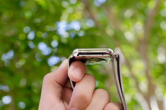
Outside of height and width, the thickness of the watch is definitely a bit more than what one might expect from a regular watch, but it isn’t really all that noticeable due to the rounded curves of the casing. When looking at the display, the display’s cover glass also blends seamlessly into the metal case of the watch, which really looks impressive indoors, although the illusion is somewhat lost in strong sunlight as it becomes obvious where the display ends and the bezel begins. This really helps with analog watchfaces, but in practice I found I was never really bothered by rectangular watch displays. If anything, I’ve found round watch display to lack information density; round watch displays just aren’t pragmatic for general purpose computing.
In order to really give a sense of what the watch looks and feels like when it’s on the wrist, I’m going to start by assuming that most people will wear this watch on their left hand. This places the side button and digital crown on the right. If you read nothing else in this entire article, you should know that the digital crown is probably the best solution I’ve seen to the smartwatch input problem yet. The digital crown manages to have just the right amount of friction to the knob so input feels deliberate without being difficult. The notches that surround the crown really help with gripping the crown and improve the precision of input with the digital crown. Both the digital crown and side button have a solid, clicky action, but it’s probably not a surprise at this point given that Apple seems to consistently nail down details like button feel on their iPads and iPhones.
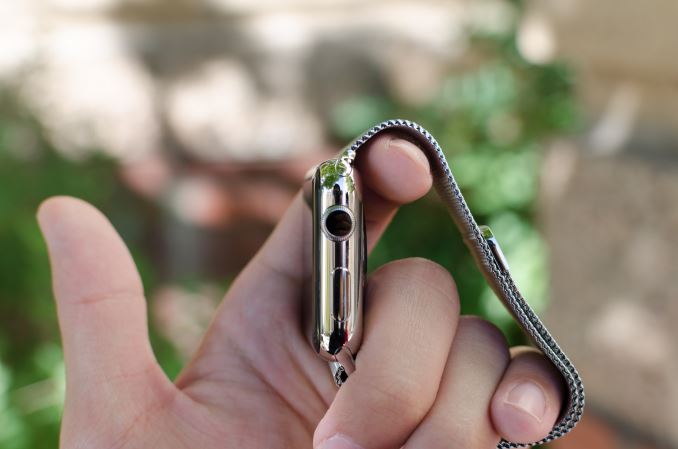
On the left side of the watch, the only notable interruptions are the speaker and microphone holes. As far as I can tell there’s only a single microphone hole, but it seems that Apple has some form of noise cancellation as background noise is generally well-muffled.
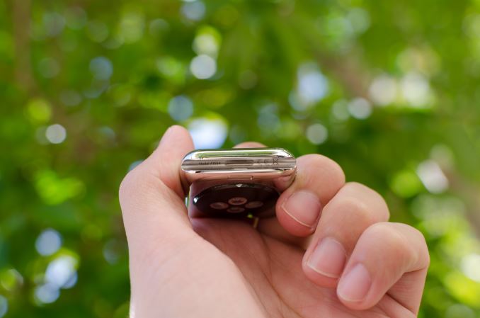
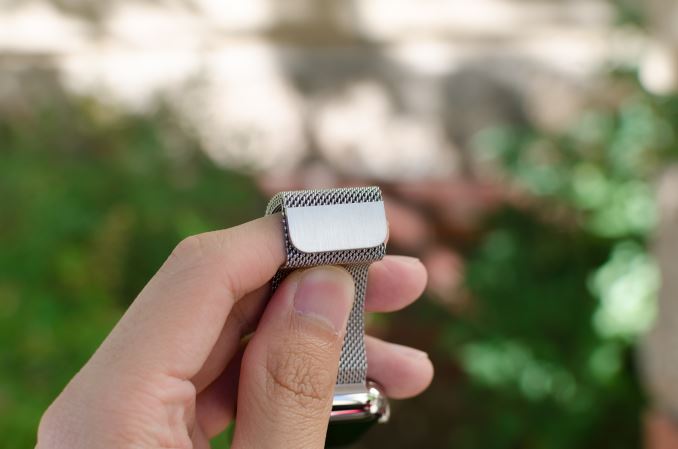
The top and bottom of the watch are just the attachment points for the bands of the watch, but from a design perspective this is probably one of the most crucial. The interchangeable bands work incredibly well because of just how easy it is to attach and detach bands. Attaching a band is as simple as matching with the slot and sliding it in, although it is possible to get it wrong by putting a band in upside-down. The fit and finish of both the Milanese loop and sport band that I received were both essentially perfect here, and the Milanese loop band has a glossy finish on the side that helps the band to blend in with the casing of the watch.
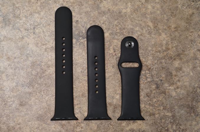
The bands themselves are probably the most important aspect of the Apple Watch's design. While Apple definitely hopes that users will be purchasing bands in addition to the one that comes with their watch, it's a safe bet that most users will be using the fluoroelastomer bands that ship with the Apple Watch Sport and the entry level Apple Watch and Apple Watch Edition models. Because the fluoroelastomer band ships with the Sport version of the watch and has to fit every wrist size the fluoroelastomer band actually is more like one and a half bands. Included in the package is the section of the strap with the metal pin, and two pieces of different lengths with holes in them. The longer one is meant for users with larger wrists, and the smaller one for users with smaller wrists.
As for the band itself, the feel of it can be difficult to describe. When they were first revealed, my initial thought was that they would have a somewhat firm and rubbery feel. It turns out that the bands are very flexible, and also very soft. The best description I could give is that it feels similar to the soft touch back of the black Nexus 5 and Nexus 9, but much smoother and very resistant to smudges. Water also tends to roll right off of it which makes it very well suited to fitness activities. Since it's not infinitely adjustable there's always a small mismatch between the size of the band and the size of your wrist, but there's not much that can be done to solve that with a pin and tuck design.
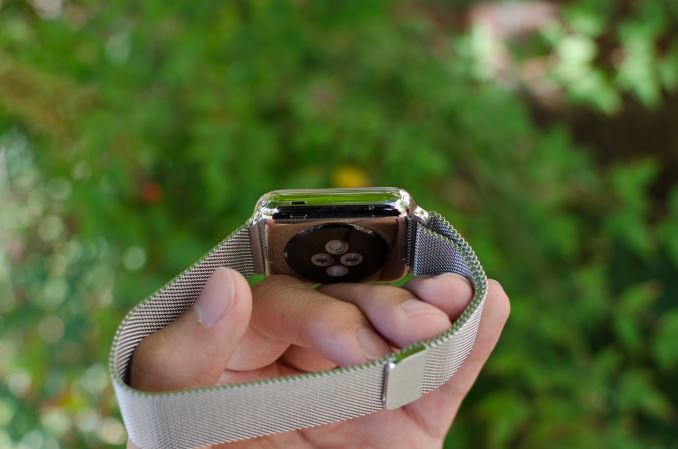
In the case of the Milanese loop, the infinitely adjustable design has basically solved the teething issues I have with wearing most watches. The band manages to deal with the issues I’ve always had with wristbands that always seemed to be either too tight or too loose. The fabric-like pattern of the metal links also helps to distribute pressure while allowing for ventilation, so I don’t feel the need to constantly take off the watch due to trapped sweat or some similar issue. It’s also easy to clean the metal bands if they get dirty, although I suspect the leather bands will be rather difficult to deal with in this regard. There is some potential to pinch hairs, but in my experience this is pretty unlikely and I can count on one hand the number of times I’ve noticed this problem in the past few months. As a result, this is probably the only watch I’ve ever worn that is consistently comfortable regardless of weather conditions. Independent of how good the wearable is from a digital logic/software standpoint, I’ve noticed that these aspects of the design are far, far more crucial than anyone seems to notice. In the case of Apple Watch, the bands are pretty much as good as it gets.
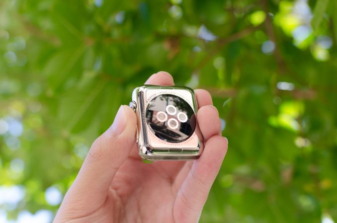
Moving past the bands, the back of the watch is somewhat unremarkable. There’s a rounded crystal that houses the heart rate LEDs and sensors, and serves as an attachment point for the MagSafe wireless charger. In practice, the only notable issue here is that the crystal seems to act as a pressure point when wearing the Watch, but it’s likely that this is done to ensure proper contact for the heart rate monitor.
Overall, Apple has pretty much nailed the design of the watch. The controls are well-executed and placed in a pragmatic position, in a way that I haven’t really seen anyone else achieve yet. The only real objection I have to the design is that the stainless steel casing seems to be a magnet for small scratches. They’re tough to see in most conditions, but with strong lighting it becomes pretty obvious that it’s pretty easy to scratch the watch casing. I suspect the only solution here is to regularly buff out scratches from the casing like most any stainless steel watch. As for the Apple Watch Sport, the 7000 series aluminum seems to hold up to daily use without any sign of scratches or chips on the casing of the watch. At 25g and 30g for the 38mm and 42mm respectively it's also lighter than the 40g and 50g masses of the stainless steel models. Since the Sport edition uses Ion-X glass like the iPhone 6 instead of the Sapphire crystal of the normal Apple Watch and Apple Watch Edition, the display cover glass is much more susceptible to scratching. While I haven't encountered any scratches at this point, the sapphire glass editions will undoubtedly better stand the test of time.




270 Comments
View All Comments
supermoon7 - Monday, October 12, 2015 - link
You're so right! Use the watch for what it's intended for. It's not a computer. According to the guys at http://www.watchtimely.com it was originally meant to have a slightly larger screen to be able to do more complicated things, but the developers realized nobody would do them on their watch anyway.xihan94 - Friday, September 11, 2015 - link
+1 for the uncovered bonus chromosome 21.johnnycanadian - Monday, July 20, 2015 - link
... you seem to have a tremendous amount of time on your hands. Perhaps learning a new skill would be valuable?Schickenipple - Tuesday, July 21, 2015 - link
This guy has written book-length posts on pretty much every Apple product review. It's quite sad, really.I'd have to imagine that ANY skill other than ranting on and on about something he's never even used would go a long way... A career, maybe?
iWatchHogwash - Monday, July 20, 2015 - link
Dera BittenRottenApple,Excellent Analysis, what a great read, rationally and logically consistent, thank you very much.
By the way, some further recommendations to read and watch:
https://www.facebook.com/pages/I-hate-Apple/511277...
http://www.businessinsider.com/10-things-we-really...
https://www.youtube.com/watch?v=qa9d5mXc7eg&fe...
https://www.youtube.com/watch?v=90NJOpjq02M
http://www.fudzilla.com/news/wearables/38007-new-y...
http://www.nytimes.com/2015/04/09/technology/perso...
http://www.fudzilla.com/news/wearables/37610-lg-re...
Other Apple news not mentioned here:
Apple Watch sales fall by 90 per cent
Apple has another lemon
It is turning out exactly as we said – sales of Apple's latest cure for cancer have slumped to a shadow of their initial "glory."
While the Tame Apple Press and a big chunk of analysts sung praises for the iWatch, claiming it would sell 70 million in its first year. We pointed out that the gizmo was nearly two years out of date and lacked most of the software which would make it moderately useful and if it succeed it was a triumph of user stupidity and marketing.
Lately analysts have been slowly withdrawing the enthusiastic sales figures they gave the watch, and now a new survey has shown that sales have fallen by 90 per cent.
Apple is selling fewer than 20,000 watches a day in the US since the initial surge in April, and on some days fewer than 10,000. This is not too bad, but it does suggest that most people who wanted an iWatch have one, and existing users are not managing to win many converts amongst their friends to make it take off. For the record to make the 70 million figure apple would have to sell 195,000 a day.
Data collected by Slice Intelligence show that Two-thirds of the watches sold so far have been the lower-profit "Sport" version, whose price starts at $349, according to Slice, rather than the costlier and more advanced models that start at $549. Apple's gold "Edition" model priced at $10,000 or more has only sold 2,000 of them have been sold in the US.
The figures are based on the electronic receipts sent to millions of email addresses following purchases. The company conducts market research on behalf of consumer-goods companies, among others, many of them in the Fortune 500.
All up though these figures are not bad, but they are not the sort of numbers which Apple needs to convince its investors that it can make mega sales any more. With sales drying up in China, Jobs mob will not have a good bottom line this year.
Source:
http://www.fudzilla.com/news/wearables/38173-apple...
And
Apple puts iWatch in stores
Maybe some idiot will buy them
Apple mysteriously has enough iWatches on hand to start putting them in its own stores.
The iWatch went on sale six weeks ago and at the time Apple did not think it would ever have enough to put it in its own shops. The original plan was to flog them online and in fashion stores, however and Jobs' Mob thought it would never have enough to meet the crushing demand for an out-of-date wearable which was more expensive than anything else on the market.
So it appears that suddenly Apple has enough. Of course the Tame Apple Press is trying to keep the story about a shortage going. Potential buyers must first reserve their device online, and some models are still out of stock.
But the sport models, which are most popular and the cheapest, are available across the country, while others can be bought in Apple's flagship shops, such as those in London and Manchester.
In order to reserve your device, you must pick the Watch you want to buy, choose a store to pick the device up and then choose a time to go and buy it.
You can also order the home delivery, but it's not recommended as it takes more than three weeks for the shipment to be delivered.
The most expensive models, such as the 38mm yellow gold model with red modern Buckle strap, are still unavailable. As Apple said last week, the 42mm Watch in Space Black with the metal link bracelet is unavailable at all stores for now.
Source:
http://www.fudzilla.com/news/wearables/38018-apple...
Finally some related news (pasted in chronological order from new to old):
http://www.fudzilla.com/news/38274-apple-press-gea...
http://www.fudzilla.com/news/wearables/38254-apple...
http://www.fudzilla.com/news/wearables/38173-apple...
http://www.fudzilla.com/news/wearables/38126-analy...
http://www.fudzilla.com/news/wearables/38018-apple...
http://www.fudzilla.com/news/38017-apple-is-convic...
http://www.fudzilla.com/news/wearables/38007-new-y...
http://www.nytimes.com/2015/04/09/technology/perso...
http://www.fudzilla.com/news/38004-xiaomi-sells-6-...
http://www.fudzilla.com/news/37983-twitter-thinks-...
http://www.fudzilla.com/news/wearables/37893-zenwa...
http://www.fudzilla.com/news/wearables/37889-apple...
http://www.fudzilla.com/news/37832-analyst-realise...
http://www.fudzilla.com/news/37787-quanta-clarifie...
http://www.fudzilla.com/news/wearables/37756-apple...
http://www.fudzilla.com/news/wearables/37660-iwatc...
http://www.fudzilla.com/news/wearables/37646-apple...
http://www.fudzilla.com/news/37635-apple-results-s...
http://www.fudzilla.com/news/wearables/37610-lg-re...
http://www.fudzilla.com/news/37609-is-the-iphone-a...
http://www.fudzilla.com/news/wearables/37586-apple...
http://www.fudzilla.com/news/wearables/37558-apple...
http://www.fudzilla.com/news/37499-imac-is-getting...
http://www.fudzilla.com/news/wearables/37485-apple...
http://www.fudzilla.com/news/wearables/37391-apple...
http://www.fudzilla.com/news/wearables/37350-apple...
http://www.fudzilla.com/news/37349-apple-a-trillia...
http://www.fudzilla.com/news/mobile/37278-new-ios-...
http://www.fudzilla.com/news/37248-apple-blames-se...
http://www.fudzilla.com/news/wearables/37235-devel...
http://www.fudzilla.com/news/mobile/37224-iphone-i...
http://www.fudzilla.com/news/wearables/37130-mobil...
http://www.fudzilla.com/news/wearables/37048-apple...
http://www.fudzilla.com/news/wearables/37001-study...
http://www.fudzilla.com/news/wearables/36699-apple...
http://www.fudzilla.com/news/wearables/36603-consu...
http://www.fudzilla.com/news/wearables/36427-sony-...
http://www.fudzilla.com/news/36342-intel-outclasse...
http://www.fudzilla.com/news/mobile/36183-microsof...
http://www.fudzilla.com/news/mobile/36169-microsof...
http://www.fudzilla.com/news/36080-microsoft-beats...
http://www.fudzilla.com/news/mobile/35959-apple-wa...
http://www.fudzilla.com/news/35740-doctors-rubbish...
http://www.fudzilla.com/news/mobile/35694-rumour-i...
Have a nice day.
Ryan Smith - Monday, July 20, 2015 - link
In the interest of transparency, BittenRottenApple has been banned from AnandTech. We have since identified him as a sockpuppet having used multiple accounts here, and while we afford our readers a great deal of liberty to discuss products and articles, we will not put up with people who are dishonest in their actions.Dennis Travis - Wednesday, July 22, 2015 - link
Ryan, thank you. It's for the good of the site. I was about to reply to him but glad I read this first!Again thanks for getting rid of people like that. Just brings the whole comments section down.
colonelclaw - Wednesday, July 22, 2015 - link
Thanks for that Ryan, on the internet it's easy to say "you need to get some kind of help" in jest, but in this case I think it may actually be true. Presumably iWatchHogwash is the same person?sammery - Tuesday, July 21, 2015 - link
Goodness me. That was so long and devoid of meaning I might start using it instead of Lorem Ipsum.WinterCharm - Tuesday, July 21, 2015 - link
Take your neurotic apple hating bullshit elsewhere.You're just bitter that Anandtech gave the watch a stellar review.