Nokia Lumia 930 Review
by Brett Howse on September 8, 2014 3:00 PM EST- Posted in
- Smartphones
- Microsoft
- Nokia
- Mobile
- windows phone
- Lumia
Design
The design of the Lumia 930 is an evolution of the all polycarbonate shell which first appeared with the Nokia N9, and was then evolved to become the basis of all of the unibody Lumia phones. Nokia has done a good job of evolving the design of their unibody phones since the N9 and Lumia 800 first came on the scene several years ago. Let us do a quick history on the Lumia unibody phones, since the Lumia 930 really takes a lot of design cues from past models.
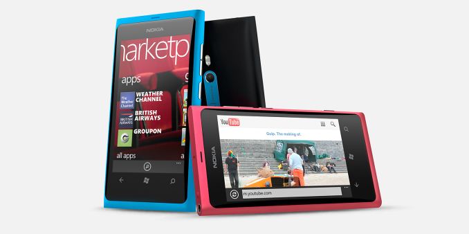
When Nokia first came on the Windows Phone scene, the first phone was the Nokia Lumia 800. The Lumia 800 was a solid polycarbonate phone with a rounded glass front which was very similar to the short lived Nokia N9 running MeeGo. Then, the Lumia 900 was released which bumped the display from 3.8” to 4.3” and shared a design that was mostly similar to the 800 – rounded sides, but squared off corners. The timing of this device couldn’t have been at a worse time though with the internals not being capable enough to run Windows Phone 8 which came out later that year.
The Lumia 920 was the first Nokia unibody phone running Windows Phone 8. It bumped the display up to 4.5” and leaned heavily on the look and feel of the 800 and 900 with rounded sides and squared off corners. The Lumia 920 was known for a great camera, and a robust 185 gram weight, which was quite heavy for a 4.5” phone. As a comparison, the iPhone 5 was launched just before the 920 was released, and it came in at only 112 grams. Phones closer to the size of the 920 were also lighter, such as the HTC 8X which was a positively svelte 130 grams by comparison to the 920.
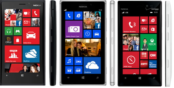
In May 2013, two new devices were launched by Nokia as a retake on the 920. The first was the 928 which is a device which offers a lot of similarities with the new 930. The shape is very much the same, with straight sides and tight radius corners, and a slightly pillowed back. This phone was only available on Verizon, but certainly shares a lot of the look and feel with the 930. At 162 grams, the 928 shaved over 20 grams off of the 920’s design but kept the unibody polycarbonate design. The second phone launched in May was available to a more global audience than the 928, and that was the 925. There are two distinct features of the 925 compared to all other Lumia unibody phones – a focus on light weight, with the phone coming in at just 139 grams, and a metal band around the outside of the phone to give it a more upscale look and feel, while also serving as the antennae for the phone.
 Lumia 920 (left) Lumia 925 (center) Lumia 928 (right)
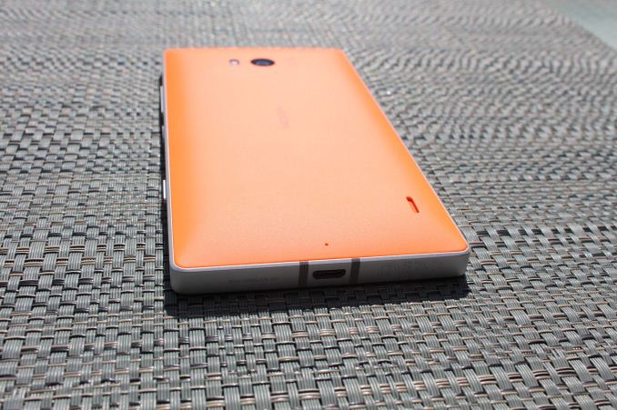
The Lumia 930 combines both the 925 and 928 designs, with its sides being made of a metal frame like the 925, but rather than the rounded sides of the 920 and 925, the 930 borrows the shape from the 928 with the straight sides and tight radius corners. The pillowed polycarbonate back on the 930 is available in four colors – white, black, green, and orange – to give the owner a chance to pick something unique to them. This design, coupled with the nicely curved glass on the front of the phone, makes for a very nice looking phone. The review device I received had the orange back, and it is certainly bright and exciting.
You will also notice two bands of darker grey at the top around the headphone jack, and at the bottom around the USB port. These would most likely be non-conductive strips to separate the two antennae, but rather than make them the same color as the metal they have been used as an accent, which helps to break up the phone's appearance.
But, as is often the case, form over function can bring some compromises to the table as well. The sharp sides, which give the phone a unique and distinctive look, are a bit slippery and not the most comfortable to hold in your hand. As compared to the recently reviewed Lumia 630, the 930 is just a lot more awkward to hold than a device like the 630 with its angled sides. Devices like the HTC 8X and Moto X have been praised for their shape which conforms so well to the hand, but even with the slightly pillowed back on the 930 that is not the case here. Some of that is certainly the size, but an angled side or even the rounded sides on the Lumias of the past is easier to hold in my experience. It is unlikely the feel of a phone in the hand ever has much sway over someone purchasing it, but it is something that I did notice during my time with the phone so it was worth a mention.
As is normal with a Lumia, the volume rocker, power switch, and two-stage camera button are all located on the right side of the phone. The power button being in the middle seems to work well for one handed use, and the buttons all have a good feel to them. The power button placement is certainly in the right location when compared to a phone with the power button on the top which gets awkward to use especially on a larger phone such as this. The power button placement is important, but the Lumia 930 also supports double-tap to wake. Two taps on the Corning Gorilla Glass 3, and the phone is ready for action.
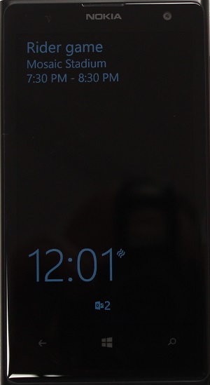
The Lumia 930 has one glaring omission, and that is there is no support for Nokia Glance screen. As I showed in the Lumia 630 review, Nokia Glance is a feature in almost all Windows 8 Lumia phones which allows the clock, alarm, vibrate, and notifications to be displayed on the screen when the smartphone is in standby. As an owner of a Lumia 1020, I have certainly become accustomed to Glance, and trying to move to a phone without it is challenging to say the least. It was forgivable on the Lumia 630 due to cost constraints, but not forgivable on a flagship phone such as the 930. If you are a new customer to Nokia, you would obviously never miss one of the best features they have ever implemented, but if you were a former customer with any of the Nokia devices which supported Glance, you would quickly find it uncomfortable. As to why the 930 lacks Glance, according to an interview by wpcentral.com, the Lumia 930 display lacks memory, which most likely would be used for Panel Self Refresh in order to keep the power costs of having some of the display on at all times to a minimum. As this is a hardware feature that is missing, do not expect it to show up in a future update, but perhaps something can be done on the firmware side.
Lumia 1020 showing Glance
Other features in the design of the phone include a nice nano-SIM tray which can be opened with just a fingernail, a dual-LED flash beside the PureView 20 MP camera, a rear mounted speaker, a micro-USB 2.0 port at the bottom and a 3.5 mm jack at the top.
Overall, the Lumia 930 has a solid design which includes great materials, but has some in-hand issues as far as comfort. The lack of a key feature of previous Lumia phones is disappointing though, with Glance Screen easily being one of the best features of Nokia Windows Phones.


115 Comments
View All Comments
pjcamp - Tuesday, September 9, 2014 - link
Not a dev. THE dev. Marcus Duarte himself claimed that users find two storage locations confusing.How we've muddled along with multiple storage locations on laptops all these years must confuse HIM to no end.
Besides this is Linux. It is possible to make a single file system spanning multiple devices. There's no reason Android couldn't clear up the "confusion" that way.
tuxRoller - Tuesday, September 9, 2014 - link
This ^I guess they've never heard of lvm/MD/btrfs.
Alexvrb - Tuesday, September 9, 2014 - link
That's not limited to Linux. I mean heck there's multiple approaches, some are completely software agnostic.Anyway, MS tried something like that with Windows Phone 7. It creates another problem when the user wants to REMOVE the memory card any time they want (users are stupid, this was a common complaint with WP7 I kid you not, result was WP8 separating the two again). WP 8.1 has a better middle-ground solution. Keep the spaces seperate but make better (and easier) use of the memory card.
BMNify - Monday, September 8, 2014 - link
Then get Lumia 1520 or 1320 or 630 or soon to be released Lumia 830 and 730, loads of options for MicroSD fanatics.jimbo2779 - Monday, September 8, 2014 - link
The issue is that this is meant to be the flagship phone at a reasonable size, the 1520 and 1320 are too big for the majority of users, the 830 is running a far inferior SoC, less RAM, poorer quality screen and camera, everything lower is in the same boat as the 830 or even worse so really the lack of SD card support here is it's main disappointment.I was looking forward to this phone so much only to find out it had no SD card support, any user of a Lumia (or other WP phone) with SD card support knows that it is so easy to use and allows for much more space than is available in a phone.
Would you rather have a phone with 32Gb or 96Gb? I know which I would prefer and I definitely would have bought a 930 outright to replace my 925 as this is an upgrade in every way but for some unknown reason they decided to make it the only phone in this years line-up without SD card support meaning it is a no go for me.
Reflex - Monday, September 8, 2014 - link
The question is what feature would you drop in order to gain that MicroSD slot? Because the 930/Icon is packed very tightly, it has everything that is in the 1520, yet in a full inch smaller package. Furthermore, it is barely larger overall than most 4.5" phones, so they really packed it tight.I am not willing to go with a larger phone. The features they did include are all very useful to me, I'd be pissed to lose, say, Qi charging, for a SD slot. I get that you want it all, but there are tradeoffs. Either you get the 930 with SD but without something else that takes up space, or you get it without SD support, or you get a larger phone that has all of it included (1520). The reason the 1520 exists is because there are some who are not willing to compromise. Quite frankly the 1520 is the phone you should be looking at, it was made with you in mind.
Also, the 520 has a SD slot not because its a high end feature but because it permits them to sell a phone with very little integrated storage, putting that part of the cost in the hands of the buyer.
Samus - Monday, September 8, 2014 - link
Most SD cards are slow, the controllers are slow, both add complexity and space to the PCB, most people rarely, if ever, use them, and most importantly, they drain the battery.If I were designing a small phone, I wouldn't put in external storage, either. Phablets and Tablets, sure...but with everything (especially WP8) becoming cloud-centric now, I don't see the need for physical media in a phone.
ummduh - Monday, September 8, 2014 - link
The cloud this, the cloud that, cloud, cloud, cloud cloud cloud.Do none of you people ever go outside the city you live in? End up in the mountains? The woods? A back country road that just happens to not have a signal?
I spend sometimes weeks on job sites out in the middle of nowhere with no signal. No wifi, either, since, ya know, it's a job site.
The cloud is 100% useless in those situations. Yea it's a neat toy, and can be handy when you never ever lose service. And you're willing to pay more and more for less and less data service.
Otherwise, you need storage on the device. 16GB, 32GB doesn't cut it. An endless supply is 64-128GB mSD cards, however, does. After apps are installed, I can only put a couple GB of music on my phone before it's filled. And then I get nagged to death by low storage warnings.
The cloud can go screw itself.
Reflex - Monday, September 8, 2014 - link
And in your situation that makes sense. However that is an edge case and the market really isn't, nor should it be, tailored to edge cases. Also, as someone who has compared coverage between carriers, I strongly suggest Verizon which tends to work just about everywhere, even in the backwoods, at least in the northern half of the country.ummduh - Monday, September 8, 2014 - link
So, I should pay extra amounts of money, every month, to stream the same data over and over to my phone, instead of carrying said data on my phone to begin with, and not keep incurring ever increasingly exorbitant monthly fees? What sense does that make?Pay to have the amount of data I'd need monthly (10GBish), over, and over, and over, and over.. etc. Or, $25 mSD?
It's not market tailoring, it's data fees extortion.