Google Nexus 5 Review
by Brian Klug on December 5, 2013 8:00 AM EST- Posted in
- Smartphones
- LG
- Android
- Mobile
- Snapdragon 800
- Android 4.4
- Nexus 5
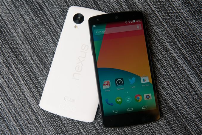
Each year, Google picks a silicon vendor, a hardware partner, and releases a new version of Android running on top of them. The result is a Nexus phone, and for five iterations now that process has repeated, resulting in a smartphone that’s the purest expression of Google’s vision for its mobile platform. Today we’re looking at the Nexus 5.
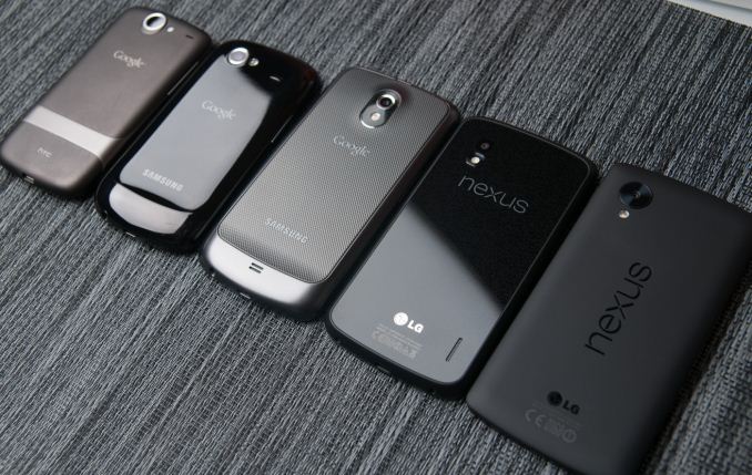
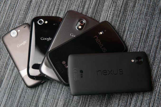
Nexus 5, as its name makes obvious, is the latest generation of Google’s line of Nexus smartphones, and also is topped by a 5-inch display. While the Nexus program originally started only for smartphones, we’ve seen Google since extend the program to include a 7-inch and 10-inch tablet form factor, as well as a line of accessories. In recent years, we’ve seen Nexus go from being part enthusiast curiosity and development device, to a brand tailored for consumers looking for the latest and greatest the Android platform has to offer at a killer price.
Last generation we saw the Nexus 4, a device that was essentially an LG Optimus G for T-Mobile in different clothing and priced at a competitive price, yet still included the latest and greatest silicon from Qualcomm with APQ8064 (S4 Pro). For Nexus 5, Google has once again gone with hardware partner LG and silicon vendor Qualcomm, this time with a phone that’s somewhat analogous to the LG G2 (but not exactly the same platform) and using the latest and greatest MSM8974 (Snapdragon 800) silicon.
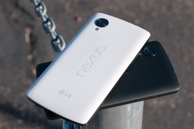
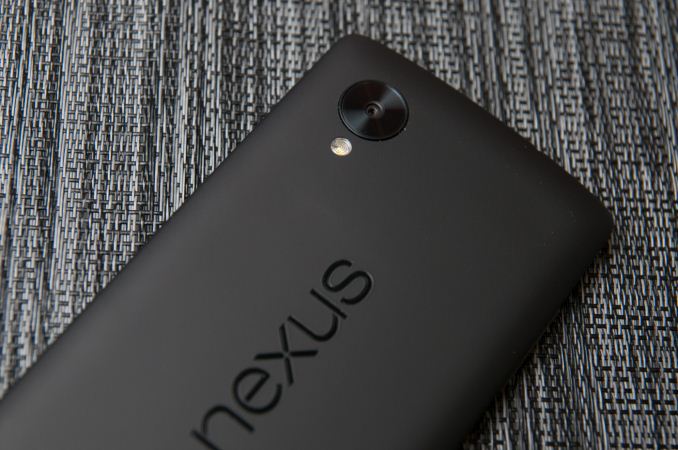
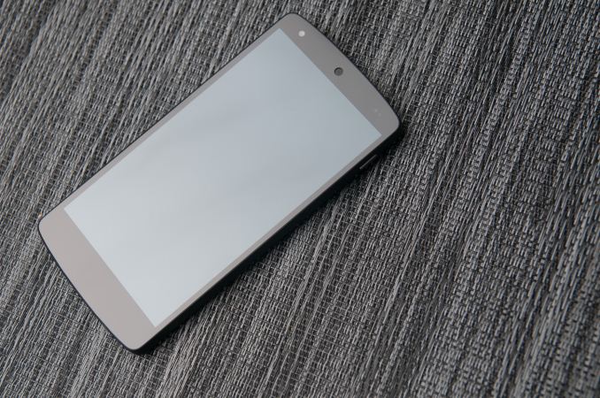
Let’s start with the hardware, since that’s the normal flow for a review. The Nexus 4 bore a lot of superficial similarities to the Optimus G, including a glass back with laser etched design below its surface, the same display, banding, and materials. The Nexus 5 on the other hand doesn’t bear any similarities to the G2, with its buttons on the back, narrow bezel, rounded backside, and glossy plastic. Instead, the Nexus 5’s design borrows much of its industrial design language from the Nexus 7 (2013), with the slightly rounded top and bottom, landscape “nexus” logo on the rear, and large radius curves all around the side. The Nexus 5 and 7 share almost the same shape and profile, and in the case of the black Nexus 5, same rubberized soft touch material on the back and sides. If you scaled down the Nexus 7 design you’d get something which is awfully close to the Nexus 5.
The result is a two-device family that feels like it was made by the same company, and it’s really the first time Google has aligned its industrial design in such a sweeping fashion, in this case even across two different hardware partners. I guess you could make the argument that with the exception of the Nexus 10, Google has eliminated any industrial design fragmentation and finally crafted some hardware design language that it owns for itself.
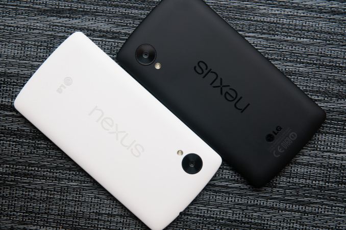
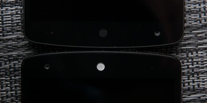
Google sampled us first a black Nexus 5, and later a white Nexus 5 at my request so I could check out the material differences I saw some discussion about. It’s true that there are some differences between the two devices. For starters, the white device has a backside which eschews the soft touch material, instead giving the polymer-backed device a rougher, textured feeling. The absence of soft touch continues to the edge, which is glossy black plastic instead of the rubberized material, and comes with protective plastic installed over it by default. On the front the only visible difference between white and black is a white colored earpiece, the rest of the bezel around the display is still black.
I’m reminded of the split between the white and black Note 3 with the Nexus 5, which also only includes rubberized material on the black model. I find myself preferring the feeling of the white model instead, but it’s really just a story of personal taste. No doubt the absence of soft touch on the white material is to prevent staining from hand oils or other dyes as the device ages. I don’t find that the absence of soft touch on the white model makes it any more difficult to hold or grip onto, the negative-angled bezel really does help the Nexus 5 fit into the hand securely.
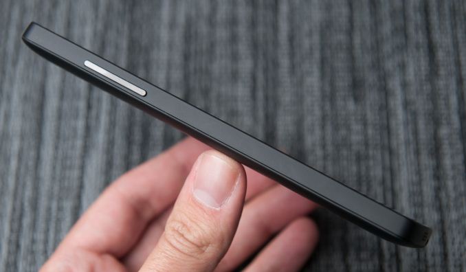
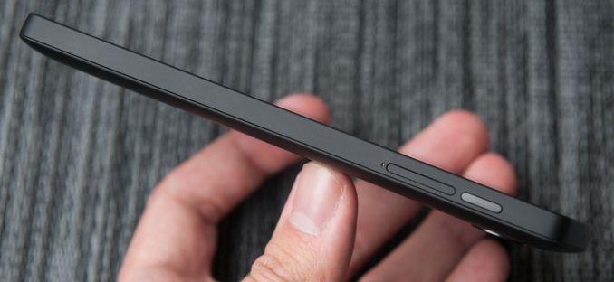
Although the Nexus 5 is a close cousin, it doesn’t adopt the button arrangement from the G2, instead locating the volume and standby buttons in a normal place. Volume rocker ends up on the left, power on the right side.
Likewise earpiece is on top and microUSB is at the bottom of the device. What’s unique about the Nexus 5 buttons is the material of those buttons – they’re ceramic, not polycarbonate. The result is that they’re sharp and instantly locatable with the brush of a finger, it’s a subtle thing that does feel different. The only complaint I have is that they do seem to rattle slightly inside their cutouts. I can affirm that the white model seems to have less rattle, but I’m not entirely sure how much of that is intrinsic to the color difference and absence of soft touch.
Also on the back is the Nexus 5’s oversized camera cutout, which is slightly raised from the surface around it. It’s fair to say that the Nexus 5 does have a camera bump, something that’s not going away soon in all but the most iconic devices. When I first saw the oversized ring, I assumed it was just a design motif, and others later speculated it was for a line of magnetically-attachable add on lenses. To date none of those have materialized, and upon further consideration having magnets next to the VCM (voice coil motor) electromagnetic focus and OIS mechanism could complicate things. In any case, at present the oversized ring around the camera aperture is a unique design point rather than something which serves a function.
The only real negative about the camera cutout is that dust seems to be able to get into the crack surrounding it and the cover glass. It’s something unfortunate about the Nexus 5’s design in general – there are cracks that show dirt quickly, for example the backside has a seam around the edge where dust seems to intrude. It obviously doesn’t change the Nexus 5’s function, but immediately starts looking dirty on the black model, and part of why given both side by side I prefer the white one.
I think pragmatic describes the Nexus 5 design quite well, since honestly the design doesn’t try to be flashy just for the sake of differentiation or make any crazy materials choices on the outside. There are subtle design features which definitely are appreciated, however, like the negative angle to the edge which makes the device easy to grip, those ceramic buttons, and the continuity of design language from the Nexus 7 of course. Materials are a big differentiator between devices right now, and again the Nexus 5 is relatively pragmatic with its choice of polymer, but does deserve kudos for not going with the slick, glossy-surfaced material still preferred by Korean handset makers.
The Nexus 5 feels well made and precision crafted, but I can’t shake the feeling that Nexus 4 felt more like a standout design of its own. The Nexus 5 seems a lot more, well, traditional, without the rounded-glass edges, chrome ring, or pattern below the glass on the back (which I still maintain contained some kind of encoded message). The reality is that Google made a lot of decisions with Nexus to optimize for cost, and that the Nexus 5’s design is actually quite differentiated given the price.
The Nexus 5 adds a lot over its predecessor – larger 1080p display, newer silicon, 802.11ac, better camera with OIS, and of course LTE connectivity, all while getting minimally more expensive than its predecessor. It’s almost unnecessary to say that the Nexus 5 is obviously the best Nexus phone yet.
| Physical Comparison | ||||
| LG G2 | Samsung Galaxy Nexus (GSM/UMTS) | LG Nexus 4 | LG Nexus 5 | |
| Height | 138.5 mm | 135.5 mm | 133.9 mm | 137.84 mm |
| Width | 70.9 mm | 67.94 mm | 68.7 mm | 69.17 mm |
| Depth | 9.14 mm | 8.94 mm | 9.1 mm | 8.59 mm |
| Weight | 143 g | 135 g | 139 g | 130 g |
| CPU |
2.26 GHz MSM8974 (Quad Core Krait 400) |
1.2 GHz OMAP 4460 (Dual Core Cortex A9) | 1.5 GHz APQ8064 (Quad Core Krait) |
2.26 GHz MSM8974 (Quad Core Krait 400) |
| GPU | Adreno 330 | PowerVR SGX 540 @ 304 MHz | Adreno 320 | Adreno 330 |
| RAM | 2 GB LPDDR3 | 1 GB LPDDR2 | 2 GB LPDDR2 | 2 GB LPDDR3 |
| NAND | 16/32 GB NAND | 16/32 GB NAND | 8/16 GB NAND | 16/32 GB NAND |
| Camera | 13 MP with OIS and Flash (Rear Facing) 2.1 MP Full HD (Front Facing) | 5 MP with AF/LED Flash, 1080p30 video recording, 1.3 MP front facing | 8 MP with AF/LED Flash, 1.3 MP front facing | 8 MP with OIS, AF, LED flash, 1.3 MP front facing |
| Screen | 5.2-inch 1920x1080 Full HD IPS LCD | 4.65" 1280x720 SAMOLED HD | 4.7" 1280x768 HD IPS+ LCD | 4.95" 1920x1080 HD IPS LCD |
| Battery | Internal 11.4 Whr | Removable 6.48 Whr | Internal 8.0 Whr | Internal 8.74 Whr |
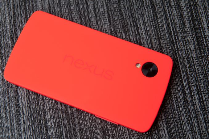
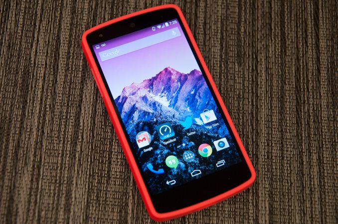
Google also sent over one of the Nexus 5 bumper cases, which really isn’t so much bumper as it is, well, all around case. The Nexus 4 had bumpers that wrapped around the edge, but left the glass back exposed, much like the iPhone 4/4S era bumpers.
Nexus 5’s bumper case covers up everything but the oversized camera aperture on the back. The red one I got doesn’t seem to be silicone but some other thermoplastic.
At $35 it’s a bit on the pricey side, but it does fit the device nicely and get the job done with some cool neon colors that spice up the Nexus 5.






231 Comments
View All Comments
BearCatCow - Thursday, December 5, 2013 - link
What a great article! Very objective and evidence based. The attention to display accuracy rather than whoever pumped up the saturation the most, the clear analysis of the camera's hardware (potential) vs software (current usability), and the multitude of battery measures are very helpful.bioyuki - Thursday, December 5, 2013 - link
Brian: Did you notice any differences in real world rf performance between the Nexus 5 and Nexus 4? Only a few data points on my end, but it seems like the N5 performs on average 3-5 dBm worse than the N4 (LTE and HSPA on Band 4). Also, does the N5 contain any of Qualcomm's tunable front end parts?BearCatCow - Thursday, December 5, 2013 - link
Question: what were the differences in battery performance with ART runtime vs the default?nostriluu - Thursday, December 5, 2013 - link
how about a battery test that's really useful for most people, how a device lasts over the course of a day with a typical set of apps? these rundown tests are really not that helpful.NeoteriX - Thursday, December 5, 2013 - link
What do you specifically propose for an objective, repeatable, platform agnostic test, hmm? What is a typical set of apps? What about the fact that apps are always changing? What about the fact that many apps are not multi-platform or aren't standardized across platforms?The rundown test (based on something agnostic and universal like web page loading) is probably the best kind of objective test you're going to get; you'll just have to extrapolate your daily performance from that.
Besides, as a pragmatic matter, Brian's/Anandtech's reviews are already take so much time and effort to do, and that's with multiple a 5-9 hour long battery tests (LTE, 3G, Wifi...). One can't test any other feature of the phone while battery testing... you want to seriously add a suite of 12-24 hour tests on top of that?
Impulses - Friday, December 6, 2013 - link
Can't believe someone's actually pinning for less controlled/repeatable battery testing just because it might be closer to their own use... AT does the best battery tests bar none, whether they mimic your use or not is irrelevant, just find a phone you own or have owned on their list and extrapolate from there. It'll be far more accurate than a pseudo real world test with too many random variables to account for.flyingpants1 - Saturday, December 7, 2013 - link
Jesus Christ, I cannot believe some of the comments on here. The battery life tests here and everywhere else are terrible. None of them reflect real-world usage whatsoever.The only real test here is a synthetic web-browsing battery life test, and it gives results between 6-10 hours, I'll eat my monitor if anyone's phone actually lasts that long in real-life web-browsing. Obviously a synthetic benchmark can be a useful as a comparative tool between phones, but not much else. It's basically the equivalent of a 3dmark score.
It's a well-known fact.. actually, by now a universally foregone conclusion that smartphones die extremely quickly, and are super annoying to charge. Brian uses phrases like "It can last the whole day on a single charge" which are utterly meaningless. That just means you left your phone in your pocket most of the time. But when you actually want to use your phone in a pinch, or while travelling, or in an emergency, or for serious work, then it's a completely different story. Yet for some reason you wouldn't get that impression from most reviewers. And so we're forced to compromise.
Compare with laptops from a couple years ago, they'd advertise 5 hours of life, get 3 in reality in ideal conditions, and within a year be down to 2 hours. I'm sure a lot of people were happy with that. So what. The Macbook Air came along and gives you up to 12-16 hours. Now *THAT* is all day life. That is what we should be getting on smartphones. 12-16 hours of screen time and constant use. Then we won't need to go and do forty million battery life tests anymore, because the problem is *solved* for 99.9% of use cases. Instead we're getting price gouged like crazy for storage, and R&D goes to things like 500PPI displays and downloading at 150mbps, things which should be of slightly lower importance than making the phone stay alive.
No idle test. This is really important, the percentage drop should be less than 1-2% every 24 hours.
No video test.
No gaming test.
Nobody seems to care about texting. People usually send *way* more texts than they make calls, and texting drains battery faster than calls do. I often run out of battery life on the train while texting, seems like a percentage point every minute or two even with my display on 0%.
The reviewers are definitely on the manufacturer's side on every single issue here: against microSD, against removable batteries, but *FOR* pointlessly thin, even to the point of sacrificing battery life and functionality. If they were on the *consumer's* side, they'd be tearing apart every single 16GB device, advocating the $1 microSD slot for *EVERY PHONE*, and demanding *EVERY PHONE* have either a version with a removable battery, and/or EXTENDED (MAXX) battery version.
My ideal device would be a 5" screen, LG G2 or RAZR MAXX-like device, 10.5mm thick, 4500mah, with 64GB microSD and front speakers like the HTC One. The closest thing right now is the HTC Butterfly S, IMO the best phone on the market by far, there are no tradeoffs at all.
bountygiver - Thursday, December 5, 2013 - link
Well the camera UI didn't go miserable in 4.4, but since 4.3. Navigating settings in 4.3+ camera UI is a pain as toggles have no feedback and there's no tell whether an option is a menu or a toggle.For the not focus problem, just tap another place and tap the original position again to refresh it.
Krysto - Thursday, December 5, 2013 - link
I'm curious why you're calling 512 MB phones "mid-range", when you can find such a phone even for $100 unlocked these days. Even Moto G at $180 is a low-end to mid-range phone, and it has 1 GB of RAM. Is it because you don't want the iPhone to be considered mid-range?Pr3ch34r - Thursday, December 5, 2013 - link
Tell me how would you consider the 5s (or even the 5c) midrange, because of ram and screen size? Both are top of the line, like it or not...