The iPhone 5 Review
by Anand Lal Shimpi, Brian Klug & Vivek Gowri on October 16, 2012 11:33 AM EST- Posted in
- Smartphones
- Apple
- Mobile
- iPhone 5
Design
Section by Vivek Gowri
The iPhone 4, when it launched, represented a clean break for Apple's industrial design. It replaced the soft organic curvature of the iPhone 3G/3GS with a detailed sandwich of metal and glass, something that arguably brought the feel of a premium device to a new level. Obviously, Apple had their fair share of issues with the design initially, and nothing could match the sinking feeling of dropping one and shattering the glass on the front and back simultaneously, but it was a small price to pay for the jewel-like feel of the device. Combined with the (at the time) incredible pixel density of the then-new Retina Display, the iPhone 4 was a revolution in hardware design. The chassis has aged remarkably well over the last two-plus years, so naturally it's a hard act to follow.
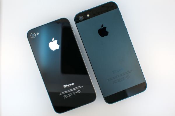
The 5 keeps a similar design language to the 4, keeping roughly the same shape as before but with a taller and thinner form factor. At first glance, the 5 actually looks almost the same as the 4, with an unbroken glass front face, prominent corner radiuses, the familiar home button, a rectangular cross-section, and metallic sides with plastic antenna bands. However, those metallic sides are part of an anodized aluminum frame that makes up a majority of the body, and that's where the industrial design diverges from the 4 and 4S.
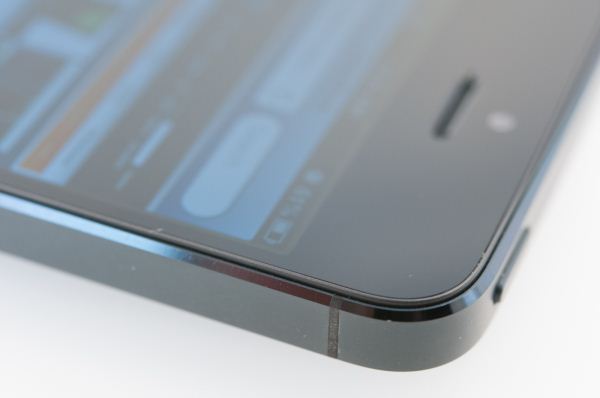
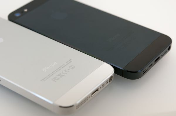
In contrast to the predominantly glass body of the previous generation iPhone, the 5 is almost entirely aluminum other than the glass front face and two small glass windows at the top and bottom of the back. It's a return to the original iPhone/3G/3GS-style of construction, with the front glass clipping into a unibody chassis. It's a significant departure from the 4 and 4S, where the stainless steel band in the center was the main housing that the front and rear panels clipped into. That was pretty radical way of doing things, so it's not all that surprising to see Apple revert to a more conventional and less complex method for the 5.
The aesthetic is actually pretty awesome, especially in the black version. The combination of black glass and off-black aluminum (Apple is calling it slate) gives the 5 an almost murdered out look that's three parts elegant and one part evil. The white and silver model has a classy look that's much friendlier in appearance than the black one. The color schemes and overall design aesthetic remind me of the Dell Adamo, one of my favorite notebook designs of all time. The similarities may be purely coincidental, but it's interesting to note nonetheless and should give you an idea of how premium the industrial design is.
All three previous iPhone body styles had very similar dimensions, so the biggest question with the 5 was how much the larger display would do to change that. Unlike many Android manufacturers, Apple still believes in things like small pockets, small hands, and one-handed smartphone usage. With the 5 being vertically stretched but no wider than the previous iPhones, the biggest impact on in-hand feel is actually the thinner body. If you're used to a larger Android or Windows device, the change seems radical, but even compared to the 22% thicker iPhone 4S, it feels a good deal smaller.
It's not just the minimized z-height though, the 25% weight loss is definitely also a factor. Even a few weeks later, I still find it striking how much less substantial it feels than the 4 and 4S. The densely-packed glass body just had a reassuring weight to it that the 5 simply lacks. But as you get used to the new form factor, you realize how far Apple is pushing the boundaries of ultrathin design. When the 4th generation iPod touch came out, I told Brian that I wanted an iPhone with that form factor - well, the 5 is essentially there (0.3mm thicker and 11 grams heavier, but close enough). It's pretty impressive to think about. If you thought the 4S was one of the best phone designs on the market in terms of aesthetics and build quality, the iPhone 5 just pushes that advantage further.


276 Comments
View All Comments
medi01 - Wednesday, October 17, 2012 - link
Try to do it in a darker environment.If you still don't notice that AMOLED black is actually, cough, black and "iphone"'s black is actually gray, you probably should visit a doctor.
darwiniandude - Friday, October 19, 2012 - link
Who cares about black being 100% black when all the colour accuracy is terrible? The galaxy note looks like is has cellophane over the screen next to an iPhone, the white doesn't look white. You take a photo of a hill side and all the trees and grass is the same over saturated shade of green. It's because of this that I'd only consider the HTC one X excuse it has an accurate LCD. I've personally never found an Amoled screen so far I can put up with. Each to their own, if black is more important to you than the rest of the spectrum, then enjoy it.bpear96 - Thursday, October 18, 2012 - link
Well obiously, there PPI's are almost the same, because of the size difference.If you had a 4.8" 1136 x 640 display, next to a 4" 1136 x 640 the 4.8" would not look nearly as good as the 4" because it would have a lower PPI (pixels per inch) since the GS3 is larger it needs a higher res display to be on par with the 4" iphone 5 display.
bpear96 - Thursday, October 18, 2012 - link
type - obviously *star-affinity - Tuesday, October 23, 2012 - link
The difference (in my opinion) being that the Galaxy S III has over saturated colors which is quite bad.http://www.displaymate.com/Smartphone_ShootOut_2.h...
GabeA - Saturday, January 5, 2013 - link
Sorry, you're comparing a poor screen technology (PenTile subpel matrix) with a top-of-the-line LCD. The comparison is flawed because the effective resolution on text is only ~82% in either direction (something like 1050 x 590 on sharp, black text) due to the interpolated, non-RGB subpixels.A good comparison would absolutely involve the One X series by HTC. In fact, holding the SGS3 and the One X side by side on this page shows an obvious difference in text clarity in favor of the One X.
rocketbuddha - Tuesday, October 16, 2012 - link
Don't you know that every iPhone comes with the halo of the RDF (Reality Distortion Field) :DThus things that other things have been having for months/years in other models appear antiquated/vanish once iPhone comes near ;-)
doobydoo - Friday, October 19, 2012 - link
So having the fastest hardware in any smartphone ever, the iPhone 5 was late to the party?Or was it the fact that it's the thinnest that you're claiming they copied from Android. Or lightest, or thinnest, or shortest, or battery life.
I wonder when any Android phone (bar the Razr Maxx which lets face it is a brick) will catch up?
A5 - Tuesday, October 16, 2012 - link
So you want a Droid Razr HD Maxx, then?webmastir - Tuesday, October 16, 2012 - link
Yep. That should be the #1 choice at the moment.