The All-in-One Battle: Dell's XPS One 24 vs. Apple's iMac
by Anand Lal Shimpi on October 30, 2008 3:00 PM EST- Posted in
- Systems
Input Device Wars
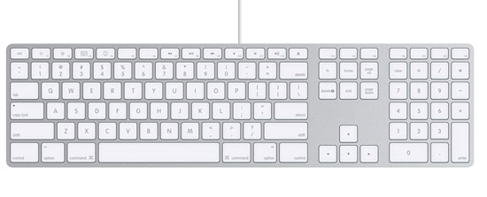
I talked a bit about the Dell's input devices so let's do the same for Apple's. The new iMacs ship with Apple's very compact aluminum keyboard, if you're a fan of the MacBook/Pro/Air keyboards, then you'll like this thing. The layout is obviously Mac optimized, so if you plan on using it under Windows you may find yourself frustrated that the Windows and Alt keys are switched. Personally I like the keyboard a lot, it's got a great feel to it, it's compact and it's easy to type on well. If you hate laptop keyboards however and need a more meaty feel to your keypresses, then you won't be a fan.

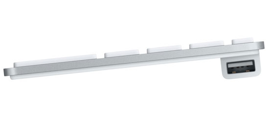
The keyboard is wired with a very short USB cable, designed to basically reach the USB port at the back of the iMac and go no further, it's the mouse however that has a very short cable. The Mighty Mouse, as Apple calls it, is designed to be plugged into the keyboard and thus you've got less than a foot of USB cord to work with. The Mighty Mouse is the same mouse I reviewed a couple of years back, it's got a single button but thanks to some fancy touch trickery it can behave as a two button mouse.

Mighty Mouse plugs in here
The entire surface of the mouse is a button (sound familiar?), press it down and you'll get a left click. Keep a finger on the right side of the mouse and press it down and it'll act as a right click, but note that for this to work you can't have your left finger resting on the left half of the mouse. My explanation may be a bit clumsy but using the mouse actually works pretty well, I don't really have any complaints there. The tracking precision is better than on the mouse that ships with the XPS One 24 and the tiny scroll ball is pretty sweet too.
For what it's worth, the scroll ball on the original Mighty Mouse I reviewed bit the dust within the first year of ownership; it just stopped working. I'm assuming that Apple's quality control has improved since the mouse was introduced but that may be a bit presumptuous on my part.
If you plan on gaming on this machine however, you'll need to replace the Mighty Mouse with something that has a real second button. While the Mighty Mouse is sufficient for all normal tasks, in a game where you're switching between left and right clicks a lot it's terribly annoying.
The Dell mouse needs to be replaced because of poor tracking precision and the Apple mouse would need replacement if you wanted to game on the iMac. The sad part is that neither of these tradeoffs are actually required by the all-in-one form factor, it's just a result of not thinking things through all the way. Dell has the greatest chance of fixing the problem though as Apple wouldn't bundle a Logitech mouse with its machine and there is no Apple branded mouse with two physical buttons for gamers.


60 Comments
View All Comments
TheFace - Thursday, October 30, 2008 - link
As far as the programs running in OSX, they do about the same as far as being able to tell which are running. Either the programs have a small 'light spot' under them (OSX 10.5), or they're in your taskbar (XP, Vista).Exposé is not the only way to switch between your programs on a mac. You can use command + tab as well, which is exactly like alt + tab in windows. So what is the big deal?
I would tend to argue that both OS's are as usable as the other, and
I use both every day. I like how everything works on my mac. I like how there are more software options and more hardware options with my PC.
MrDiSante - Thursday, October 30, 2008 - link
I didn't realize that command + tab was an option, I guess they're about even there. However, I still think that not separating running programs and shortcuts is a big mistake, both on the part of the designers of Mac OS X and Windows 7. I think that it is important to just glance and see the approximate amount/type of programs running instead of actually having to look through it. As well, I feel that the text also brings more to the table than it takes away by looking worse.michael2k - Friday, October 31, 2008 - link
Um, Apple has had a solution for that problem for years.A triangle/dot indicator that tells you whether the icon is a shortcut (no instance running) or a reference (application is running).
In other words:
> Icon == Application is up
Icon == Application is not up
sxr7171 - Monday, November 3, 2008 - link
Similar on S60 phones. Very useful in a phone OS.Eidorian - Thursday, October 30, 2008 - link
You might want to take a look at the iMac's GPU again in GPU-Z. It should be an 8800M GTS.fyleow - Thursday, October 30, 2008 - link
I skimmed the article so apologies if this is covered.The iMac 24" uses an H-IPS panel. Any idea if the Dell uses the same? That could make or break the pricing IMO. IPS screens do not come cheap and the most affordable 24 inch IPS is the HP lp2475w which is a $650 monitor.
n00bxqb - Thursday, October 30, 2008 - link
The 24" iMac most certainly does not use an H-IPS panel. It's an S-PVA panel.As for the Dell, I'm not sure what it uses.
andreschmidt - Friday, October 31, 2008 - link
The 24" iMac does use an H-IPS panel...fyleow - Thursday, October 30, 2008 - link
The new 24" iMac uses the LG LM240WU2 panel which is an IPS panel.n00bxqb - Thursday, October 30, 2008 - link
Based on the specs here:http://www.dell.com/content/products/productdetail...">http://www.dell.com/content/products/pr...;cs=19&a...
I would guess the Dell also uses a *VA panel.