NZXT Nemesis and Nemesis Elite
by Purav Sanghani on February 5, 2005 4:25 PM EST- Posted in
- Cases/Cooling/PSUs
External Design
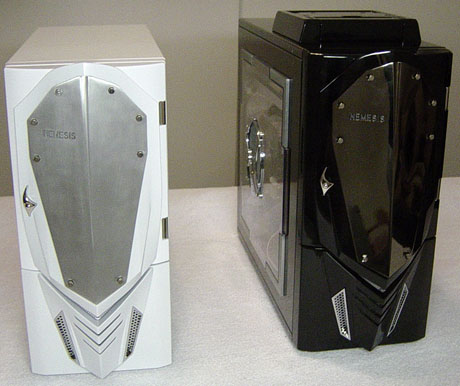
There are quite a few similarities between both flavors of the Nemesis. The first thing that sticks out is the metal shield bolted onto the bezel of each model. On the steel version, the shield is a brushed aluminum one whereas the Elite aluminum model's shield looks like it has a dark chrome coating. On the left side of the shield of both models is the "Nemesis" name in all uppercase lettering, which lights up when the system is powered on - subtle, yet innovative.
Nemesis (white, steel), Nemesis Elite (black, aluminum)
On the Elite mode, there is a small silver piece, which seems to be there just for show, but it is really an extension to the power button behind the door. This way it is not necessary to open the door to turn the power on. This is not the same for the steel version of the Nemesis, though. The door must be opened in order to access the power and reset buttons.
At the bottom of the bezel, we see four V-shaped vents, which allow air to be taken in. Above those vents, on the Elite model, is a V-shaped LED, which lights when the system is powered on. The color of the LED can be changed between red, blue, aqua, green and purple as well as a combination of blue/aqua, blue/purple, and red/green. The steel model does not have this feature along with many others that the Elite model has as we will see later.


53 Comments
View All Comments
semo - Sunday, February 6, 2005 - link
thanks Anand.to all ppl that keep saying "who buys these cases", well go back and read #7. i say keep reviewing these monstrosities (someone buys them) but then review 10 normal/enthusiast/any-no-gimmick cases.
piroroadkill - Sunday, February 6, 2005 - link
The worst bit is this case isn't all that bad, they just had to piss all over it by putting an ugly front on it... I don't get why any manufacturer would do that...ElFenix - Sunday, February 6, 2005 - link
thanks anand!danidentity - Sunday, February 6, 2005 - link
That is the ugliest POS I have ever seen. I stopped reading the second I saw the picture on the first page. Does anyone actually buy these things?Locut0s - Sunday, February 6, 2005 - link
Thanks Anand!Operandi - Sunday, February 6, 2005 - link
Optimus Prime called....He wants his body armor back.
Dualboy24 - Saturday, February 5, 2005 - link
Can you do nice case designs in the future... I would love to see reviews on more Lianli and antec cases... also what these two manufactures have in the budget line (-$100 cases)I think alof of people find these cases ugly... but Its nice that manufactures do make unique designs at least it keeps things fresh.
hoppa - Saturday, February 5, 2005 - link
thank you for that, anand! i'm yet another that is sick of ugly, loud cases.Rand - Saturday, February 5, 2005 - link
You know, it's odd... but I think the 3 nicest looking cases I've seen reviewed on AT were all priced under $30.I'm not sure whether that makes me really cheap, or the fancier cases horrendously misdesigned.
"but I'd rather review nothing than do any more of these."
You know your get crappy parts for review when when you'd rather review nothing. :)
Gatak - Saturday, February 5, 2005 - link
#13 and others...Will you buy and send a case that you like to see to AnanTech for review?
If not, then how do you think they will ever be reviewed?