NZXT Nemesis and Nemesis Elite
by Purav Sanghani on February 5, 2005 4:25 PM EST- Posted in
- Cases/Cooling/PSUs
Internal Design of Nemesis Steel Model
Since the internal layouts of each case are completely different, we will start off by examining the steel model to explain fully the features of each case.
Nemesis
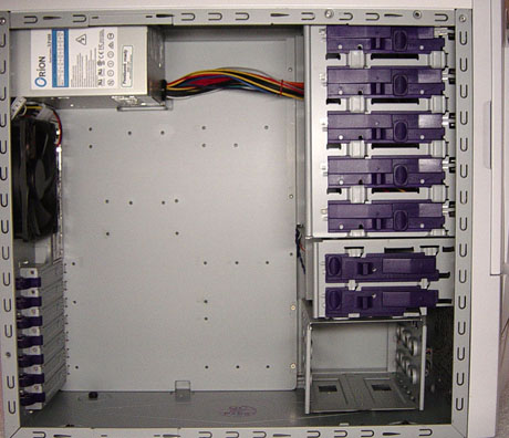
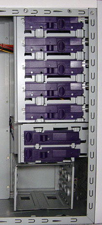
It is obvious when we open the steel model Nemesis that except for the aluminum armor plate on the bezel, the structure is made completely of steel. At the front of the case, we see the drive bays, five 5-1/2" bays as we saw from the bezel, and a total of five 3-1/2" bays, one of those being external. Tool-less mounting devices have been implemented in this model and seem to be the exact locking mechanisms that NZXT had implemented in the Guardian. They are purple in color and extend over all five 5-1/4" bays and two out of the five 3-1/2" bays. The bottom three bays reserved for HDDs use drive rails that are also included with the package.

Nemesis
Moving to the back of the case, we see that NZXT has also decided to implement rotating clips on the expansion slots like we saw in the Guardian as well as the Centurion 5 from CoolerMaster.

Nemesis
The power supply mounting area is easily accessible and will accommodate a power supply of any size. There is a strong platform on which a heavy unit can sit for added support and reduced stress on the case's structure.


53 Comments
View All Comments
ImJacksAmygdala - Sunday, February 6, 2005 - link
Well to Asus's credit they actually were able to make an uglier case than this one...http://usa.asus.com/products/pccomponents/chassis/...
kcma - Sunday, February 6, 2005 - link
sooooooooooooooooooooooooooooooooooooooo tacky...what is up with ugly tacky expensive cases... and ugly tacky cheap cases? it's official, anandtech has no taste, i click on these case reviews just to laugh at their bad taste...
BLHealthy4life - Sunday, February 6, 2005 - link
#18: that is HILARIOUS!#30: Yes you can possibly make a case this ugly...and they did.
Every year cases are getting more freaking ugly and extreme in design.
I just stick with the basic Lian-li designs...even some of the Lian-li cases are getting pretty damn ugly.
Like a few others, I did not even read the article after I saw the ugliest case I've ever seen in my life.
TinyTeeth - Sunday, February 6, 2005 - link
How can you possibly make a case this ugly?Griswold - Sunday, February 6, 2005 - link
Oh my God! My eyes... must wash my eyes..aaaargh!stephenbrooks - Sunday, February 6, 2005 - link
Erm, why does this article appear truncated? When I view the last page, it ends:"[...] then why spend $120 on something similar? We may surprise many of you with our final decision. For those who enjoy these custom-modded cases from the factory, then aesthetically"
That's it! Were the words after that censored? :p
Bonesdad - Sunday, February 6, 2005 - link
Thanks, Anand, for putting a stop to this...I wanna see some "adult" cases...not lego cases.Gholam - Sunday, February 6, 2005 - link
It's official, someone managed to beat Thermaltake in the "make the ugliest case possible" contest.darkteb - Sunday, February 6, 2005 - link
uglydarkteb - Sunday, February 6, 2005 - link