NZXT Nemesis and Nemesis Elite
by Purav Sanghani on February 5, 2005 4:25 PM EST- Posted in
- Cases/Cooling/PSUs
External Design
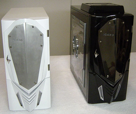
There are quite a few similarities between both flavors of the Nemesis. The first thing that sticks out is the metal shield bolted onto the bezel of each model. On the steel version, the shield is a brushed aluminum one whereas the Elite aluminum model's shield looks like it has a dark chrome coating. On the left side of the shield of both models is the "Nemesis" name in all uppercase lettering, which lights up when the system is powered on - subtle, yet innovative.
Nemesis (white, steel), Nemesis Elite (black, aluminum)
On the Elite mode, there is a small silver piece, which seems to be there just for show, but it is really an extension to the power button behind the door. This way it is not necessary to open the door to turn the power on. This is not the same for the steel version of the Nemesis, though. The door must be opened in order to access the power and reset buttons.
At the bottom of the bezel, we see four V-shaped vents, which allow air to be taken in. Above those vents, on the Elite model, is a V-shaped LED, which lights when the system is powered on. The color of the LED can be changed between red, blue, aqua, green and purple as well as a combination of blue/aqua, blue/purple, and red/green. The steel model does not have this feature along with many others that the Elite model has as we will see later.


53 Comments
View All Comments
ImJacksAmygdala - Sunday, February 6, 2005 - link
Well to Asus's credit they actually were able to make an uglier case than this one...http://usa.asus.com/products/pccomponents/chassis/...
kcma - Sunday, February 6, 2005 - link
sooooooooooooooooooooooooooooooooooooooo tacky...what is up with ugly tacky expensive cases... and ugly tacky cheap cases? it's official, anandtech has no taste, i click on these case reviews just to laugh at their bad taste...
BLHealthy4life - Sunday, February 6, 2005 - link
#18: that is HILARIOUS!#30: Yes you can possibly make a case this ugly...and they did.
Every year cases are getting more freaking ugly and extreme in design.
I just stick with the basic Lian-li designs...even some of the Lian-li cases are getting pretty damn ugly.
Like a few others, I did not even read the article after I saw the ugliest case I've ever seen in my life.
TinyTeeth - Sunday, February 6, 2005 - link
How can you possibly make a case this ugly?Griswold - Sunday, February 6, 2005 - link
Oh my God! My eyes... must wash my eyes..aaaargh!stephenbrooks - Sunday, February 6, 2005 - link
Erm, why does this article appear truncated? When I view the last page, it ends:"[...] then why spend $120 on something similar? We may surprise many of you with our final decision. For those who enjoy these custom-modded cases from the factory, then aesthetically"
That's it! Were the words after that censored? :p
Bonesdad - Sunday, February 6, 2005 - link
Thanks, Anand, for putting a stop to this...I wanna see some "adult" cases...not lego cases.Gholam - Sunday, February 6, 2005 - link
It's official, someone managed to beat Thermaltake in the "make the ugliest case possible" contest.darkteb - Sunday, February 6, 2005 - link
uglydarkteb - Sunday, February 6, 2005 - link