NZXT Nemesis and Nemesis Elite
by Purav Sanghani on February 5, 2005 4:25 PM EST- Posted in
- Cases/Cooling/PSUs
Internal Design of Nemesis Elite (Aluminum) Model
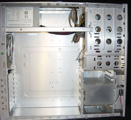
Now, let's take a look at the internal layout of the Nemesis Elite. The first thing that we noticed, even before opening the Elite model, was that it is made of aluminum because of its light weight and a look inside confirmed this.
Nemesis Elite
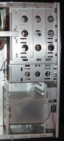
At the front of the case, we see the drive bays in a similar layout as the steel model, but with a few variations. First, since there are only four 5-1/4" drive bays, there is more room for extra 3-1/2" bays. With a total of two external 3-1/2" bays, there is a HDD cage positioned to the side, which can hold up to five HDDs. All of the bays use drive rails, which makes installation a bit quicker and cleaner than using screws. The drive bay layout reminds us a little of Thermaltake's Damier V6000A.

Nemesis Elite
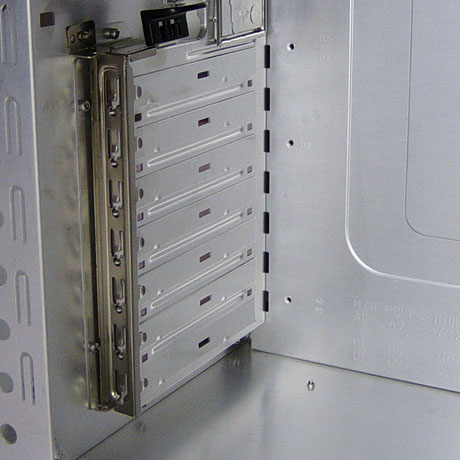
The expansion slots on the Elite model also had a tool-less mounting device on them, but it is not like anything that we have seen before. To install an add-in card, we push up on the tab to unlock it, then rotate out to lift the steel strip off the expansion slot mounting points. To lock the cards, we reverse the process and push the tab back until we hear a click.

Nemesis Elite
The Elite model has an aluminum bar running across the top about 1/4 of the way down as added support for the structure of the case. This may get in the way of installing the power supply when the motherboard is already mounted with a large heat sink fan like ours, so we advise users to install the power supply first.
The wiring inside the Elite edition reminded us of the V6000A, once again, which had a great amount of wiring that was usually in the way of things. Since the fans aren't protected on the inside, these wires could have been caught if they weren't stowed away or tied down. Another solution, on the manufacturer's side, would have been to wrap each bundle of wiring into sleeves to contain the mess. Hopefully, NZXT can add this to future models.


53 Comments
View All Comments
smn198 - Monday, February 7, 2005 - link
Sei, I look forward to seeing the new range of cases. I hope that Anand feels it is worthwile to review them. I think the case reviews at Anandtech are among the best, just the cases which are being reviewed aren't always the best looking. It would be a shame to loose them!Sei - Monday, February 7, 2005 - link
Hello,Thanks for the feedback guys, from an design point of view, we're hoping our next case will appeal to you guys. Like justly said, Before entering this market, the kings of sleek design Coolermaster, Silverstone, and Lian-li have already established a lot of market share and we really didn't want to make it harder for us to enter. We really wanted to bring something different to the table. Now that people have heard of us, we're going to introducing our own style of sleek cases this year. Galak, I believe silverstone and lian-li have introduced similar designs where the psu is located at the bottom of the case, and we're definitely looking into a structure different from the conventional design. Thanks again.
<-- Designer
Zak - Monday, February 7, 2005 - link
Yup, I didn't even bother reading after looking at the picture, UGLU POS! Anand, guys please, stop doing this - this is a waste of resource!Zak
justly - Sunday, February 6, 2005 - link
Sei, its nice to hear comments from someone that represents the manufacturer. I imagine it must be easier to break into the computer case market with a design like the "Guardian" instead of trying to compete with more conservative design. However, I have to say that no matter how well it is engineered the appearance alone would make me choose a different case. The "Guardian" design is so "over the top" there are ony two opinions you could expect "I love it" or "why in the world would they make such a thing". Obviously I'm not one of the people in your target market (Personally I like the simple elegant look of the Enlight EN-7250 series). I hope your company does well, even though you can be assured that I won't buy this case.Gatak - Sunday, February 6, 2005 - link
#36, Sei:Are you from the company that designed these cases? Cool to see someone actually taking time to read customer responses :).
Some of the people responding in here probably didn't think further than their noses, so I wouldn't take to much notice.
Anyway, as you say, there are many different customers with vastly different needs and tastes. Although I personally like more "grown-up" designs, I know people that used to love cases like this.
To those that didn't read the review you should know that the cases did actually have good features. Ease to mount and work with is a big plus.
To Sei: As far as I know the idea (in the beginning of time) to put the PSU at the top-back position was to use the exhaust fan to also remove the heat from the inside case. This probably worked good when systems didn't produce so much heat.
Today, things are quite difference. We already need extra exhaust and intake fans to keep airflow good. At the same time we like the PSU fan to produce as little noise as possible.
Wouldn't it possible to design a tower-type case where the PSU is placed in the bottom and the motherboard placed at the top? The idea is to spread out heat sources some. There is no need to have the VGA and CPU to also heat the PSU.
This placement would also make much more room to work with at the top. It would be possible to add a large 120mm at the top, removing the heat efficiently without having to sound much.
The PSU would also be cooler, needing less powerful fans, and therefore be quieter. All in all, it would be more pleasant to work in the case and it would be cooler and quieter.
Gatak - Sunday, February 6, 2005 - link
btw, for all those that want glass windows or otherwise transparent cases. You should think of EMI in/out from your computer. The metal case is not only a shell, but it is also a electromagnetic shield.But then I guess most of you use un-earthed wall outlets.
DS Delaroca - Sunday, February 6, 2005 - link
these are two cases i own, my lian Li has a danger dan water cooler, and my Koolance case, i know they are pricy but to they have looks and peformance so they worth it.this is my Lian Li: http://www.newegg.com/app/Showimage.asp?style=albu...
and this is my Koolance:
http://www.frozencpu.com/images/products/detail_hi...
Sei - Sunday, February 6, 2005 - link
Hello Guys,Man you guys are ruthless. :) Before designing each case, we are clear about who we are marketing our cases to. We knew that both the Guardian and the Nemesis were not going to be very appealing to many people. But of those people who do buy our cases, they are extremely happy with it. We're really proud to be one of the manufacturers who design unique products. It may seem that our attention to the "tacky" designs overshadow our quality but we are a company that is very dedicated to our customers ,providing good service and listening to our customers on our forums. Anyway, thank you guys for all the comments and taking the time to read this. I promise we will be coming out with more sleeker cases under another line
Thanks again guys! :)
DS Delaroca - Sunday, February 6, 2005 - link
nope #33 its rit that its the most anal looking case i have see in a long time, its like ASUS try their best to make a POS just for show. i mean the color,the desing, did i mention the color?.timmiser - Sunday, February 6, 2005 - link
#33, nah, I don't think that one is any more ugly. The Nemesis still holds the crown in my opinion.What I'd like to know, do adults design these cases?
-Tim